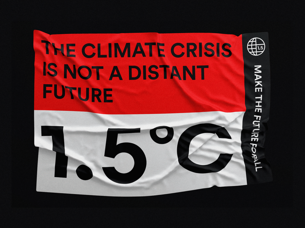
Designing for a Planet in Crisis: The Visual Power of ‘1.5°C’ Magazine
In a world teetering on the edge of environmental catastrophe, art and design have taken on new responsibilities. No longer confined to the realm of aesthetics, visual communication has emerged as a critical tool in the global conversation on climate change. One compelling example of this transformation is 1.5°C, a bold editorial project created by Bold Period. This magazine is more than a publication—it is a call to action.
A Visual Alarm Bell for a Warming World
The title 1.5°C immediately signals urgency. It references the critical threshold identified by the Intergovernmental Panel on Climate Change (IPCC), which warns that exceeding 1.5 degrees Celsius of global warming could lead to irreversible environmental damage. For Bold Period, this isn’t just a scientific statistic—it’s a design challenge. How do you translate a data point into something visceral, emotional, and impossible to ignore?
The answer lies in the magazine’s visual language. From color choices to graphic systems, every element of 1.5°C is engineered to provoke awareness and reflection. The design team utilizes a palette grounded in symbolism—fiery reds and scorched oranges dominate, signaling danger and urgency. These colors aren’t just eye-catching; they’re emotional cues that stir the reader’s sense of alarm.
Editorial Design That Speaks in Climate Metrics
The structure of the magazine draws heavily from the language of science and data. Graphs that track rising temperatures, sea levels, and carbon emissions are repurposed as design elements, not only to inform but to visually disrupt. The familiar lines of climate graphs are interwoven with photography and typographic elements, turning cold statistics into compelling visual narratives.
This fusion of data and design doesn’t just tell you what’s happening—it shows you. It takes abstract information and makes it tangible. It invites readers to not just read about climate change but to feel it, to confront its consequences on every page. The editorial layout echoes this intent: sharp angles, dynamic layering, and asymmetric grids echo the instability of the climate crisis itself.
Raising Voices Through Design
At its core, 1.5°C is about amplification—of facts, of emotion, and of unheard voices. The magazine serves as a platform for those affected by the climate crisis, from scientists and activists to communities living on the frontlines of environmental degradation. Through a careful balance of narrative and visual storytelling, the magazine gives shape to their stories in a way that is both accessible and impactful.
Bold Period’s design doesn’t overshadow the voices it uplifts. Instead, it enhances them. The typography, bold yet precise, balances readability with visual emphasis. Imagery is chosen not just for beauty but for relevance—evoking everything from deforestation and melting ice caps to renewable energy initiatives and grassroots movements. Each spread feels like a protest poster waiting to be pulled from the page.
Designing for Collective Action
Beyond awareness, 1.5°C aims to inspire participation. The magazine is not content with passive readership; it encourages its audience to act. This ethos is embedded within the design. Sections of the magazine are devoted to practical strategies, highlighting organizations, community projects, and policy proposals. Interactive elements—both in print and through digital integration—encourage readers to take part in environmental action, whether through education, advocacy, or lifestyle changes.
The magazine positions design as both a mirror and a megaphone. It reflects the reality of our planetary crisis, but also amplifies solutions. And in doing so, it challenges the notion that editorial design is purely passive. Instead, it becomes a tool for mobilization, urgency, and hope.
The Future of Purpose-Driven Design
1.5°C represents a growing movement in the creative industry—a recognition that design has a role to play in the world’s most pressing challenges. The project exemplifies how aesthetics can be deeply tied to ethics, how form can follow function in a way that is not only purposeful but transformative.
Bold Period’s work stands out not just for its polish and creativity, but for its courage. It takes on a complex, sometimes paralyzing subject, and presents it in a form that is clear, evocative, and deeply human. The result is a magazine that isn’t just about climate change—it’s a part of the climate conversation itself.
Conclusion: More Than a Magazine
Ultimately, 1.5°C is a testament to what design can do when paired with intention. It’s a striking example of how the tools of graphic and editorial design can be used to address real-world problems—making data personal, making danger visible, and making action feel possible.
In an age where the climate crisis demands our full attention, 1.5°C offers a new way to engage—a visual, editorial, and emotional experience that reminds us not just of what we’re up against, but of what we stand to save. Through design, it connects the dots between awareness and responsibility—and invites us all to be part of the solution.

