In an age when music, news, and conversation fit neatly into our pockets, tuning in to a traditional radio broadcast can feel delightfully retro—unless, of course, that station is your local public radio. For eight decades, Bay Area listeners have turned to KALW for everything from in‑depth reporting to late‑night jazz. Now, as KALW approaches its 80th anniversary, the station has enlisted the San Francisco branch of COLLINS to chart a bold new course: a visual identity both rooted in history and energized for the next eighty years.
Honoring Eighty Years of Local Storytelling
When COLLINS designer Barney Stepney and his team began immersing themselves in KALW’s archives, they quickly realized that this wasn’t just any community radio station. KALW has pioneered programs on social justice, the arts, and neighborhood affairs long before those topics became mainstream conversation. In a city celebrated for its vibrant culture—from the Exploratorium’s hands‑on experiments to the Symphony’s sweeping scores—KALW has served as a critical amplifier for voices that otherwise might have gone unheard.
“San Francisco’s perpetual sense of possibility comes from its many music and cultural scenes,” Stepney reflects. “KALW is a critical voice for those spaces—and one of the most pioneering radio stations in the U.S.” In other words, this redesign wasn’t simply a branding exercise; it was an opportunity to give form to a station that has itself been a catalyst for community connection.
Finding Character in the Quirky Past
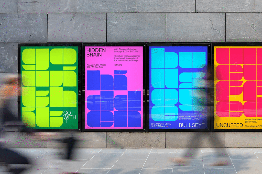
While researching KALW’s visual heritage, the COLLINS team uncovered a curious relic: a late‑1970s logo rendered in stencil lettering. Its assorted shapes and irregular proportions felt at odds with the flamboyant, psychedelic sensibility of 1970s San Francisco. Yet in that oddball inconsistency, the designers glimpsed something invaluable: raw character.
“There was surprising memorability and tons of energy in that old stencil,” Stepney explains. “It had a blunt, utilitarian aspect that anyone could understand, but it was also representative of building blocks coming together—just as KALW has built community over the last eighty years.” That insight set the stage for a bold decision: rather than smoothing over the stencil’s quirks, the new identity would lean into its rough‑hewn charm.
Stencils as Symbols of Community
Stencils carry a certain democratic spirit. They’re tools of expression—meant to be shared, repeated, and reassembled in endless combinations. By anchoring the new logo in a stencil motif, COLLINS created an emblem that feels both handcrafted and adaptable, capable of expanding to countless applications: newsletters, event posters, social media graphics, even mural‑sized installations.
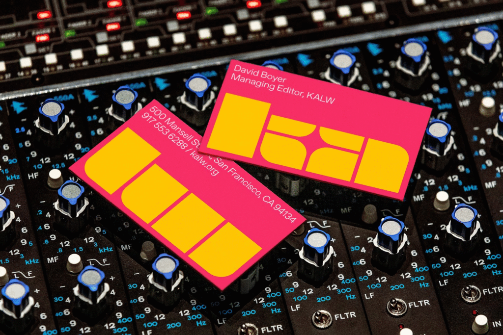
At its heart, the new logo is a stylized rendition of the station’s four‑letter call sign. Each edge and cut‑out feels deliberate, but no two letters are identical in width or angle. The effect is instantly recognizable and uniquely KALW: bold enough to carry across a crowded festival banner, yet intimate enough to sit comfortably in a smartphone app.
A Color Palette With Musical Roots
While the stencil delivers structure, the color system brings dynamism. Drawing inspiration from mid‑century jazz and classical concert posters—alongside the exuberant hues of “Rhapsody in Blue” sequences in Fantasia 2000—COLLINS selected a palette of vibrant, complementary pairings. Fiery oranges collide with deep teals; electric magentas pulse against soft grays. These intense bursts of color work in short, bright flashes—like the sudden crescendo of a horn or the flourish of a string section.
Text and iconography sit confidently within these color fields. Headlines in clean, geometric sans‑serifs balance the stenciled logo’s rough edges, while subheadings occasionally slip into an expressive script, carrying forward the station’s human‑centered ethos. Across print and digital, these elements combine to create a sense of controlled exuberance—an identity that feels as alive as a live broadcast.
Designing for Tomorrow—Together
Throughout the redesign process, collaboration was key. KALW programmers, producers, and station managers weighed in on every stage, ensuring that the identity did more than look good—it had to feel authentic to the people who make the station tick. That participatory approach mirrors KALW’s own mission: to co‑create stories with the community rather than broadcasting at it.
The new system is intentionally flexible. A stencil‑cut “KALW” block can morph into a background pattern for a fundraising appeal. A two‑color gradient can underscore a social‑media preview for a live‑streamed concert. Even simple stickers and swag items feel cohesive, because every graphic element lives within the same visual grammar.
A Future Brightly Charged
As KALW prepares to celebrate eighty years on the airwaves, its refreshed identity offers more than a facelift. It signals a recommitment to the station’s founding promise: to connect Bay Area communities through conversation, culture, and curiosity. By weaving together the grit of a DIY stencil, the warmth of vibrant colors, and the clarity of modern type, COLLINS has given KALW a voice that feels uniquely its own—and poised to resonate well into the twenty‑first century.
In a media landscape crowded with on‑demand playlists and algorithmically driven podcasts, there’s something reassuring about a radio station that still summons us to listen together. With its new identity firmly in place, KALW is set not only to endure—but to flourish. After all, a bold voice travels far, and there’s no better way to carry the human story forward than through the airwaves we share.

