In today’s crowded digital landscape, forging a distinctive brand identity can feel like trying to whisper in a bustling marketplace. Yet that’s exactly the challenge Feiner, a platform built for creative exchange, set out to conquer. Tasked with reflecting both time‑honored elegance and the nimble spirit of modern innovation, Obrazur Brands crafted a visual system that feels at once rooted in tradition and effortlessly adaptable—a duality few designs manage so smoothly.
Weaving Tradition into Every Letter
At the heart of Feiner’s identity lies its custom logotype, built upon the foundation of the Unna serif. Unna, with its gracefully tapered strokes and classical proportions, immediately evokes a sense of poised refinement. But Obrazur didn’t stop at simply selecting a stately font; they went further, refining each serif junction until every curve and terminal spoke with purpose. The result is a wordmark that carries the weight of centuries‑old typographic conventions, yet pulses with a quiet, contemporary energy.
Perhaps the most telling flourish appears in the treatment of the letter “i.” Rather than resting comfortably atop a standard dot, the designers introduced a bespoke accent—an intentionally small but visually striking detail that transforms the commonplace into something uniquely Feiner. It’s an elegant wink to the viewer, a reminder that even in a refined context, there’s room for personality and surprise.
Flexibility for the Modern World
A logo that thrives in print doesn’t always survive the demands of social media or small‑scale app icons. Anticipating this, Obrazur devised a compact iteration of the full logotype alongside a dedicated app icon. Stripped of ancillary flourishes but preserving the same refined serifs and signature accent, this streamlined version ensures Feiner’s presence remains unmistakable amidst a sea of thumbnails and avatars. Whether stamped on a presentation slide or shrinking to badge size on a mobile screen, the mark retains its integrity, balancing legibility with visual intrigue.
Patterns That Tell a Story
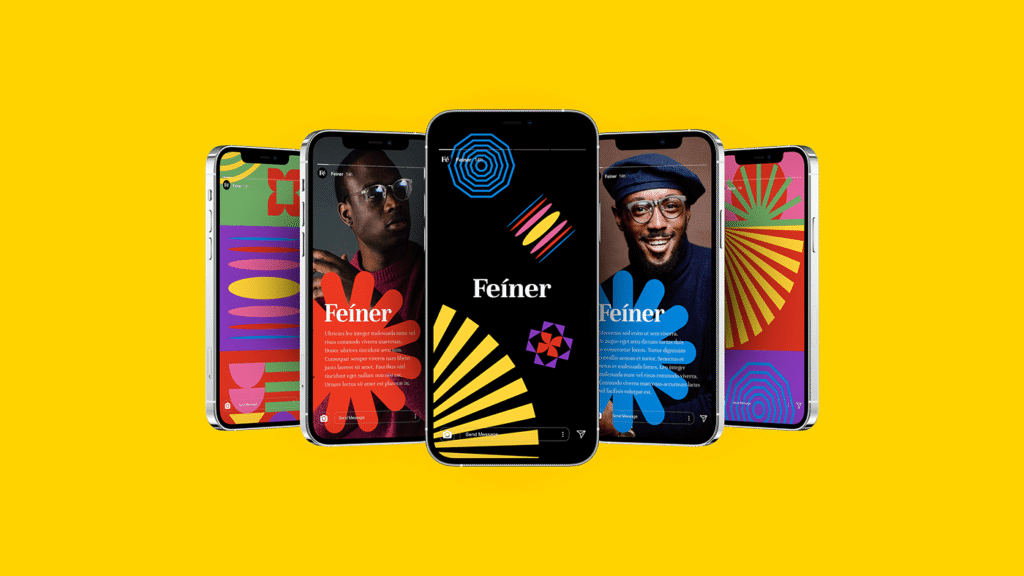
Beyond type, Feiner’s expression unfolds through a suite of twelve bespoke patterns. Each arrangement of lines, dots, or shapes captures a facet of the platform’s creative ethos—some suggest the unexpected intersections of ideas, others conjure the steady rhythm of collaboration. As these motifs appear across backgrounds, banners, or printed materials, they lend context and vibrancy without ever overshadowing the core wordmark.
The true genius of this system lies in its modularity. Designs can mix multiple patterns in one layout or lean on a single motif to maintain a cleaner look. This versatility encourages exploration: community managers might choose a bold, high‑contrast pattern for an event announcement, while a softer, more linear design could underscore an in‑depth tutorial.
A Color Palette Charged with Emotion
Complementing these patterns is a palette of six vivid hues, each selected for its emotional resonance. From a warm amber that suggests creative spark to a cool teal that speaks of thoughtful reflection, the spectrum enables Feiner to craft distinct moods on demand. Pairing any of these colors with one of the brand’s neutral backgrounds—an ivory or soft slate—guarantees maximum contrast and readability, all while keeping the layout feeling fresh.
This palette does more than brighten pages; it guides the viewer’s emotional response. A lively coral might headline an open‑call for project submissions, while a serene lavender could frame a quiet showcase of finished work. The effect is subtle but powerful: color choices become another channel for storytelling.
Consistency That Invites Exploration
What ties every element together—type, symbol, pattern, and hue—is a clear guiding principle: elegance need not be static. Feiner’s branding radiates a sense of unity, yet it doesn’t consign the platform to a single visual voice. Instead, it offers a toolbox, inviting the internal design team or external partners to remix and reapply components in new configurations. This balance of cohesion and flexibility mirrors Feiner’s mission as a space for ongoing creative exchange: always one design away from the next unexpected spark.
Lessons in Lasting Impact
Feiner’s visual identity illustrates a fundamental truth of branding: longevity arises when you marry respect for tradition with an eye toward tomorrow. By rooting their logo in a classic serif and then injecting bespoke adjustments, Obrazur ensured the mark feels both grounded and alive. By building a system of patterns and colors that can flex to fit countless contexts, they gave Feiner the tools to remain dynamic without ever drifting from its core essence.
For any creative team setting out to build—or reinvent—a brand, Feiner offers a compelling blueprint. Start with a timeless foundation, refine every detail until it sings, and then design for adaptability across platforms and media. With this approach, a brand can speak with consistent clarity while still welcoming fresh interpretations.
In the end, Feiner’s identity does more than look polished: it opens a door. It invites artists, writers, and makers to step into a space where sophistication meets spontaneity, where every typographic nuance and vibrant pattern proclaims that creative exchange is both an art and an adventure.

