In a world where ride-hailing apps have become an everyday essential, differentiation is no longer about speed or cost alone—it’s about trust, innovation, and how seamlessly a brand integrates into people’s lives. This is where Milaq, a rising player in the ride-hailing sector, makes its mark. With a thoughtfully executed branding and visual identity crafted by designer Iliass Sabouny, Milaq isn’t just another name on your phone screen—it’s a symbol of modern movement, redefined.
Branding with Purpose in a Crowded Market
From its inception, Milaq set out to be more than a functional service. The team envisioned a brand that didn’t just transport people from one location to another—but one that moved with them, understood them, and adapted to their needs. That vision called for more than just a slick app interface or competitive rates. It demanded a brand identity that could speak directly to users with clarity, personality, and trust.
Enter Iliass Sabouny, the creative mind behind Milaq’s bold new visual presence. With a design philosophy rooted in user empathy and precision, Sabouny took on the challenge of building a brand identity that was not only aesthetically sharp but also emotionally resonant.
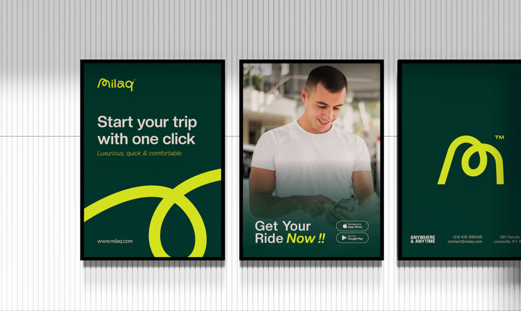
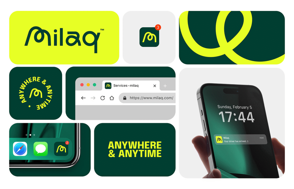
The Logo: A Symbol of Motion and Meaning
Every strong brand begins with a strong mark. For Milaq, the logo serves as a visual anchor—an emblem that encapsulates the company’s mission and forward-thinking spirit. Sabouny’s design is more than just a clever shape or letterform. It’s a symbol of fluidity, direction, and purpose—reflecting the dynamic nature of transportation while hinting at the seamless journey Milaq promises its riders.
The logo’s smooth curves and calculated structure mirror the app’s intuitive user experience. It’s approachable, modern, and distinct—three qualities that ride-hailing users subconsciously look for when deciding who to trust with their daily commute.
A Color Palette That Speaks Confidence
Color plays a subtle yet powerful role in how users perceive a brand. For Milaq, Sabouny selected a palette that straddles the line between innovation and dependability. The primary tones are grounded—blues, greys, and deep blacks—instilling a sense of stability and professionalism. But splashes of vibrant accent colors inject life into the brand, signaling agility, freshness, and tech-savvy sophistication.
The result is a system of colors that are not only versatile across digital and physical platforms but also emotionally evocative. Whether seen on an app icon, a driver’s badge, or a vehicle wrap, Milaq’s colors reinforce the message: this is a brand you can rely on.
Typography That Guides, Not Distracts
In the ride-hailing industry, clarity is king. Whether you’re trying to locate your driver in a crowd or confirming your fare on the app, the typography must be legible, clean, and unobtrusive. Sabouny embraced this principle wholeheartedly.
Milaq’s brand typeface is sleek, sans-serif, and meticulously spaced. It exudes modernity without leaning into the overly sterile or impersonal. It’s typography that feels native to the mobile environment—designed to inform, not overwhelm. At the same time, it carries enough personality to ensure that even text alone feels unmistakably “Milaq.”
Visual Language Rooted in Experience
Beyond the logo and type, Milaq’s visual identity encompasses a full system of imagery, iconography, and UI elements that reflect the brand’s values. Sabouny developed a visual ecosystem that ties every touchpoint together—from the onboarding screens in the app to the promotional banners in the streets.
Photography and illustration choices lean into realism and human connection. You’ll see smiling faces, vibrant cityscapes, and real-life commuting moments—not generic stock imagery, but a visual diary of modern urban movement. This approach helps Milaq position itself as a brand that sees people, not just passengers.
Designing for Trust in a Digital Age
What sets Milaq apart isn’t just its clean visuals or trendy aesthetics. It’s how its brand identity cultivates trust—a critical commodity in a world where data privacy, safety, and driver accountability are hot-button topics.
By emphasizing transparency through design, Milaq reassures its users before they even tap “Book Now.” Every visual element, from the calm color choices to the intuitive navigation layouts, works to minimize friction and maximize confidence. It’s a masterclass in user-first branding.
Lessons from Milaq’s Brand Evolution
Milaq’s brand journey, as orchestrated by Iliass Sabouny, offers valuable takeaways for any designer or startup:
- Start with a mission. Milaq’s brand isn’t just pretty—it’s built on a clear purpose: to improve transportation through trust and ease.
- Think beyond the logo. A brand lives in its every expression—from app design to in-app messaging, from driver uniforms to billboard ads.
- Design with empathy. Every visual decision in Milaq’s identity reflects a deep understanding of user needs, from accessibility to emotional comfort.
- Consistency builds recognition. The cohesive system of colors, type, and visuals helps Milaq carve out a recognizable space in a saturated market.
More Than a Ride—A Brand Experience
In the end, Milaq is redefining what it means to hail a ride. It’s no longer just about getting from point A to point B—it’s about feeling good, safe, and seen along the way. Through its standout visual identity, it communicates these values clearly and confidently. Sabouny’s work doesn’t just decorate the brand—it defines it.
As ride-hailing continues to evolve, Milaq proves that branding is no longer a supporting player—it’s the vehicle itself, guiding the journey every step of the way.

