In the often-cluttered world of modern branding, simplicity can be a bold statement. This is precisely the case with HR/STUDIO, the commercial design identity of renowned designer Henrique Regonato. With a sharp eye for detail and a refined creative direction, Regonato has crafted a visual identity that speaks volumes through restraint, minimalism, and Swiss design discipline.
The branding of HR/STUDIO is not just a visual aesthetic—it’s a philosophy. It’s about intentional design that strips away the unnecessary to reveal a brand that is quietly confident, unmistakably modern, and striking in its clarity.
A Minimalist Foundation with a Swiss Soul
At the core of HR/STUDIO’s branding is an unmistakable allegiance to Swiss style—a design movement known for its focus on grid-based layouts, objective clarity, and the prioritization of function over flourish. This influence is apparent in every aspect of Regonato’s work. There’s no room for visual noise here. Each component—whether color, type, or space—has a purpose and contributes to a larger system of coherence.
Layouts are meticulously aligned, white space is generous, and every page or surface feels both open and ordered. The result is an identity system that doesn’t scream for attention but commands presence through balance and structure.
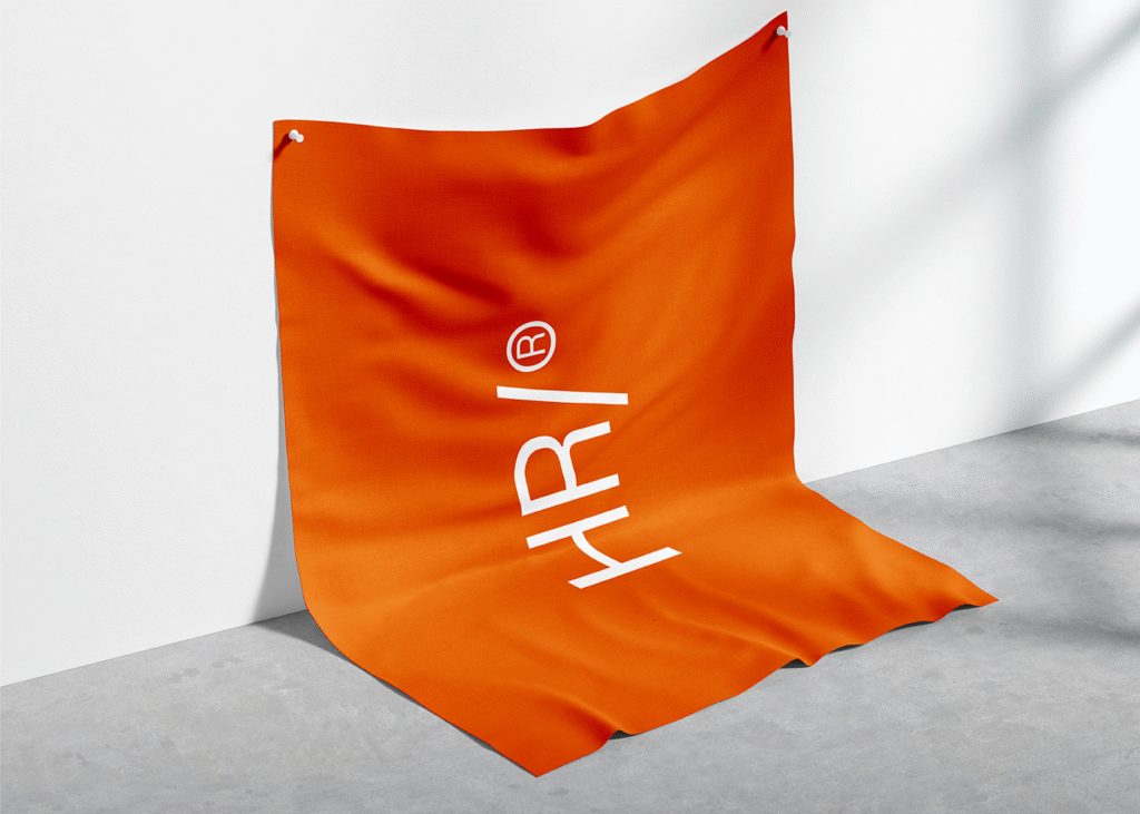
Color Palette: Restraint with a Pulse
Regonato’s chosen color palette is anchored in monochrome elegance: black, white, and a range of sophisticated greys. This foundational trio creates a neutral canvas upon which the brand builds its tone of professionalism and modernity. But then comes the twist—a vivid orange accent—a small but intentional burst of energy that elevates the entire system.
This use of color demonstrates a masterful control of contrast. The orange doesn’t overwhelm but instead acts as a highlighter, drawing the eye to key elements like logos, interface details, or calls to action. It’s the brand’s visual heartbeat—subtle, but unmistakably alive.
Typography: Function Meets Finesse
In HR/STUDIO’s identity, typography does the heavy lifting—a hallmark of minimalist design. Regonato leans into clean, sans-serif fonts that are both neutral and elegant, contributing to a cohesive typographic language across all touchpoints. But simplicity doesn’t mean monotony. Bold size contrasts and smart line spacing create a dynamic visual rhythm while preserving readability.
This is typography with discipline. The bold headings, delicate body text, and occasional typographic interplay create a hierarchy that is both intuitive and visually satisfying. It’s not decorative—it’s communicative, aligning with Swiss design’s belief that form must follow function.
A Visual System Built for Versatility
One of the most commendable aspects of the HR/STUDIO brand identity is its adaptability. While minimalist in nature, the system is designed to work seamlessly across a variety of media—digital platforms, print materials, presentations, social media, and beyond.
This versatility is made possible by the consistency of its visual components. From the tightly structured grids to the refined use of white space, every element contributes to a flexible yet recognizable visual language. Whether you encounter HR/STUDIO on a website or a business card, the experience is unified and unmistakably “on-brand.”
This is especially important in an age where design must perform across dozens of devices and user contexts. HR/STUDIO shows that minimalism isn’t about limitation—it’s about scalability and clarity at every level.
More Than a Look—A Design Mindset
Henrique Regonato’s work for HR/STUDIO is more than a portfolio piece; it’s a case study in the power of strategic minimalism. He doesn’t just design surfaces—he curates experiences. Every decision, from color to kerning, contributes to a brand that feels confident in its purpose and poised for relevance.
And perhaps that’s the most compelling takeaway from this project. In a time when brands often chase novelty or visual complexity, HR/STUDIO stands apart by embracing timelessness. It’s not concerned with trends. It speaks a design language that will feel just as fresh tomorrow as it does today.
A Template for Modern Designers
For emerging designers, creative directors, or anyone in the branding world, HR/STUDIO offers a powerful reminder: restraint is a strength. Great branding doesn’t always need loud colors, layered textures, or ornate logos. Sometimes, the boldest message is delivered with the fewest words—or in this case, the cleanest lines.
This identity doesn’t demand attention; it earns it.
And in doing so, Henrique Regonato proves that true creative excellence lies not just in what you add, but in what you choose to leave out.
In the end, HR/STUDIO is more than a brand—it’s a quiet revolution in modern design. One that champions thoughtfulness over theatrics, and function over fuss. A visual identity that invites you in, guides your eye, and never lets you forget: sometimes, less really is more.

