Bold, Beanless, and Bursting with Personality: How Minus Coffee Is Redefining the Brew
In an industry steeped in tradition, innovation often comes from the unlikeliest corners. Enter Minus Coffee, a bold new player in the caffeine world—except, ironically, without the coffee beans. This disruptive brand is shaking up the coffee aisle not just with what’s inside the can, but with the creative flair on the outside too.
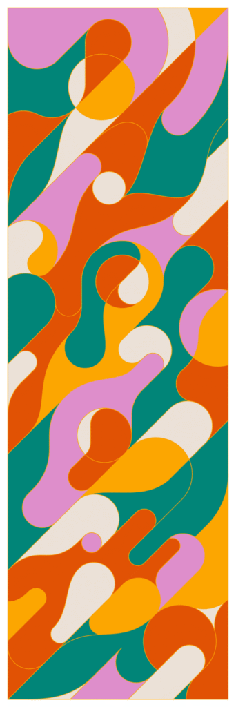
To help communicate their rebellious spirit and eco-forward mission, the team behind Minus Coffee turned to visual artist Calvin Sprague—a master of retro flair and vibrant storytelling. The result? A visual identity that feels like a psychedelic joyride through pop culture, mid-century modernism, and 21st-century design cool. With a product as unconventional as beanless coffee, the branding needed to do more than look good—it had to make people curious, excited, and eager to take a sip of something entirely new.
Beanless but Not Bland
Let’s start with the big idea: Minus Coffee isn’t made from coffee beans at all. Instead, it’s brewed using a fermentation-based process that mimics the flavor and kick of coffee, without relying on traditional agriculture. The implications are big—fewer emissions, less water use, and a radical rethink of how we approach our morning fix.
But introducing such a concept requires more than an explanation. It needs an identity that immediately communicates, “We’re not your average cup of joe.” That’s where Sprague comes in.
A Visual Rebellion in a Can
Sprague’s approach to Minus Coffee’s packaging and branding leans into funk and freedom. The aluminum cans act as small, portable canvases, wrapped in explosive color palettes and abstract character designs that blend retro comic energy with digital-age quirk. This isn’t design meant to whisper on a shelf. It’s meant to shout across it—and then wink at you.
Rather than a rigid brand system, Sprague’s work embraces chaotic cohesion. Each design is distinct, yet part of a shared visual universe that feels wild, youthful, and completely unconcerned with the rules. It’s design that feels like a party. One where everyone’s welcome, and the drink of choice just happens to be beanless.
Branding Beyond the Can
The energy doesn’t stop at the packaging. Sprague’s illustrations carry over to Minus Coffee’s website, social media channels, and merch. Everywhere you see the brand, you see this curated chaos—a visual world full of bouncing eyeballs, dancing mugs, and floating limbs, all rendered in thick, confident lines and bold hues.
It’s not just about fun. There’s strategy behind the madness. In a crowded beverage market, recognition is currency. Minus Coffee’s distinct look ensures you’ll remember it—even if you haven’t tasted it yet. The brand’s voice is playful, cheeky, and inviting, and Sprague’s visuals translate that perfectly without needing a single word.
A New Kind of Coffee Culture
Traditionally, coffee branding has leaned into craft, calm, and cool—think brown kraft paper, minimal black-and-white logos, and clean, Scandinavian fonts. But Minus Coffee isn’t part of that world. It’s rewriting the narrative from the ground up. Sprague’s illustrations don’t just make the product look fun—they signal that this is a different kind of coffee experience. One that’s inclusive, experimental, and unafraid of being loud.
In a sense, the visual identity becomes a manifesto. It says: this is what coffee can look like when we rethink everything. This is what sustainability can feel like when it’s packaged with joy, not guilt. This is what you get when design isn’t afraid to dance a little.
The Power of the Unexpected
One of the most powerful aspects of this collaboration is its use of surprise. You don’t expect a beanless coffee to come wrapped in psychedelic colors and cartoonish weirdness. And that’s the point. Minus Coffee isn’t just trying to replace traditional coffee—it’s offering something entirely its own. And Sprague’s work supports that by creating a visual language that’s both fresh and rebellious, full of texture and movement.
And let’s not overlook the aluminum cans themselves—sleek, recyclable, and perfect for chilling in the fridge or being carried to a music festival. The format aligns with the brand’s forward-thinking ethos, and the art makes it something you want to show off, not stash away.
Designing for the Future
At its core, the Minus Coffee brand is about possibility. What happens when you take something as established as coffee and reimagine it from scratch? What if your morning ritual didn’t come with the same environmental cost? And what if sustainability could be… fun?
Sprague’s visual identity doesn’t just support those questions—it amplifies them. His illustrations turn each can into an invitation: to taste differently, to think differently, and to laugh a little while you’re at it.
Final Sip
In a world where design too often plays it safe, the partnership between Calvin Sprague and Minus Coffee is a reminder of what happens when you throw the rules out the window. It’s colorful. It’s weird. It’s fun. And most importantly, it’s effective.
So the next time you’re browsing for a caffeine fix and see a can bursting with visual attitude—one that looks more like an album cover than a coffee label—you might just be looking at the future. Beanless, bold, and buzzing with creativity.
Cheers to that.

