Rebranding a historic institution is never simple — especially one as revered as the Orquestra Sinfônica do Estado de São Paulo (São Paulo Symphony Orchestra), or OSESP. Entrusted with this delicate task, São Paulo-based design studio Polar created an identity that doesn’t just represent classical music but actively breathes it.
Founded decades ago, OSESP stands as one of Brazil’s most important cultural pillars. Yet over time, its brand had begun to feel adrift — prestigious, but lacking the dynamism that reflects the orchestra’s role in modern Brazil. The new identity needed to honor the past while capturing the vitality of the present. Polar’s approach? Craft a visual language rooted in the very rhythm and life of music itself.
Rather than lean heavily on classical tropes — gilded flourishes, ornate imagery — Polar returned to fundamentals: rhythm, movement, and emotion. Rhythm, in particular, became the core around which the entire system was built. Taking inspiration from the vertical lines of musical notation, the studio developed a graphic structure that pulses through every application of the brand.
Nowhere is this clearer than in the OSESP wordmark. Instead of settling for a static, uniform logo, Polar set the individual letters at varying heights, subtly evoking the rise and fall of notes on a musical staff. It’s a design that feels alive, offering a visual echo of sound without resorting to obvious musical clichés.
Typography plays a key supporting role in the new identity. Polar selected Gal Gothic, a modernist sans serif from Brazilian foundry Blackletra, as the primary typeface. It’s clean and efficient, balancing the traditions of classic design with a distinctly contemporary sharpness. However, in its lowercase treatment and wide spacing — a necessary adjustment to harmonize with the vertical bars — the font sometimes edges toward a slightly elementary feel. Nevertheless, it provides the flexibility and timelessness essential for a brand that must remain relevant across seasons and generations.
Accompanying Gal Gothic is Silva Text, also from Blackletra, a straightforward serif font that introduces a warm, approachable tone. Primarily used for program notes and other text-heavy materials, Silva Text reinforces the brand’s commitment to clarity without sacrificing personality.
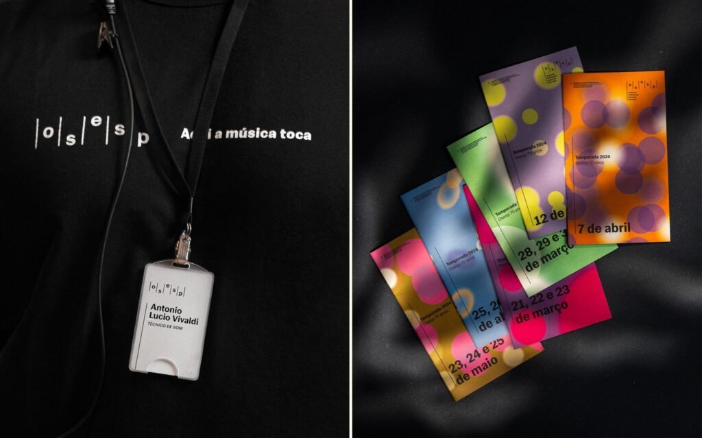
But music is more than structure; it’s emotion, movement, and nuance. To capture these more ephemeral qualities, Polar introduced vibrant colors and kinetic forms into the identity. Working alongside developers, they created Instrument — a generative design tool that translates live audio data into real-time visual compositions. As a piece of music plays, elliptical shapes morph, overlap, and pulse based on its tempo, volume, and resonance.
This dynamic visual system does more than add flair; it transforms OSESP’s identity into a living entity. Every performance generates its own graphic signature, ensuring the brand remains fresh and continually connected to the music itself. For OSESP’s in-house team, it offers a flexible toolkit, empowering them to easily craft new campaigns and marketing materials without losing the cohesion of the overall brand.
Color is another critical element in this refreshed identity. Each hue is selected to evoke a specific emotional resonance: deep reds for drama, rich blues for reflection, vibrant yellows for joy. The shifting palettes allow each concert season, event, or promotional campaign to maintain a unique visual identity while still unmistakably belonging to the OSESP brand universe.
The beauty of Polar’s work is its ability to balance opposing forces. The vertical bar structure introduces discipline and consistency, while the color and motion elements inject vibrancy and spontaneity. This tension between order and freedom mirrors the very essence of orchestral performance — meticulously composed yet emotionally charged.
In motion — across social media, promotional videos, and digital campaigns — the new branding shines with kinetic energy. Yet even when applied to static materials like posters, programs, tickets, and merchandise, the identity retains its vibrancy. It scales elegantly across mediums, from grand billboards to delicate printed ephemera, maintaining impact at every size.
Through this masterful reimagining, Polar positions OSESP as an orchestra that honors its heritage while embracing the future. The new branding appeals to seasoned concertgoers and newcomers alike, offering an accessible and compelling visual narrative that mirrors the richness of the music itself.
By seamlessly weaving precision and fluidity into every aspect of the design, Polar has created more than a new look for OSESP — they have crafted an evolving, living identity. One that, like the music it represents, is at once structured and profoundly human.

