When it comes to building a beauty brand, authenticity and storytelling are as vital as the products themselves. Senja Cosmetics, a premium Scandinavian skincare label founded by Senja Parkkinen, understands this perfectly. With products ranging from toners to cleansing foams and oils, all crafted from potent natural ingredients and manufactured in Finland, the brand needed an identity that would genuinely reflect its spirit — raw, natural, and elegant.
To bring this vision to life, Senja partnered with Finnish design studio Werklig, resulting in a visual identity that masterfully fuses the brand’s Nordic roots with a refined contemporary aesthetic.
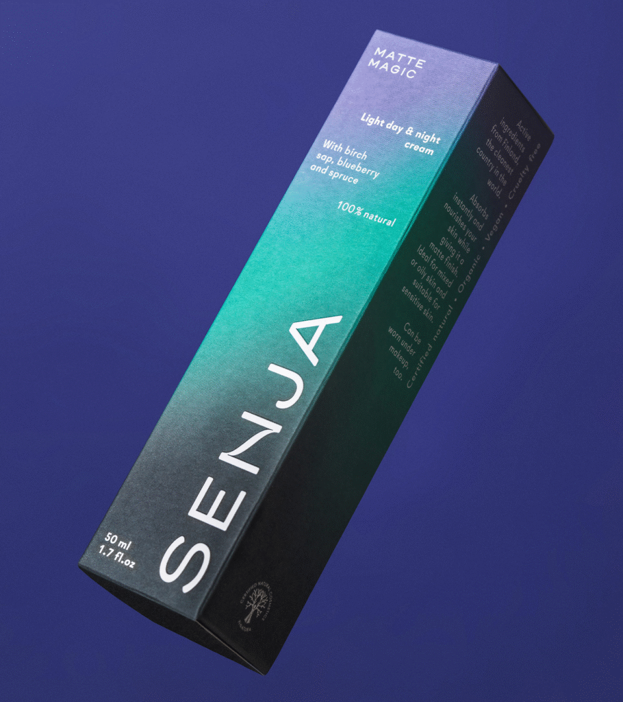
Capturing the Nordic Soul
At the heart of Werklig’s design is a strong sense of place. Rather than leaning into generic tropes of natural beauty, the studio chose to embrace the unique atmosphere of the Scandinavian environment. This regional authenticity is most vividly expressed through the brand’s signature gradient — a striking blend of black, green, and purple hues inspired by the ethereal glow of the Aurora Borealis.
This gradient does more than provide a visual punch; it carries symbolic weight. It evokes the pristine, often harsh Nordic landscapes where the brand’s ingredients originate. It suggests transitions — from day to night, from light to darkness — echoing the rhythms of nature and, subtly, the day-and-night use of skincare products. In this way, the gradient becomes a poetic device, speaking to both the brand’s geographical roots and the experiential quality of its products.
The Art of Balance
Beyond color, Werklig introduces a series of meticulously arranged still-life sculptures, crafted from natural materials. These compositions celebrate the Finnish environment, drawing inspiration from its varied landscapes — the dense forests of the east, the wild moorlands of Lapland, the scattered archipelagos, and the expansive plains of the west.
The sculptures are more than mere visuals; they represent a delicate balance between craft, nature, and product. Their careful construction mirrors the balance inherent in Senja’s skincare philosophy — the interplay between natural ingredients and scientific precision. Each sculpture serves as a tactile, emotional anchor for the brand, reinforcing a deep connection to place and material.
A Logo Rooted in Simplicity
Central to the new identity is the custom-designed Senja wordmark. In a market saturated with ornate and overly stylized branding, Senja’s logo stands out precisely because of its restraint. Simple and soft, it fits naturally within the cosmetic industry’s expectations of elegance while introducing a unique twist: the distinctive treatment of the letter “N,” where the vertical strokes flow smoothly into one another.
This subtle design detail reinforces the broader themes of fluidity and transition that permeate the brand. It also adds a quiet memorability to the logo — a small, thoughtful deviation that ensures the brand feels both sophisticated and approachable.
Layers of Meaning
Every element of Senja’s new identity works on multiple levels. Visually, it is arresting — the bold gradients, the minimal typography, the sculptural imagery. But beneath the surface, there is a rich subtext: the resilience and beauty of the Nordic environment, the careful craft that defines both the products and their presentation, and the synergy between human creativity and the natural world.
The overall execution speaks volumes about quality and authenticity. Whether it’s the fine balancing act of the still-life compositions or the intelligent use of color and form, Werklig’s work ensures that Senja Cosmetics not only looks premium but feels genuinely connected to its origins.
A Digital Disconnect
However, not every aspect of the brand’s presentation achieves the same level of refinement. While the printed materials — postcards, packaging, and other collateral — beautifully balance color, typography, and imagery, the online presence lags slightly behind. The website, though functional, lacks the grace and cohesion seen in the physical touchpoints, missing an opportunity to fully translate the brand’s narrative into the digital space.
Still, the strength of the visual identity shines through, creating a powerful foundation for Senja Cosmetics to build upon as it grows its presence both within Scandinavia and internationally.
A Thoughtful Reimagining
In a beauty industry often overwhelmed by noise and superficial trends, Senja Cosmetics’ new identity stands as a testament to the power of authenticity and thoughtful design. Werklig’s approach honors the brand’s roots while providing it with a fresh, contemporary voice — one that feels as natural and enduring as the Finnish landscapes it draws from.
By merging art, environment, and branding into a seamless whole, Senja has carved out a distinctive space for itself — a brand that not only cares for the skin but also tells a compelling story of nature, balance, and beauty.

