There’s no shortage of sandwich shops vying for attention these days, but few carry the kind of playful punch that Fuku delivers. Branded by Brooklyn-based agency Red Antler, Fuku isn’t just another food joint—it’s a celebration of bold flavors, no-frills fun, and unmistakably New York energy.
Fuku, proudly calling itself a “fine brining establishment,” specializes in a specific culinary delight: the chicken “sando” (yes, sandwich for the rest of us). The journey of this brand began humbly as a secret menu item at David Chang’s legendary Momofuku Noodle Bar in New York’s East Village. Its popularity exploded, eventually giving rise to a brand of its own. While Fuku’s physical footprint is a bit scattered—showing up at sports arenas and music venues across the U.S. from Madison Square Garden to the Hard Rock Stadium in Miami—it’s this very flexibility that keeps it buzzing with an energetic, pop-up spirit.
Red Antler’s task was to evolve Fuku’s brand identity without losing its roots in the culinary world or its irreverent attitude toward traditional dining. And for the most part, they succeeded brilliantly.
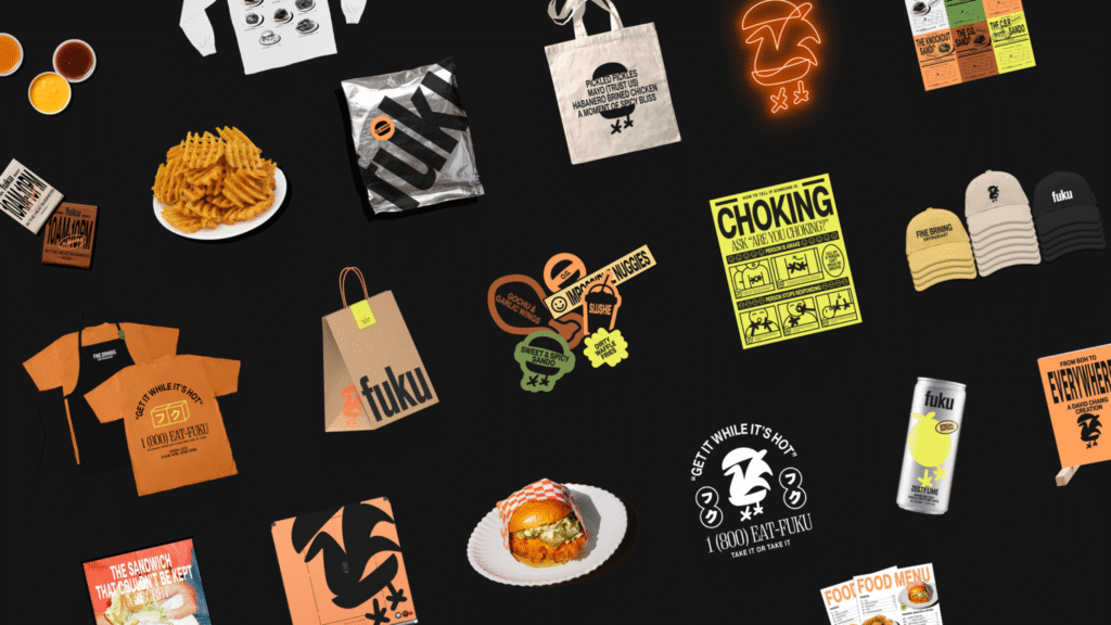
A Visual Identity That Pulls No Punches
At the core of Fuku’s branding is an unapologetic embrace of what it is: simple, confident, and not overly concerned with sophistication. The logo features a cartoonish chicken sandwiched between a bun—a literal, almost cheeky visualization of their signature product. For some, this might feel a touch too obvious. Yet it perfectly matches the brand’s directness and humor.
Supporting this is a straightforward yet striking wordmark, rendered in Akzidenz-Grotesk BQ Condensed. This classic font was carefully chosen as a nod to the gritty, honest typographic styles found on Manhattan’s storefront awnings. Paired with 3D signage and stacked cubes, the wordmark finds its home as much in the streets as it does inside the arenas where Fuku thrives.
The broader identity leans heavily on two outstanding typefaces from Montreal’s Pangram Pangram: the versatile PP Neue Montreal and the robust PP Right Serif. Their combination injects a dynamic rhythm into Fuku’s visual communications, from menus to marketing collateral. There’s a deliberate mixing of grit and polish here, an aesthetic dance that captures New York’s paradox of roughness and glamor.
Art Direction That Feels Like the City
The campaign’s art direction deserves special mention. Red Antler turned to no-nonsense flash photography—sharp, lively, and raw. The imagery oozes a late-night New York atmosphere, almost cinematic in its immediacy. It feels spontaneous, slightly chaotic, and irresistibly alive—exactly the emotional flavor one expects when grabbing a spicy chicken sando at 11 p.m. between concert sets.
This vivid editorial style not only elevates the brand’s attitude but situates it firmly in the sensory overload that is quintessential NYC nightlife.
When “Cool” Tries a Little Too Hard
Yet, for all its strengths, Fuku’s branding occasionally teeters into overreach. The playful tone is welcome, but sometimes the brand seems a bit too eager to be cool. Take the “sticker-bomb” elements scattered throughout packaging and marketing. While the idea is conceptually sound—gritty, irreverent, a nod to skater culture—the execution feels, at times, slapdash. There’s an undercurrent of trying too hard to tap into a Gen X or Millennial ‘slacker’ coolness that the brand honestly doesn’t need. Fuku’s authenticity lies in its simplicity, and anything that feels forced slightly dilutes that power.
Similarly, taglines like “fine brining” and “take it or take it” feel puzzling rather than clever. One wonders if the messaging occasionally loses clarity in an effort to sound edgy or ironic.
The Verdict: Flavor Over Fuss
Despite these minor missteps, Fuku’s brand identity lands firmly where it matters: it’s memorable, energetic, and fun. Red Antler captured something essential—the spirit of a city that never sleeps and never overthinks its best ideas. The visual and verbal language hits hard on menus, where strong type and striking photography come together to whet the appetite instantly.
For those willing to embrace a chicken in a bun as their emblem of culinary joy, Fuku offers a deliciously bold experience. It’s messy, vibrant, and utterly New York. And sometimes, that’s exactly what you want from a sandwich—or a brand.

