Since their humble beginnings in a backyard shed in 2007, The Dinner Ladies have been on a mission: to fill freezers—and hearts—across Australia with wholesome, ready-to-heat meals. Founded by two determined women who understood the chaos of family dinnertimes all too well, their goal was simple yet powerful: deliver comforting, home-style meals that take the pressure off busy households. Now, after seventeen years of success, The Dinner Ladies decided it was time for a brand refresh—one that honored their spirited roots while preparing them for the next chapter of growth.
Enter Universal Favourite, a Sydney-based creative agency tasked with reimagining the brand. The objective was clear: evolve The Dinner Ladies’ visual and verbal identity into something modern, bold, and distinctly theirs—without losing the no-nonsense attitude that had made them so beloved.
A Brand That Grew Out of Love and Necessity
From day one, The Dinner Ladies stood out for their honest, relatable approach. In a market flooded with meal delivery services boasting empty promises of “healthiest” or “most convenient,” The Dinner Ladies offered something refreshingly different: genuinely good, homemade food made with heart. Their brand had always been anchored in a delightful blend of wholesomeness and rebellious spirit. But over the years, multiple design iterations had softened that edge. The brand’s unique personality needed to be dialed back up—and fast.
Universal Favourite fully immersed themselves in The Dinner Ladies’ story. They sifted through old website designs, sketched logos, and even visited the original shed where it all began. Their research unearthed some key treasures: early trad-tattoo-style illustrations, a love for authenticity, and a proudly “anti-mumsy” attitude that defied typical frozen meal stereotypes. These elements would become the foundation for the brand’s evolution.
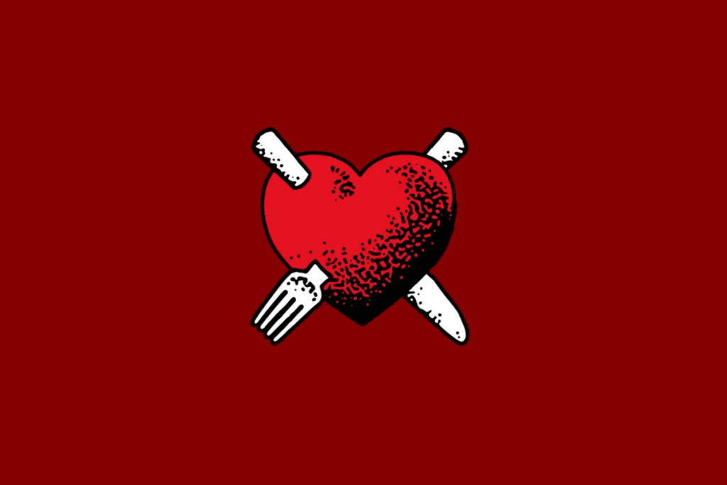
Refining the Ingredients: Logo, Color, and Type
The rebranding process started with the heart—literally. The original logo was separated into two components: the heart symbol and the wordmark. This separation allowed for greater flexibility across touchpoints and ensured clarity and scalability. Illustrator Jake Foreman was brought on board to redraw the heart logo, infusing it with his signature textured, stippled style that feels both handcrafted and rebellious.
The Dinner Ladies’ recognizable red was kept but refreshed into a brighter, more modern hue. Supporting this hero color, a secondary palette of warm, slightly retro shades created a vibrant, versatile system perfect for everything from packaging to digital platforms.
Typography also played a crucial role in reinforcing the brand’s bold new voice. Denim Wide, a typeface from Displaay Type Foundry, was chosen for its confident yet practical nature. It commands attention in headings while its regular cut offers a friendly, clean look for body text—allowing the brand’s cheeky tone to shine through without losing readability.
A Voice That’s Comforting, Cheeky, and Unmistakably Real
The Dinner Ladies’ tone of voice has always set them apart. Universal Favourite, working with copywriter Cat Wall, crafted a verbal identity that is equal parts empathetic caregiver and charming rebel. It speaks directly to time-poor families without resorting to fake friendliness or over-the-top sincerity. Instead, it’s refreshingly straightforward, sprinkling in just the right amount of humor and realness.
Photography further captured the brand’s essence. Led by photographer Alana Dimou and a talented creative team, the imagery embraces the beautiful messiness of real life: bolognese-smeared toddlers, half-eaten plates, and moments of genuine joy around the dinner table. It’s a celebration of authenticity over polished perfection, just like the meals themselves.
Illustrations That Tell a Story
Illustrations have always been a beloved part of The Dinner Ladies’ identity, and the rebrand took this tradition to new heights. Drawing inspiration from traditional tattoo art, Jake Foreman created a suite of vibrant illustrations that serve both as storytelling pieces and functional design elements. Whether highlighting specific menu items or embodying the brand’s overall mission of “Food from the Heart,” these drawings inject a sense of personality and energy into every customer touchpoint.
Packaging Designed for Real Life
Because The Dinner Ladies’ meals often get grabbed in a rush, the packaging had to be highly functional as well as attractive. Universal Favourite introduced a simple, color-coded system to quickly distinguish between protein types, making it easier than ever for busy families to find their favorite dishes in a hurry. Clear, legible labeling and vibrant colors ensure that The Dinner Ladies’ meals don’t just taste good—they stand out in the freezer, too.
Looking Ahead: A Future Rooted in Heart and Hustle
The Dinner Ladies now have a brand that not only celebrates their inspiring journey but also sets them up for future success. Their updated identity—bold, vibrant, and packed with personality—pays homage to their founding spirit while firmly planting them in today’s marketplace.
More than just a facelift, this rebrand reaffirms what The Dinner Ladies have always stood for: real food, real people, and real solutions for dinnertime chaos. With a refreshed look and voice that captures their true essence, The Dinner Ladies are ready to dish out deliciousness to even more Australian homes—loud, proud, and unapologetically themselves.

