Along the eastern edge of England lies a stretch of coastline that feels untouched by time — windswept dunes, tidal creeks, salt marshes, and secretive wildlife coexisting in quiet splendor. This is the Norfolk Coast, a place not only celebrated for its natural beauty but also fiercely protected for its ecological significance. Designated an Area of Outstanding Natural Beauty, this region is a patchwork of Marine Conservation Zones, National Nature Reserves, Sites of Special Scientific Interest, and even a UNESCO Biosphere Reserve. But as beloved as it is, it is also increasingly fragile.
To safeguard this dynamic environment, and to better tell its story, Lantern, a branding agency based in London, was brought on to create a unifying identity for the many organizations working to preserve it. Their mission: help define Norfolk Coast’s strategic positioning and visual voice in a way that encourages respectful exploration, strengthens community ties, and ultimately ensures this coastline is protected — not just for today, but for generations to come.
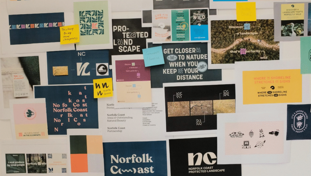
Immersion Before Design
Before diving into logos and color palettes, the Lantern team did something refreshingly grounded: they went outside. Over four days, they hiked muddy paths, cycled sun-dappled backroads, watched birds wheel over the salt flats, and listened — really listened — to the stories of local residents and visitors. They wanted to feel what makes Norfolk special, and to see the pressures it faces through the eyes of those who live and breathe it.
This deep immersion wasn’t just research. It was essential. Norfolk isn’t a brand to be manufactured from a boardroom; it’s a living place with millennia of history, seasonal rhythms, and a tight-knit coastal culture. And any identity that would do it justice had to respect that.
A Coast in Motion
The resulting brand strategy centers around a powerful insight: Norfolk is alive. Its waterways shift like veins, migrating birds arrive and depart like clockwork, and farming patterns evolve with the soil’s needs. Even the landscape changes daily with the tide.
This understanding formed the backbone of a new positioning: Norfolk as a “living coast in perpetual motion.” It’s a place where land and sea, people and nature, all move together — sometimes in calm harmony, sometimes in wild unpredictability. And like any living thing, it needs care, respect, and stewardship.
Designing with the Land in Mind
Lantern’s visual identity for Norfolk captures this spirit of movement and coexistence. The new logo is a thoughtful fusion of the initials “N” and “C” — an abstracted symbol that flows like the creeks and curves of the coastline it represents. It’s not merely a mark; it’s a reminder of interconnection.
The broader visual system is dynamic, balancing clarity with vibrancy. A muted, natural color palette was chosen to reflect the richness of the environment without overpowering it — sea greens, dune beiges, and salt-spray blues working in harmony. These colors form a backdrop for photography that brings audiences right into Norfolk’s wild embrace — from windswept walks in winter to golden fields in high summer.
A key component of the visual storytelling was the introduction of a custom illustration suite. These hand-drawn elements showcase Norfolk’s flora, fauna, and cultural touchpoints — all the way from rare shorebirds to heritage boats. Used as badges or stamps, they act as “positive proof” of experiences, creating a visual language for responsible adventure.
Encouraging Year-Round Discovery
One of Lantern’s most strategic shifts was to push beyond the usual seasonal tourism narrative. Instead of showcasing Norfolk only during summer’s high tide of visitors, the brand now invites discovery through all seasons. To support this, Lantern commissioned and directed an off-season photoshoot, portraying Norfolk as a place of quiet joy even in the chill of January or the muted light of October.
This choice supports two key goals: sustainability and accessibility. By promoting off-peak travel, the brand helps reduce strain on vulnerable ecosystems while supporting local businesses throughout the year.
More Than a Destination
What Lantern has created isn’t simply a tourism brand. It’s a tool for unification — bringing together conservation groups, local communities, and tourism boards under a shared identity that speaks to the Norfolk Coast’s value and vulnerability.
Through bold-yet-considered design, they’ve built something that’s not just seen, but felt. Whether it’s a tube station poster inviting city dwellers to kayak along tidal rivers, or a wayfinding sign nestled beside a coastal footpath, the identity speaks with a calm, confident voice: This place is special. Let’s keep it that way.
For Everyone, Forever
The new Norfolk Coast brand is about balance — between visibility and humility, between protection and participation. It reminds us that beautiful places don’t have to shout to be seen, but they do need voices to stand up for them.
In a world increasingly defined by environmental urgency, the Norfolk Coast’s reimagined identity offers a quiet revolution: a call to slow down, tread lightly, and engage with nature as part of it — not apart from it.
And in doing so, it helps secure something truly precious: a living coast that can thrive, for everyone, forever.

