In a time when sustainable agriculture is more necessity than niche, a quiet revolution is taking root — microscopic in scale but massive in potential. At the forefront of this shift is Imio, a green-tech company that has emerged with a bold ambition: to empower farmers with the power of living microbes, not synthetic chemicals.
Designed in partnership with G—W Studios in Stockholm, Imio’s brand identity doesn’t just reflect the company’s eco-scientific roots — it embodies them. With a mission to restore the planet and nourish productivity, Imio needed more than just packaging and a logo. It needed a visual language that could communicate both the intelligence of its microbial technology and the soul of its environmental ethos.
Farming, Rewritten at the Microscopic Level
At the heart of Imio’s innovation is its all-natural microbial inoculants — tiny, living agents that enhance soil health and support plant vitality without relying on harsh agricultural chemicals. Years of research and scientific rigor led to these breakthroughs, offering farmers an alternative that’s just as effective as it is sustainable.
But the innovation didn’t stop in the lab. To bring this complex product into the hands of farmers across the globe, Imio needed a brand that could translate intricate science into an approachable, trustworthy, and future-facing experience. That’s where G—W Studios stepped in, reimagining not only how the product looks, but how it feels to engage with — from e-commerce packaging to field stickers and digital touchpoints.
A New Kind of Agricultural Brand
Imio wasn’t just launching a product — it was pioneering a direct-to-consumer e-commerce experience in a field that typically relies on industry intermediaries. Agriculture, for all its advancements, often feels behind in digital engagement. So, the challenge wasn’t simply one of design — it was about crafting an identity that could meet farmers where they are, while inviting them into a future they hadn’t yet imagined.
The solution? A visual identity where science and nature intertwine — clean, grounded, and unmistakably alive.
The Imio wordmark is the cornerstone of this design philosophy. A sleek sans-serif typeface provides clarity and precision, while subtle organic curves mimic the natural flow of root systems or microbial networks. It’s a delicate balance — one that pays homage to both the controlled environment of a lab and the wild unpredictability of nature. It’s not sterile, nor is it overly rustic. It’s modern agriculture, redefined.
From Fields to Labs: A Visual Ecosystem
The color palette chosen for Imio is neither loud nor muted — it exists in harmony with its surroundings. Earthy greens meet cool, clinical tones. The result is a system that feels rooted in the soil yet informed by science. It signals growth, without falling into the cliché of “greenwashing.”
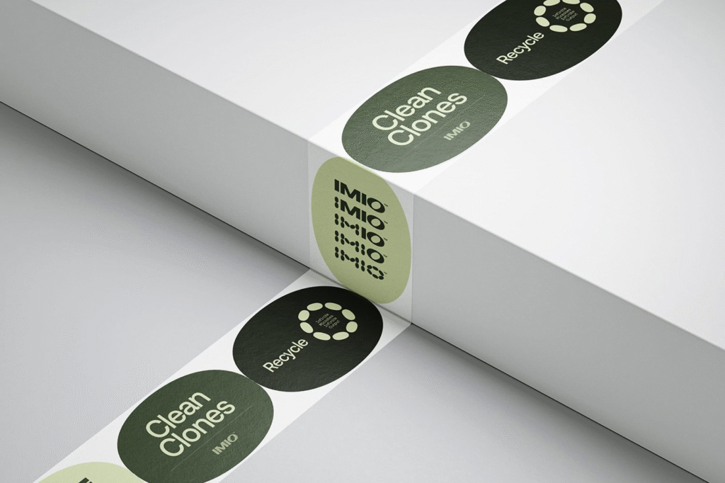
Supporting visuals — including packaging and iconography — build on this theme. Shapes and patterns echo microbial structures and cellular geometry. Labels and stickers feel intentional and tactile, making even a bag of microbial inoculants feel like a premium, thoughtful product.
It’s rare for agricultural packaging to look this refined — and even rarer for it to communicate why it matters. But Imio understands that design isn’t just aesthetic. It’s a conduit for trust, clarity, and education in a space that often feels dominated by complexity and jargon.
A Brand That’s As Alive As Its Products
Perhaps the most intriguing element of the Imio brand is its ability to mirror the product itself. Just as microbes quietly transform the soil, the identity created by G—W Studios doesn’t shout. It whispers with confidence, suggesting that real power lies in unseen, well-designed systems.
Even the tagline — “some designs go viral, ours went microbial” — captures the subtle cleverness that runs through the brand’s DNA. It’s science with a wink. Nature with a nod to innovation.
Looking Ahead: Farming with Intelligence
Imio’s launch is more than a brand rollout — it’s the beginning of a new chapter in agriculture. A chapter where farmers don’t have to choose between productivity and sustainability. Where the most powerful solutions don’t come from synthetic formulas, but from biological intelligence that has been quietly thriving beneath our feet for millennia.
The identity G—W Studios developed allows Imio to speak confidently to a modern farmer who wants results but also understands the importance of stewardship. It repositions agricultural design from utilitarian to intentional — proving that even in a sector steeped in tradition, there’s room for creativity, clarity, and care.
Final Thoughts
Imio isn’t just another green tech startup. It’s a symbol of what’s possible when design, science, and sustainability work together. Its branding proves that a message — no matter how microscopic its subject — can be made powerful with the right voice, the right visuals, and the right vision.
In an industry where change often takes decades, Imio is accelerating the timeline. And with branding that feels as alive as its mission, it’s clear this microbe-powered movement is only just beginning to grow.

