In today’s landscape of digital overload and endless metrics, BERA stands apart by offering clarity where others offer complexity. Positioned as an equity assessment platform for major brands—including those within the Fortune 5000—BERA is not just crunching data. It’s guiding companies through it, helping them rediscover their identity and reorient their future. But how do you brand a platform built on algorithms, foresight, and strategic insight—without making it feel like another cold, data-driven tech tool?
Enter the creative minds at How&How, the design agency with studios in London and Lisbon, who reimagined BERA not as a tech company, but as a kind of celestial guide—a compass in the chaotic world of brand equity. The result? A brand identity that is strikingly direct, quietly poetic, and visually grounded in the surprising elegance of chaos theory.
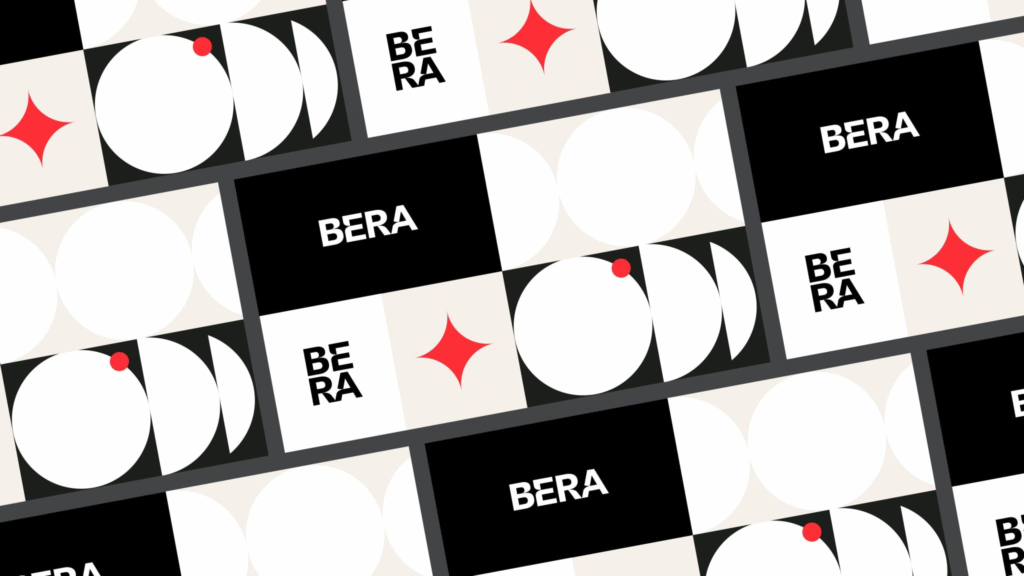
From Chaos to Clarity
BERA’s unique value lies in its ability to harness massive amounts of seemingly unconnected brand data and extract from it a clear path forward. Think of it like predicting weather patterns or plotting the movement of stars—what looks random is often deeply systematic beneath the surface.
To express this underlying structure, How&How took inspiration from chaos theory—the idea that within apparent disorder, patterns always exist. From this concept emerged a visual system based on simple geometric elements, primarily circles, which could be built up into intricate forms or pared back to essential shapes. This modularity allowed the team to visually represent the complexity of data without falling into the typical tropes of lines, graphs, and grids.
At the heart of this system sits the “North Star”—a central icon developed from the circle motif and etched directly into the logotype. This star doesn’t just symbolize navigation; it embodies BERA’s core promise: to guide lost or evolving brands toward a more purposeful, profitable future.
Designing for Direction
For BERA, the challenge wasn’t about appearing high-tech—it was about appearing trustworthy, insightful, and human. The rebrand had to walk a fine line: rooted in data, but not buried by it. Strategic, but not soulless.
To that end, How&How developed a visual language that feels both analytical and intuitive. The icon set, built on the foundational circle, acts like a visual vocabulary for BERA’s brand philosophy. These icons shift between levels of complexity depending on context, reflecting how the company adapts its insights to the unique needs of each client.
The color palette and graphic approach follow this same logic: clean, calm, and deliberate, with enough personality to make BERA feel approachable—even as it talks to billion-dollar brands.
A Wordmark That Points Forward
The wordmark itself is a quiet triumph of precision and symbolism. How&How chose BW Gradual, a typeface known for its pure geometry and quick, sweeping curves. From this foundation, they crafted a custom logotype, subtly infused with star-like radiance in its arcs and angles. It’s a design that looks forward—both literally and metaphorically.
This fast, confident typography reflects BERA’s ambition and forward-thinking ethos. It feels sturdy, reliable—something you’d want to lean on when navigating uncertainty. Yet it also sparkles with just enough individuality to avoid the homogeneity of traditional tech branding.
Turning Insight into Identity
More than a facelift, the rebranding of BERA redefined how the company communicates its purpose. The visual identity isn’t just decoration—it functions as a tool for storytelling. From corporate collateral to internal documents and digital interfaces, every design element works in service of BERA’s core message: that brand success is not guesswork, but guided evolution.
The North Star appears across touchpoints as both a process diagram and a symbolic beacon. It signals that behind every recommendation BERA makes, there is a methodology—precise, tested, and scalable. This idea resonates with leadership teams searching for clarity in fast-moving markets. It’s not about trends. It’s about trajectory.
A Brand That Reflects Its Promise
Perhaps the most compelling success of BERA’s rebrand is how deeply integrated the new identity is with the company’s function. The branding doesn’t sit on top of the business—it grows from within it. Every design choice, from shape to symbol to typography, is a visual translation of what BERA actually does: make sense of complexity, reveal hidden potential, and point brands toward their optimal future.
This authenticity gives the identity longevity. It’s not chasing aesthetic trends; it’s rooted in a durable, conceptual foundation. As BERA continues to scale and work with some of the world’s most prominent companies, this brand language will continue to hold up—flexing as needed but always pointing north.
Conclusion: Charting New Territory in Brand Equity
In a market flooded with analytics platforms and data dashboards, BERA distinguishes itself not just through what it does, but through how it communicates. Thanks to How&How’s reimagining, it now has a voice—and a look—that is both sophisticated and grounded. It invites brands into a relationship built on trust, insight, and clarity.
The new identity speaks volumes without shouting. It offers confidence without arrogance. And most importantly, it embodies the idea that when guided by the right light, even the most chaotic brand journey can find its true course.
For BERA, that guiding light is more than a metaphor. It’s now a visual truth—etched into every letter, circle, and star.
4o

