In the rolling hills of the Tortonesi Apennines, far from the rush of industry and convention, lies a vineyard that doesn’t just grow grapes—it cultivates time, silence, and meaning. I Carpini is more than a winery. It is a philosophy in motion, a quiet rebellion against mass production, and a return to the wisdom of the land. Here, wine isn’t rushed; it is nurtured, awaited, and released only when it whispers that it is ready.
Designed in close collaboration with Milan-based Drogheria Studio, the visual identity of I Carpini captures this profound relationship between earth, time, and expression. The result is not just a brand—it is a visual poem, told through handmade textures, organic rhythms, and thoughtful symbolism.
A Winery Rooted in Ecology and Emotion
What distinguishes I Carpini from other vineyards is not just its geography—though the Tortonesi Apennines, with their untouched biodiversity, offer a compelling backdrop. It’s the way the vineyard interacts with that geography. Every aspect of cultivation is considered holistically, with deep respect for the local ecosystem. No step is rushed. No shortcut is taken. The winemakers observe, adapt, and allow nature to set the rhythm.
In this process, wine becomes more than a beverage. It becomes a record of a particular time and place, a story told by the soil, the sky, and the seasons. The vineyard’s respect for biodiversity is not performative; it is foundational. Each bottle is a celebration of life—its irregularities, its unpredictability, and its quiet perfection.
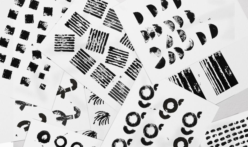
Visual Identity Inspired by the Land
Translating this philosophy into design required an equally sensitive approach. Drogheria Studio approached the task with poetic restraint, seeking not to overpower the story but to reveal it. The resulting identity is grounded, expressive, and elegantly minimal.
At the center of the design is the logo: two circles in motion. On the surface, they resemble the top-down view of a wine glass—simple, intuitive. But these circles also evoke a deeper symbolism. They represent cycles, rotation, and above all, time—the unseen ingredient in every bottle. They nod to lunar phases, to the slow arc of the seasons, to the circular motion of the hands that tend the vines. This logo does not merely identify a brand; it becomes a meditation on process and patience.
In keeping with the vineyard’s organic nature, the logo appears in four variations—each one corresponding to a different vineyard. These subtle shifts in rotation communicate the idea of movement and transformation, as if each wine were caught at a different moment in its own quiet journey.
Labels That Read Like Verses
Perhaps the most distinctive feature of I Carpini’s visual identity is its wine labels. Each bottle is named after a poem, and each poem is graphically interpreted on its respective label. These are not digital designs polished to perfection. Instead, they are hand-stamped artworks, deliberately irregular and wonderfully tactile.
This technique reinforces the vineyard’s closeness to the land. Stamping leaves behind imperfections—the kind that feel honest and alive. The figures illustrated on the labels don’t just represent the names of the wines; they carry within them the essence of stories, shaped by patience, climate, and culture.
Through these handcrafted designs, the label becomes part of the wine’s narrative. It speaks to the consumer not with loud fonts or glossy embellishments, but with a whisper—”This was made with care. This took time.”
Time as a Philosophy
In modern winemaking, speed often replaces skill. Wine is harvested, fermented, bottled, and shipped to meet quotas and calendars. I Carpini defies this model. Time here is not an obstacle but an ally.
The winemaker doesn’t consult a schedule to decide when a wine is ready. They listen. They watch. They wait. Only when the wine communicates its maturity does it leave the cellar. This reverence for time informed every decision in the design process. From the visual identity to the structure of the labels, spaciousness was key. Negative space, soft rhythms, and organic alignment suggest a slower pace—an invitation to breathe.
In this way, time becomes more than a theme; it becomes a character in the brand’s story.
An Identity That Ages Well
What Drogheria Studio has achieved with I Carpini is not merely beautiful packaging—it is a rare kind of honesty. The design does not mask or manipulate. It illuminates. It invites the drinker to consider the unseen layers of the wine in their hand: the ecosystem that nourished the grape, the human hands that tended it, the poetry that named it, and the patience that shaped it.
In a marketplace increasingly saturated with surface-level storytelling, I Carpini offers a welcome departure. Here, the wine and the brand are inseparable, each one enriching the other. It’s not about selling a product; it’s about sharing a perspective.
Conclusion
I Carpini reminds us that wine, at its best, is not just consumed—it is experienced. And an experience this rich deserves a design that matches its depth. With a logo that speaks in circles, labels that feel like verse, and a brand that honors silence as much as sound, I Carpini redefines what it means to be a modern winery.
It stands not for excess or speed, but for meaning, craft, and grace. In every bottle, a little bit of the land. In every label, a moment of reflection. In every sip, a sense of time well spent.

