In the crowded arena of snack bars, where countless brands jostle for attention, Byte Bars emerges as a refreshing disruptor, thanks to the creative genius of Cast Iron Design in Boulder. This wasn’t just about creating another snack bar; it was about crafting a brand that would break free from the tired, “crunchy granola” stereotypes and capture the hearts of a younger, more discerning generation.
The strategy behind Byte Bars was clear from the start: be bold, be irreverent, and most importantly, be different. Cast Iron Design set out to create a visual identity that would resonate with a cross – generational, free – spirited audience. Drawing inspiration from two iconic eras, they wove together the groovy, laid – back vibes of the 1960s and the electric, vibrant poppiness of the 80s and early 90s. The result is a brand that feels like a time – traveling party, with typefaces and icons that seem to dance off the packaging, and a color palette so vivid it could light up a dark room.
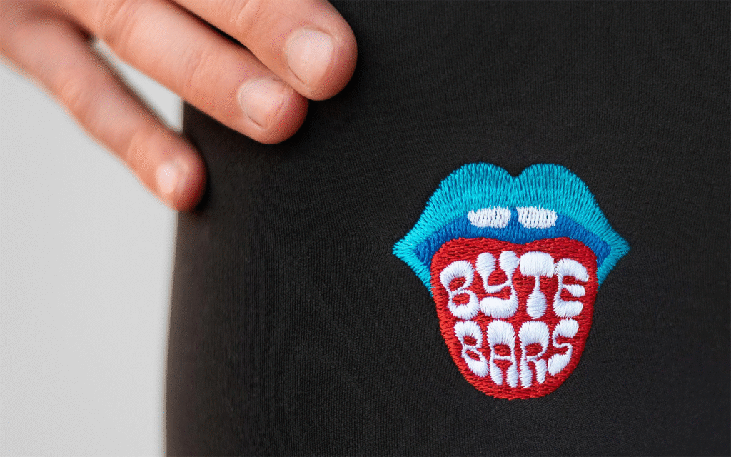
The brand name, “Byte Bars,” became the springboard for a playful and innovative design element. Cast Iron Design developed a series of mouth icons, each with varying levels of detail. These mouths, combined with an extensive range of colors, give each individual bar its own unique look. It’s a clever way to keep the brand fresh and engaging, as if each bar has its own personality waiting to be discovered. Whether you’re a teenager looking for a fun, new snack or an adult nostalgic for the bold aesthetics of the past, there’s a Byte Bar that feels like it was made just for you.
But Byte Bars’ commitment to standing out doesn’t stop at its visual appeal. When it came to packaging, the brand made choices that reflected a deeper sense of responsibility. For the retail boxes, Neenah Paper’s Folding Board 100 PC White was chosen – a 100% post – consumer waste recycled stock. This decision not only reduces the brand’s environmental footprint but also sends a message about the importance of sustainability. Similarly, for the t – shirts, water – based ink was specified. Not only is this type of ink better for the environment, but it also offers a higher quality print, ensuring that the Byte Bars logo looks as sharp as the brand itself.
However, like many in the food industry, Byte Bars faces a significant challenge when it comes to packaging its actual product. The flexible film substrates commonly used for snack bars, including Byte Bars, present a serious environmental conundrum. Conventional plastic films, made up of multiple laminated materials, are lightweight, cost – effective, and highly functional. But their multi – material composition means they can’t be recycled in standard curbside recycling systems. At present, there are no compostable flexible films that can match the stability and barrier protection of traditional films. It’s a problem that Byte Bars, and the entire snack bar industry, grapple with, a reminder that even the most innovative brands still have hurdles to overcome on the path to true sustainability.
In the end, Byte Bars is more than just a snack; it’s a statement. It’s a brand that dares to be different, that combines fun, style, and a sense of responsibility. As it continues to make its mark in the saturated snack bar market, it shows that with a little creativity and a lot of determination, there’s always room for something new and exciting.编辑分享

