In the bustling creative landscape of London, Dutchscot embarked on a transformative journey with a company that was ready to redefine its presence in the world of design. Formerly known as Jona Hoad Design, Hoad & More, with its passion for crafting lighting and beyond, was on the cusp of a new chapter. Dutchscot took on the task of not only renaming the company but also creating a fresh identity and website that would capture the essence of Hoad & More’s unique approach to design.
Hoad & More is not just a design firm; it’s a creative powerhouse where the realms of imagination and practicality seamlessly blend. Their work spans from the creation of exquisite lighting products to the installation of awe – inspiring displays. They approach each project with equal enthusiasm for the conceptualization and the execution, a rare combination that sets them apart. The new name, “Hoad & More,” is a masterstroke of branding. It encapsulates two crucial aspects of the company: their collaborative spirit and the diverse nature of their projects. Whether it’s a delicate light switch or an elaborate, large – scale chandelier, Hoad & More dives into every endeavor with equal dedication.
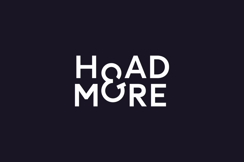
At the heart of the new brand identity lies the ampersand. Recognizing Hoad & More’s natural inclination towards collaboration, Dutchscot made the ampersand the focal point of the logo. This simple yet powerful symbol represents the coming together of different ideas, skills, and perspectives. The addition of “& More” as a suffix on items like business cards further emphasizes the company’s expansive approach to design. It’s not just about what’s immediately visible; it’s about the endless possibilities that lie beyond.
The ampersand doesn’t just serve as a decorative element; it has practical applications as well. It has become a distinctive shorthand logo, used in editorial contexts and as a maker’s mark, a signature that instantly identifies Hoad & More’s work. To take this integration a step further, Lineto, in collaboration with Dutchscot, created a special cut of the Circular font that incorporated the ampersand. This attention to detail showcases the depth of thought that went into every aspect of the brand identity.
Complementing the new logo and identity is the revamped website, a digital showcase that offers a behind – the – scenes look at Hoad & More’s creative process. The homepage is designed to be an exploratory experience, inviting visitors to delve deeper. As users roll over the words, they are greeted with short films and imagery, an embodiment of the “& more” concept. These elements reveal the journey from the initial sketches to the final, polished pieces, giving viewers a glimpse into the hard work, creativity, and passion that go into each project.
The series of short films on the website are like windows into the soul of the studio. They capture snippets of daily life at Hoad & More, from the designers deep in thought over their sketches to the artisans meticulously crafting each piece in the workshops. The inclusion of moquettes and other behind – the – scenes elements adds a layer of authenticity, making the website not just a portfolio but a living, breathing representation of the company.
With this comprehensive rebrand, Hoad & More has not only updated its visual identity but has also created a narrative that resonates with its values and approach to design. Dutchscot’s work has elevated Hoad & More’s brand, positioning it as a company that thrives on collaboration, diversity, and the pursuit of creative excellence. As Hoad & More continues to illuminate spaces with its innovative designs, its new brand identity will surely shine as a beacon, attracting clients and design enthusiasts alike.

