In the heart of London’s creative scene, the design studio Horse took on a project that was as refreshing as a cold beer on a hot day. They were tasked with creating the brand identity and packaging for Good Things Brewing, a fledgling Sussex – based company with a vision as grand as it is noble: to build the world’s most sustainable brewery.
Good Things Brewing’s founder, Sam Robinson, is on a mission to revolutionize the beer – brewing industry. As he sees it, the traditional way of brewing beer is rife with inefficiencies. In the UK, a country known for its love of beer, vast quantities are produced, but at a significant environmental cost. Raw ingredients are shipped from far – flung corners of the globe, leftover grain is recycled haphazardly, and staggering amounts of energy and water are squandered. “Our planet simply can’t sustain it,” Sam laments. This realization, coupled with the lack of public awareness about the environmental impact of beer – making, sparked his determination to create a brand that would do things differently.
At Good Things Brewing, sustainability isn’t just a buzzword; it’s woven into the very fabric of the operation. The brewery aims to be completely energy – efficient and off – grid, with a commitment to recycling and reusing everything, from water to grain. One of the most innovative aspects of their process is what they do with the spent grain. Instead of letting it go to waste, they dry and mill it using a state – of – the – art, low – energy, solar – powered dehydrator and a traditional stone mill. The result? Delicious wholemeal flour, turning what was once a discarded by – product into a valuable resource.
When it came to the brand’s visual identity, Sam had a clear vision: to break free from the traditional craft beer aesthetic. He wanted to move away from the clichéd “skater” graphics and the exclusive “boys’ club” feel that often pervades the industry. Instead, he aimed for a look that was more closely connected to the natural world and appealing to a wide audience. Horse rose to the challenge, creating a core icon that masterfully conveys the essence of the brand’s products while evoking a sense of nature and tranquility.
The centerpiece of the visual identity is a linear, graphically styled bird. Its tail feathers, ingeniously designed to mimic an ear of barley, pay homage to the key ingredient in beer. This bird takes center stage across all of Good Things Brewing’s variants, a bold and recognizable symbol. Complementing the icon is a soft color palette, applied to textured matt paper labels. The result is a packaging design that not only looks good but also feels good in the hand, evoking a sense of the natural and the artisanal.
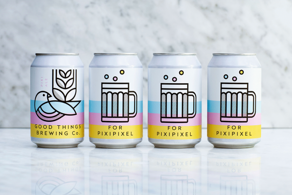
Good Things Brewing doesn’t stop at just producing its own beer. It also offers bespoke brews for other brands and events, adding another layer of complexity to the branding challenge. Horse had to find a way to give these collaborative edition cans their own unique personality while still maintaining a clear connection to the Good Things brand. Their solution was ingenious: double – faced cans. One side of the can is dedicated to an icon that represents the third – party brand or event, while the other side proudly displays the Good Things Brewing identity.
Good Things Brewing is more than just a brewery; it’s a movement. With its unwavering commitment to sustainability, a fresh and inclusive brand identity, and a willingness to collaborate, it’s setting a new standard for the beer – brewing industry. As consumers become more environmentally conscious, Good Things Brewing is poised to show that good things really do come to those who brew sustainably.

