
When thinking about television networks, it’s easy to focus on their on-screen presence — the bright logos, the opening sequences, and the vibrant program promotions. Yet, South Korea’s Total Variety Network (tvN) has taken a different route with the help of Studio fnt, embracing an often-overlooked space: offline branding. The result is an inspired blend of visual identity and product design, offering a tangible, memorable experience of the brand beyond the screen.
Founded in 2006, tvN has become a household name in South Korea, known for a wide range of entertainment programming. Traditionally, its branding has leaned heavily on a simple white-and-red palette and a straightforward logo. Online and on-screen, the visual identity remains functional but relatively modest, often serving as a neutral backdrop to the distinct branding of individual shows.
However, when it came time to create a physical store and product line, tvN turned to Studio fnt for a fresh offline identity. The focus was not on reinventing the wheel but on amplifying existing brand elements through thoughtful design. The project centers around a suite of stationery and furniture products, from adhesive notes and notebooks to tote bags, iPhone cases, tables, and modular storage units.
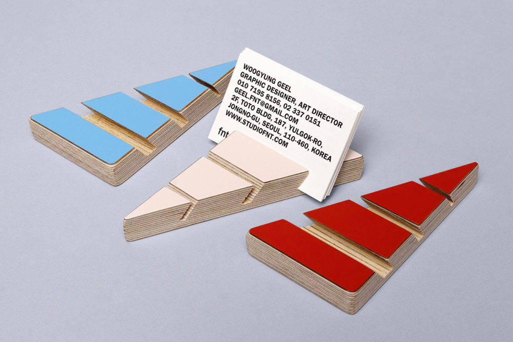
What ties this wide-ranging collection together is a clever use of geometry. Studio fnt extracted angular forms from the tvN logo — itself a playful, italicized sans-serif treatment rich with diagonal energy — and expanded them into graphic patterns and structural designs. Whether it’s the clean bisecting lines of a notebook cover or the dense, overlapping stripes on an iPhone case, each product captures the spirit of the brand in a different way.
The collaboration with Korean designer Park Kiljong on the furniture elements adds another layer of sophistication. Desks and cabinets boast modular pinboard functionality, blending high-concept design with practical use. The choice of materials — glossy powder-coated steel paired with the organic warmth of layered plywood — creates a tactile experience that feels both contemporary and accessible.
Interestingly, not every piece leans toward practicality. Some items, like adhesive notepads sliced at dramatic angles, favor visual flair over pure utility. Yet this slight tilt toward the stylistic never feels out of place; instead, it speaks to tvN’s quirky, modern personality. There’s even a hint of retro playfulness in the collection, reminiscent of the Memphis design movement, but it’s subtle enough to feel fresh rather than nostalgic.
Color plays a vital role in unifying the diverse products. Red, pink, and blue dominate the printed goods, while white and grey introduce calm neutrality in the furniture. The uncoated, unbleached texture of the paper products and the visible plywood grain of the furniture highlight a dedication to material honesty, grounding the bold visual language with a tactile authenticity.
One of the most impressive aspects of this offline identity is how successfully it works without heavy reliance on the logo. The visual cues — the patterns, the materials, the colors — are strong enough to evoke tvN’s brand personality on their own. This subtlety makes the design feel less corporate and more lifestyle-oriented, inviting customers to engage with the brand in a personal and meaningful way.
In many ways, Studio fnt’s work elevates tvN’s offline presence beyond what its online or on-air branding achieves. Where the network’s digital identity sometimes lacks memorability, the store products radiate character and cohesion. Together, they build an image of a brand that is confident, cheerful, and willing to experiment — a refreshing change in the crowded world of media branding.
Ultimately, tvN’s venture into offline branding demonstrates the powerful potential of thoughtful design. By trusting Studio fnt to dig into the core visual DNA of the brand and expand it into the physical world, tvN has crafted a unique, tangible experience that connects with its audience in unexpected ways. This project serves as a reminder that a brand’s identity doesn’t end with its logo or a color scheme; it lives in every interaction, every product, and every moment of engagement.
Design by Studio fnt, with furniture collaboration by Park Kiljong, this offline identity for tvN sets a benchmark for how networks — and brands more broadly — can thoughtfully extend themselves into the real world.

