In a world where pastries are often admired for their flavor and fleeting delight, Alon Shabo dares to redefine the experience — elevating dessert into the realm of high design. Based in Tel Aviv, Shabo is not just a pastry chef; he is a culinary artist whose creations reflect a deep obsession with form, symmetry, and sensory pleasure. His signature is unmistakable: structured compositions, bold colors, and architectural precision that blur the line between pastry and performance.
Collaborating with Ark, a design studio in Tel Aviv, Shabo’s brand identity has been meticulously crafted to mirror his artistic philosophy. What results is more than a logo or a pastry box — it’s a visual language that tells the story of a perfectionist who treats his pastries like couture garments: exquisitely crafted, one detail at a time.
Craft as Concept: Pastries as Design Statements
At the heart of Alon Shabo’s practice is a dedication to pushing the boundaries of conventional pastry-making. He doesn’t merely bake; he experiments. His desserts are thoughtful compositions of unexpected flavors, bold textures, and vibrant tones. Each treat is a small sculpture — made to dazzle both the palate and the eye.
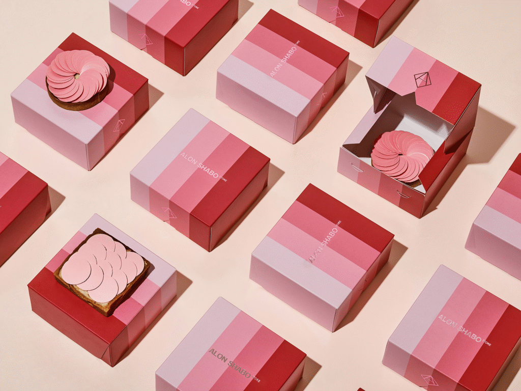
To translate this passion into a brand, Ark developed a visual system grounded in repetition, structure, and clarity. Shabo’s packaging — especially the now-iconic triangular boxes — is not just functional but expressive. It speaks the same visual language as the pastries within: geometric, modern, and refined. Whether it’s a soft pink cube or a sharply angled prism, each package becomes an extension of the dessert itself — a promise of precision and creativity before the first bite is ever taken.
Couture Meets Confection
Shabo often compares his work to haute couture, and the comparison holds. In haute couture, garments are crafted slowly, with obsessive attention to detail and an emphasis on singularity. Shabo approaches desserts in much the same way. Each piece is a study in composition: a balance of ingredients, colors, and forms that work in harmony.
This philosophy extends to every brand touchpoint. The color palette, for instance, combines rich tones with pastels, creating a visual rhythm that feels both modern and timeless. The typography is minimal, yet confident — a quiet nod to the refinement of the product. Every visual decision, from the fold of a pastry wrapper to the hue of the box, echoes Shabo’s guiding principle: elegance through structure.
A Visual Identity That Feels Like a Tasting Menu
Entering Shabo’s pastry shop is like stepping into a minimalist gallery. The display of sweets feels curated, not crowded. And this restraint carries through in the brand’s visual system. Rather than overwhelming the senses, Ark and Shabo’s identity design lets the products shine.
Photography plays a key role here. Rather than relying on lifestyle shots or backgrounds cluttered with props, the focus remains squarely on the pastries — often presented against clean, monochromatic backdrops that heighten their sculptural appeal. These aren’t pastries you simply eat. You admire them. You study them. Then, you devour them.
Design that Elevates the Experience
In a crowded culinary landscape, where bakeries often compete for attention through spectacle, Shabo’s brand sets itself apart by embracing subtlety and depth. His is not the loudest voice in the room — but it may be the most considered.
Ark’s design ensures that the experience of Alon Shabo’s desserts begins long before a customer tastes them. It starts with anticipation. With the satisfying weight of a beautifully folded box. With the moment of opening it and discovering what lies inside — each pastry seated like a jewel in a velvet case. It’s a process that respects both the product and the person enjoying it.
Reinventing the Pastry Box
One of the standout elements of the Alon Shabo identity is the triangular pastry box — a daring departure from the standard square or rectangular packaging typical in patisserie. But this is no gimmick. The shape reflects Shabo’s design-forward mindset, playing with symmetry, modularity, and repetition.
Beyond its visual appeal, the triangular form allows for intriguing display configurations — tessellating patterns that create a kind of edible mosaic. It invites play. It invites curiosity. And more importantly, it elevates even the act of carrying dessert into an aesthetic experience.
An Immersive Dessert World
Shabo’s visual identity is not limited to packaging alone. The entire customer journey is choreographed to match the brand’s refined tone. From the moment you step into his boutique — with its clean lines, curated displays, and gentle lighting — you are immersed in a world where design is not decoration, but the very foundation of the experience.
The harmony between the physical space, the visual system, and the pastries themselves creates a rare type of branding — one that feels sincere and lived-in. It’s not marketing. It’s storytelling through craft.
Conclusion: Sweet Precision
Alon Shabo and Ark have achieved something rare in the world of culinary branding — a visual identity that doesn’t just decorate the product but reflects its essence. In every triangle box, in every structured swirl of ganache, there is an unspoken message: this was made with care, intention, and design in mind.
In Shabo’s world, dessert is no longer the sweet afterthought. It is the main event. And thanks to a brand system that understands the power of restraint and repetition, that message has never been clearer — or more delicious.

