ASCENT: Where Rugged Adventure Meets Refined Hospitality
In the world of branding, few ideas are as bold—or as elegantly executed—as ASCENT. This conceptual project by designer Jihwan Jeon takes the revered performance brand Arc’teryx and reimagines it through the lens of luxury hospitality. Set in the dramatic natural splendor of North Vancouver, ASCENT is not just a creative exercise—it’s a compelling vision of how a brand synonymous with endurance and outdoor innovation can evolve into a haven of refined retreat.
At its heart, ASCENT is a poetic collision of contrasts: the rawness of the mountains with the softness of curated comfort, the technical with the aesthetic, the thrill of exploration with the serenity of stillness. And yet, under Jeon’s direction, these elements do not clash—they converge into a brand experience that is immersive, coherent, and quietly powerful.
Reimagining a Legend
Arc’teryx, with its roots in high-performance gear designed for climbers and backcountry adventurers, has always stood for resilience, precision, and innovation. Jeon’s task was to retain these values while introducing a new context: luxury hospitality. The result is ASCENT—a retreat concept that draws from the DNA of Arc’teryx but speaks a different language.
Rather than stripping the brand of its performance ethos, ASCENT extends it. Here, innovation isn’t just found in Gore-Tex jackets and harnesses—it’s embedded in the guest experience, the architecture, and even the signage. It’s a shift in application, not a change in identity.
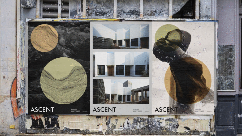
A Visual Identity Carved from Nature
ASCENT’s branding is understated yet intentional. The visual identity takes cues from nature itself—structured typography echoes the ridges of mountainous terrain, while an earthy, neutral color palette mirrors the soft, muted hues of forest floors and rocky peaks. These design decisions create a grounded, meditative aesthetic that feels authentic to the landscape and loyal to the spirit of the Arc’teryx brand.
Jeon’s use of minimalism does more than look clean—it invites contemplation. It allows the surroundings to breathe, honoring the retreat’s location without visual interference. It’s luxury without noise, design without ego.
From Concept to Touchpoint
ASCENT is not just a logo on a building. It’s a holistic identity system that stretches across all guest touchpoints, from printed materials to environmental design. Brochures and postcards carry the same visual restraint and sophistication as the rest of the branding. Clean layouts, subdued photography, and premium textures subtly convey the retreat’s dual mission: to ground guests in nature and elevate their experience.
Wayfinding signage is a particular triumph in Jeon’s system. Designed to blend rather than stand out, these elements are integrated using natural materials—wood, stone, and brushed metal—that feel like extensions of the landscape. It’s the kind of detail that makes the guest journey feel seamless and intentional, even when simply finding a trailhead or locating the spa.
The Experience of ASCENT
The imagined guest experience at ASCENT is where the vision truly takes flight. It’s not hard to picture: waking up in a sleek cabin nestled between trees, your windows framing peaks that change color with the rising sun. You’re handed an itinerary that combines curated hiking trails with moments of luxury—perhaps a fireside massage or a meal made from locally foraged ingredients.
Functionality isn’t sacrificed for comfort; instead, the two are intertwined. Just as Arc’teryx gear is built to support without distraction, ASCENT supports guests’ journeys—both physical and emotional—without unnecessary embellishment. It’s a retreat designed with purpose, for people who crave nature but don’t want to leave refinement behind.
A Blueprint for Brand Evolution
ASCENT is more than a design exercise—it’s a strategic case study in brand expansion done right. In an age when lifestyle brands seek to extend their influence into new markets, Jeon’s project is a reminder that such transitions only succeed when the core values remain intact. Arc’teryx’s reputation for innovation and excellence isn’t diluted in ASCENT—it’s distilled into new form.
By transforming high-performance outdoor wear into a lifestyle of intentional luxury, ASCENT shows what’s possible when branding is used not just to sell, but to tell a story. It’s an invitation to live the brand in a new way—no longer just on the trail, but in every moment of rest and reflection between the climbs.
The Takeaway for Designers
For creatives and strategists alike, ASCENT is a masterclass in restraint, storytelling, and brand integrity. It demonstrates that minimalism can be expressive, that hospitality can feel adventurous, and that visual identity is more than just appearance—it’s experience, emotion, and environment.
In ASCENT, Jihwan Jeon hasn’t just designed a logo or a brochure—he’s designed a world. One that beckons with quiet confidence, rooted in the wild and reaching toward the refined. It’s a vision of branding not as a surface, but as a landscape to be explored.

