Since its founding in 1985 by playwright David Mamet and actor William H. Macy, the Atlantic Theater Company has cemented its reputation as a daring and influential force in New York’s Off-Broadway scene. Renowned for championing both emerging and established playwrights, the theater has always maintained a bold, unmistakable voice—one that was vividly captured through a striking visual identity crafted by Paula Scher of Pentagram in 2015.
Now, continuing her longstanding collaboration with the Atlantic, Scher returned to design the 2019–20 season campaign, bringing fresh elements into an already iconic framework. Her latest approach blends consistency with evolution, a balance that mirrors the theater’s own commitment to innovation grounded in tradition.
A Living Identity
From the beginning, the Atlantic Theater’s graphic identity was never intended to be static. Much like the vibrant energy of the performances it represents, the brand’s visual language is built to evolve season by season. Scher’s original 2015 design established a vivid, dynamic foundation: the bold typeface Tungsten, a fierce red-and-blue palette, the distinctive “A” shaped like a spotlight or megaphone, and a deliberately unstructured layout that rejected formal grids in favor of raw, expressive energy.
This adaptable spirit has been the hallmark of the theater’s promotional materials, with each season introducing new twists while preserving the brand’s recognizable core. For 2019–20, the evolution continues, now incorporating photography for the first time and adding a new material dimension to the design.
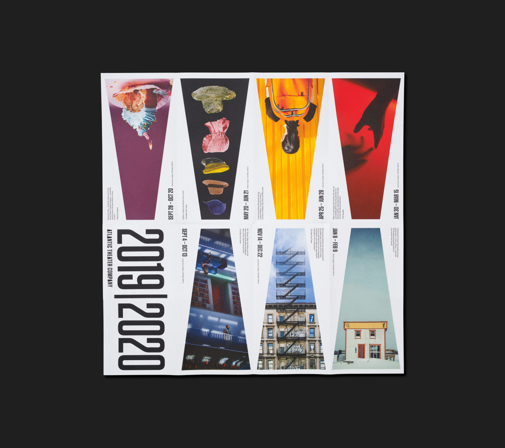
Introducing Photography and Material Layers
One of the most notable shifts in the 2019–20 campaign is the integration of naturalistic photography. Where previous seasons relied heavily on vivid, high-contrast colors and stark graphic treatments, the latest identity leans into a more organic aesthetic. Lighting captured directly in-camera gives the photographs a warm, authentic quality, moving away from the deliberately artificial brightness of past campaigns.
This imagery is cleverly contained within the iconic “A” shape, turning the megaphone-spotlight form into a window, a frame, or even a portal into the performances themselves. By cropping images within this distinctive silhouette, Scher teases the viewer with glimpses of action, hinting at narratives that extend beyond the boundaries of the page. It’s an evocative technique that stirs curiosity and invites deeper exploration.
Adding to this layered experience is the introduction of a clear printed sleeve, separating the megaphone form and the season’s text (“2019|2020”) onto different surfaces. As the viewer interacts with the piece—sliding the sleeve, aligning or misaligning the elements—they participate in completing the design, echoing the role of the audience in completing a live performance. This tactile element enhances the connection between theater and viewer in a subtle yet engaging way.
A Shift in Tone: From Postmodern Chaos to Subtle Structure
While earlier seasons reveled in postmodern playfulness—overprinted type, anarchic layouts, and clashing colors—this year’s design introduces a touch more order. Though the sense of freedom remains, there’s now a clearer underlying grid guiding the composition. The visual bluster has been dialed down, but not entirely abandoned; traces of irregularity still ripple through the covers, preserving the theater’s rebellious spirit.
This shift feels appropriate. Within the continuum of the Atlantic Theater’s evolving identity, each season’s design is a reflection not just of visual trends but of the creative energy animating that year’s productions. The move towards a more structured, naturalistic approach aligns with the theater’s current programming and offers a fresh, contemporary interpretation of its long-standing ethos.
An Identity That Breathes
What makes Scher’s work for the Atlantic Theater particularly compelling is its refusal to become rigid or formulaic. Like her celebrated identity for the Public Theater, this is a living, breathing system, designed for change rather than permanence. Each season’s adjustments—whether in color, typography, material, or imagery—keep the identity alive, relevant, and surprising.
The megaphone remains a central and powerful symbol. No longer just a bold graphic backdrop, it now functions as a dynamic container for narrative and imagery. It continues to shout the theater’s message loud and clear: here is a place of bold storytelling, of energetic creativity, and of fearless new voices.
Conclusion: A Continuum of Creativity
Paula Scher’s campaign for the Atlantic Theater’s 2019–20 season exemplifies how thoughtful design can both honor tradition and embrace innovation. Through the integration of naturalistic photography, a tactile material experience, and a subtle refinement of structure, the visual identity captures the theater’s ever-evolving spirit without losing sight of its roots.
The result is an identity that doesn’t merely advertise performances but mirrors the very essence of theater itself: a live, changing, participatory art form that thrives on the energy between creator and audience. Once again, Pentagram and Scher have shown how design can tell a story just as powerfully as the plays it represents.

