In the ever-evolving landscape of outdoor adventure, Big C Charters is charting a bold new course. Based in the vibrant waters of the San Francisco Bay Area, the charter service blends high-octane fishing with striking design — a rebrand that challenges old norms and introduces a fresh identity to a timeless sport.
At the helm of Big C is Christian Cavanaugh, a towering 6’8″ former professional basketball player whose passion for fishing is as outsized as his frame. Known locally for landing massive catches and for his larger-than-life personality, Christian built Big C Charters on authenticity, skill, and a deep love of the sea. But with a growing fanbase, expanding fleet, and rising interest from younger outdoor enthusiasts, it became clear the brand needed a visual overhaul to match its momentum.
That’s where Mucho, a San Francisco-based creative studio, stepped in — not just to update a logo, but to rethink the entire brand identity. The result is a visually striking and culturally attuned brand that honors the roots of fishing while speaking clearly to the next generation of anglers.
Hooking a New Identity
The name Big C Charters practically begged for an iconic mark — and Mucho delivered with a custom-designed, elongated ‘C’ that’s anything but forgettable. Standing tall and curving like a fishing hook mid-cast, the logo is a direct nod to Christian’s nickname and stature, as well as to the sport at the heart of the brand. It’s a clean, minimalist design that manages to evoke both strength and movement, capturing the essence of a day at sea.
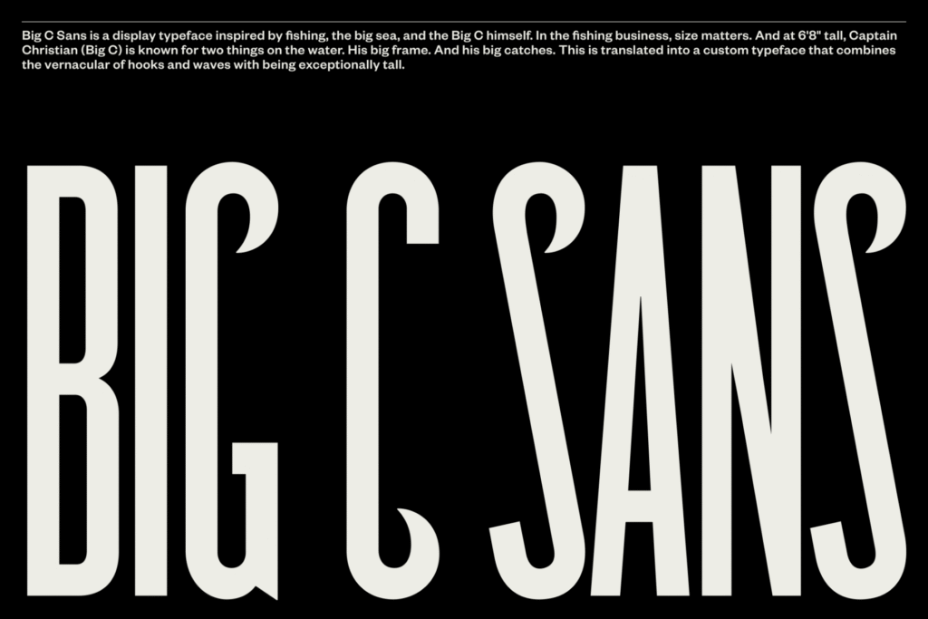
But the branding doesn’t stop at a single symbol. To reinforce the logo and give the brand a cohesive voice, Mucho developed a custom typeface: Big C Sans. Inspired by nautical lettering and the utilitarian signage often seen on fishing boats, this bespoke typeface features elongated letterforms and subtle terminal curves that mimic the arc of waves or the flick of a hook. The type is bold, weather-resistant, and easily legible — whether on a hoodie, boat hull, or windswept dock.
A Splash of Unexpected Color
In a market awash with deep sea blues and muted greys, Big C Charters does something radical: it brings color to the fore. Drawing inspiration from the vibrant materials found aboard fishing vessels — hi-vis rain gear, lure flashers, and neon bait — Mucho built a palette that grabs attention. These hues lend the brand a high-energy, contemporary feel that defies the stereotypical, salt-weathered aesthetic of traditional fishing guides.
The use of color isn’t just about being different. It’s strategic. It invites younger adventurers, families, and casual anglers into a space that might once have seemed intimidating or outdated. It’s a bold visual signal that says: this is fishing for everyone, not just salty pros with decades at the helm.
Typography That Tells a Story
The custom Big C Sans typeface does more than label; it communicates. It draws from the early 20th-century sans-serif letterforms — clean, no-nonsense, and confident — while incorporating uniquely marine elements. Each letterform subtly nods to its oceanic inspiration, with hooks, waves, and stretched ascenders giving it rhythm and character.
The typography also plays a practical role. On the open water, clarity matters — and Big C’s visual system was designed to stand out in every condition, from foggy mornings to sun-drenched afternoons. Whether printed on a sign, a boat jacket, or a bait cooler, the branding always delivers high impact.
Real People, Real Adventure
What anchors the entire identity is the imagery. The brand’s photography is raw, candid, and unfiltered — a deliberate departure from posed hero shots or stylized marketing imagery. These are real moments at sea: hands gripping rods, fish breaking the surface, sun bouncing off the waves, and smiles of genuine excitement.
This reportage-style photography captures what Big C is really about — authentic experiences that blend excitement, community, and connection to nature. It reflects the joy of being out on the water, the unpredictability of the catch, and the camaraderie among crew and guests. In an industry where glossy perfection often rings false, these images speak a truth that resonates.
Bridging Generations of Anglers
One of the biggest challenges Mucho faced was balancing the brand’s forward-thinking appeal with its seasoned, traditional clientele. Big C Charters isn’t abandoning the experienced angler — far from it. Instead, the new brand seeks to unify generations under a shared love of fishing, offering an experience that’s professional, inclusive, and undeniably exciting.
Through a clever mix of modern aesthetics and timeless themes, the rebrand invites both the seasoned fisherman and the curious first-timer aboard. Whether you’re looking to relive childhood memories on the bay or seeking your very first big catch, Big C welcomes you with open arms — and a bold, beautiful identity that promises adventure.
Casting Ahead
The new Big C Charters identity does more than refresh a logo — it redefines what a charter company can be. By blending storytelling, modern design, and a deep respect for fishing culture, Mucho and Big C have created a brand that is as memorable as the experiences it offers.
In a sea of sameness, Big C sails differently. With every brightly colored box, with every stylized wave of type, and with every cast line, it signals a new era of maritime adventure. It’s a brand built for the thrill of the catch — and the story that follows.

