In the heart of Lima, Peru, creativity thrives in unexpected corners. One such corner belongs to 121—a partner agency of the DDB Group—where the art of forging genuine human connections underpins everything they do. When 121 joined forces with the inventive minds at Hueso Studio, the goal was simple yet ambitious: to craft a visual identity that feels as much like a conversation as it does a logo. What emerged is a brand that leans into nostalgia, embraces the warmth of social ties, and stands ready to inspire both clients and collaborators.
A Homegrown Agency with Global Ambition
Though headquartered in Peru’s bustling capital, 121 isn’t interested in designing in a vacuum. As a member of the DDB network, they blend local insight with international standards, offering clients solutions that resonate on a very human level. But as they grew, their own brand identity began to feel misaligned with their mission. How could 121 visually convey the promise of personal, one‑on‑one engagement? Enter Hueso Studio.
Hand in Hand with Hueso Studio
Known for their playful yet purposeful approach to branding, Hueso Studio became the ideal partner. Together, they set out to build more than just a logo—they wanted a living system that could adapt across touchpoints, from presentation decks to digital banners, from office signage to social media profiles. Above all, the identity needed to radiate warmth, openness, and an unmistakable sense of social connection.
Nostalgia with a Modern Twist
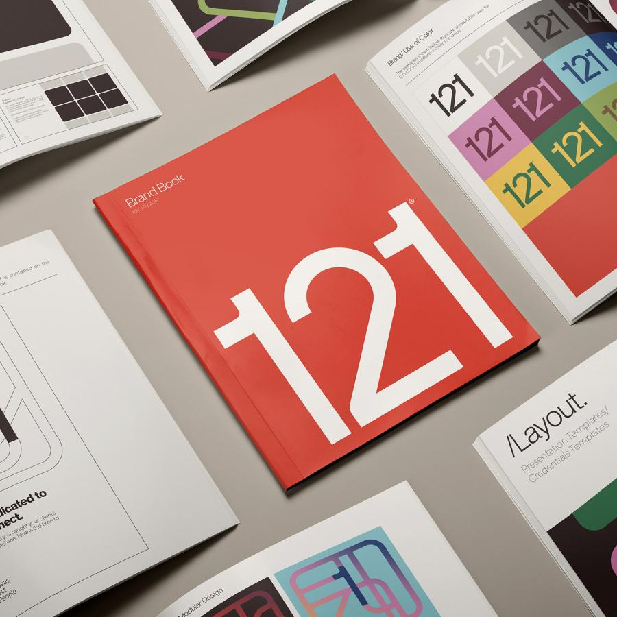
Scroll through 121’s new brand book and you’ll notice a deliberate wink at the past. Broad, curving lines trace pathways across layouts; gradients shift gently from burnt orange to mustard yellow; typography feels rooted in the soft, rounded letterforms of the 1970s. It’s a design language that harks back to the days of print brochures and poster art—before the internet became our default canvas. Yet there’s nothing antique about it. Clean grids, generous white space, and crisp digital execution remind us that this is a brand built for today’s screens as much as yesterday’s pages.
Why the retro influence? It’s more than a stylistic choice—it’s a statement about human connection. The ‘70s aesthetic feels familiar and reassuring, conjuring memories of communal gatherings and analog craftsmanship. For a communications agency whose very name—121—hints at intimate dialogue (“One To One”), this nostalgic palette underscores their commitment to personal attention.
From “One To One” to “121”
The numerical leap from “One To One” to “121” might seem small on paper, but it carries symbolic weight. “One To One” speaks to individualized service; “121” encapsulates that same promise in a succinct, memorable graphic form. The identity system weaves this transformation into every facet of its design. The digits themselves become building blocks: they frame images, anchor text, and guide the eye through layouts. A single “1” might stretch diagonally across a page, leading to a bold “2” that punctuates a key message. These interactions create a visual dialogue, mirroring the back‑and‑forth of meaningful client relationships.
Building a Living Visual Ecosystem
Beyond color and form, the true genius of this brand lies in its flexibility. Each element—whether it’s a chevron of gradient stripes or a pattern of geometric shapes—can be mixed, matched, and rearranged without losing coherence. Need a vibrant backdrop for a case study? Layer overlapping gradients behind a concise block of text. Want a punchy opening slide for a pitch? Let a sweeping curve cut across the frame, paired with the stark numeral “121” in crisp white. Even social media posts carry the same DNA, adapting effortlessly to square, vertical, or horizontal formats.
This adaptable system does more than look good; it empowers 121’s team. When everyone—from graphic designers to account managers—responds to client requests, they’re all speaking the same visual language. The brand becomes a communal tool, inviting co‑creation and reinforcing the agency’s ethos of partnership.
A Vessel for Connection
At its essence, 121’s new identity is a vessel—one designed not just to hold information, but to spark interaction. By bridging the conceptual gap between “One To One” service and the shorthand “121,” the branding achieves something rare: it feels both intimate and expansive. Clients see themselves reflected in the warm gradients and familiar lines; teams find inspiration in the system’s malleability. Whether it’s a printed brochure passed across a boardroom table or an animated banner scrolling across a laptop screen, the design gently reminds us that every project begins with a conversation.
Why It Matters
In an industry often obsessed with novelty for novelty’s sake, 121’s collaboration with Hueso Studio offers a refreshing counterpoint. Rather than pursuing the newest fad, they mined the past for elements that resonate emotionally, then retooled them for the digital age. The result is a brand identity that feels human first, digital second—a reminder that behind every marketing campaign and creative brief are real people seeking authentic connection.
For agencies and designers alike, this project provides a valuable lesson: effective branding isn’t just about looking cutting‑edge—it’s about feeling right. By honoring the tactile warmth of 1970s design, translating “One To One” into a crisp numerical logo, and building a flexible visual toolkit, 121 and Hueso Studio have created more than a brand—they’ve created a catalyst for conversation. And in the world of communications, that may well be the most innovative design of all.

