In the ever-evolving world of branding, true originality is a rare bird. Every new visual identity echoes whispers of past ideas. But what sets work apart is not whether it’s entirely new, but how far it pushes familiar concepts into fresh, daring territory. Leo Burnett’s reimagining of the Royal Ontario Museum (ROM) is a vivid testament to this principle.
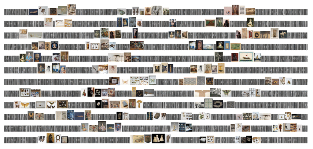
At first glance, it’s easy to spot a visual kinship between ROM’s new branding and Pentagram’s 2018 redesign for the Library of Congress. Both use typography as a frame for archival imagery. Yet Leo Burnett’s vision stretches the concept much further, leaning boldly into the edges of legibility and embracing the chaos and wonder of a collection that spans millions of years and 13 million artifacts—from ancient bones to delicate butterflies, textiles, sculptures, and more.
A New Identity for a New Audience
Despite being Canada’s largest and most revered cultural institution, the Royal Ontario Museum faced a pressing challenge: its public image hadn’t kept pace with the breadth and richness of its collection. Especially among younger and more diverse audiences, ROM’s appeal seemed muted. Whether the problem lay in access, representation, or simply outdated presentation was unclear. What was obvious, however, was the need for a profound shift.
Leo Burnett’s brief was ambitious—overhaul every touchpoint, from signage to uniforms, and express the museum’s deeper mission: to help people understand the past, make sense of the present, and collectively shape a shared future. The rebrand wasn’t just cosmetic; it was a full-scale rejuvenation.
Typography as Time Travel
At the heart of this transformation lies typography. Collaborating with Colophon, Leo Burnett developed a custom typeface called ROM Coign. The font, available in seven weights and four widths—all super condensed—was designed with a specific emotional resonance. Its expansion and contraction mimic the way we experience history: zooming into intimate details, then pulling back to grasp vast epochs.
Every character in ROM Coign is envisioned as a “stitch in time,” forming an endless timeline where history unfolds seamlessly. The letters, arranged in varied widths and densities, create a dynamic, ever-shifting experience—at times looking like the spines of ancient tomes stacked side by side, occasionally punctuated by vivid covers facing outward.
Leo Burnett didn’t just design a font; they crafted a storytelling device. The variable nature of ROM Coign allows text to stretch across monumental signage or wrap delicately around the thin shaft of a pencil. It adapts fluidly, labeling fragile artifacts one moment and towering across entrance halls the next.
Pushing Boundaries: From Readable to Remarkable
One of the most striking—and risky—decisions in the ROM rebrand is the willingness to let type flirt with unreadability. In certain applications, the typography is packed so tightly with images that the words almost dissolve. But that tension, between the seen and the hidden, the known and the mysterious, mirrors the museum’s own dual identity: part visible collection, part unseen archive.
This approach leverages modern type design technology to an extraordinary degree. It would have been easy to prioritize clarity and play it safe. Instead, Leo Burnett embraced complexity, conveying the overwhelming scale of history itself.
Form, Function, and Flexibility
Beyond its philosophical aspirations, the design is remarkably functional. Wayfinding inside the museum uses the boldest, most condensed versions of the typeface to mark floors and galleries clearly. The same visual language flows through posters, merchandise, and online platforms, creating a coherent brand universe that feels at once timeless and contemporary.
Supergraphics at the entrance envelop visitors before they even step inside, setting the tone for an experience where history is alive, sprawling, and anything but static.
The relationship between type and image is fluid and unconventional. Words are not mere carriers of information; they become visual landscapes, densely populated with fragments of the past. It’s a visual metaphor for how history feels—layered, complex, sometimes overwhelming, but endlessly fascinating.
Conclusion: A Brand as Vast as Its Collection
While the echoes of previous designs are undeniable, Leo Burnett’s rebrand for the Royal Ontario Museum pushes the idea further and deeper. It acknowledges that in today’s design world, being truly first isn’t as important as being fearlessly creative.
By embracing both readability and abstraction, structure and chaos, the new ROM identity mirrors the experience of engaging with history itself. It’s an invitation to explore, to lose oneself, and to find new connections across time.
In the end, this isn’t just a museum’s rebrand. It’s a celebration of human curiosity—a living, breathing tribute to the ever-expanding story of our world.

