In an era where supermarket shelves bristle with elaborate illustrations and kaleidoscopic color schemes, the elegance of understatement can feel almost radical. Dou Soymilk, a recent project by designer Siyu Shen, embraces that very spirit—stripping away excess to let pure ingredients and confident typography carry the brand’s message. The result is packaging that feels honest, approachable, and resolutely modern.
Simplicity as a Statement
At its core, Dou Soymilk is proudly unadorned: a single ingredient beyond water—organic soybeans. In a marketplace awash with added sugars, flavor enhancers, and ambiguous “natural” claims, Dou’s transparency is refreshing. Siyu Shen recognized that when your product needs no embellishment, your design should follow suit. Thus emerged a visual identity that speaks volumes through what it omits.
Rather than crowd the label with hand‑drawn graphics or decorative flourishes, Shen leaned heavily on typography. This choice may sound straightforward, but it demands precision: every curve, weight, and spacing decision must earn its place. The payoff is a brand voice that feels frank and inviting rather than bombastic.
A Typeface with Personality
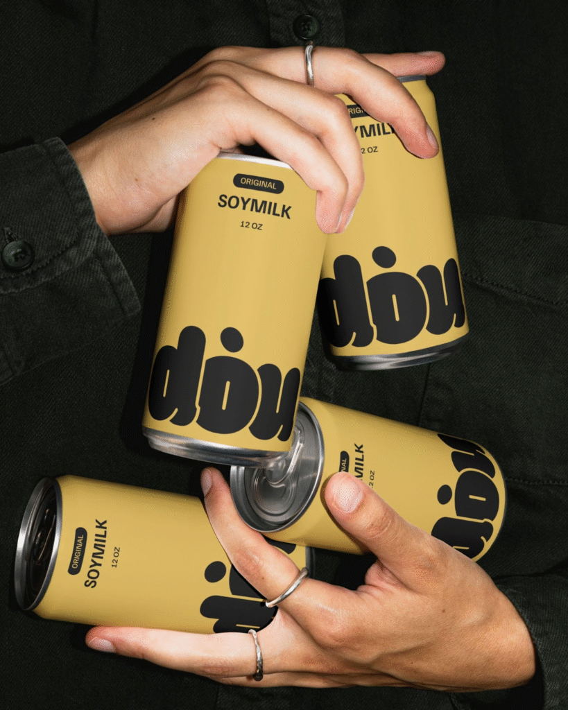
The centerpiece of Dou’s identity is a bespoke logotype. Its softly rounded letterforms convey warmth and human scale—qualities not often associated with industrial packaging. There’s an almost tactile sense to the letters, as though you could mold them in your hand. This custom wordmark sits in striking contrast to the supporting text, which employs a minimalist sans‑serif. Clean lines and ample letter spacing give words like “SOYMILK” room to breathe, reinforcing readability and modernity.
This interplay of fonts accomplishes several things at once: the friendly logotype creates instant personality, while the sans‑serif underscores the brand’s straightforward ethos. It’s a delicate balance that speaks to the meticulous craft behind successful branding—when the type itself carries narrative weight, there’s no need for visual clutter.
A Palette Rooted in Nature
Color decisions in minimal design become all the more significant, and here too Dou’s approach is purposeful. The cans arrive in two harmonious hues: a crisp, almost paper‑white and a muted, earthy yellow. The white can feels clean and clinical, a nod to the purity of the contents. The yellow variant introduces a gentle warmth, evoking the golden glow of sun‑ripened soybeans in a field. Neither color distracts; instead, they frame the typography, allowing it to remain the focal point.
By limiting the palette, Dou Soymilk communicates its values instantly: simplicity, purity, and a directness that invites trust. In a crowded aisle, these cans stand out not through loudness, but through the quiet assurance of their design.
Honesty in Every Line
On the label, there’s no room for vague marketing promises. Large, unambiguous statements such as “UNSWEETENED SOYMILK” and “MADE ONLY WITH WATER & ORGANIC SOYBEANS” assure consumers exactly what they’re getting. There’s an integrity to this candor—a design decision that respects consumers’ desire for transparency as much as it respects the product itself. The ingredient list becomes part of the visual rhythm, each phrase rendered with the same clarity and precision as the logo.
Beyond the can, secondary packaging—such as cardboard carriers—echoes this type‑driven aesthetic. Panels of negative space, punctuated by bold lettering, lend a sense of cohesion across every touchpoint. From hand‑torn edges on eco‑friendly packaging materials to the tactile impression of stamped ink, the minimal approach threads through the entire brand experience.
Why Minimalism Resonates Today
Minimal branding is hardly new, but in food and beverage, it often reads as sterile or impersonal. Dou Soymilk sidesteps that pitfall by infusing its minimalism with warmth—through type choice, tactile materials, and earthy hues. The design feels less like an absence of content and more like a purposeful distillation of what matters most.
Consumers, increasingly wary of hidden ingredients and greenwashing, are drawn to authenticity. Packaging that doesn’t mask or distract signals confidence in the product itself. In Dou’s case, the unvarnished presentation becomes a form of storytelling: every empty corner and every letterform speaks to the brand’s commitment to simplicity and quality.
Lessons for Designers and Brands
Siyu Shen’s work on Dou Soymilk offers several takeaways:
Let your product dictate your design
When the product story is inherently simple, reinforce it with equally straightforward visual language.
Use typography as your star
A custom logotype paired with a restrained secondary font can build brand personality without unnecessary ornament.
Choose color with intention
A limited palette focuses attention and can evoke emotion more subtly than a rainbow of hues.
Champion transparency
Bold, honest statements about ingredients and sourcing foster consumer trust and reduce cognitive load.
Extend minimalism holistically
Cohesion across primary and secondary packaging ensures that every encounter with the brand feels unified.
In an industry often defined by excess, Dou Soymilk’s branding feels like a breath of fresh air—proof that minimalism need not be austere, nor essentialism dull. By marrying the purity of its contents with typography that communicates both confidence and warmth, Siyu Shen has crafted a visual identity that feels as nourishing as the soymilk itself. For any brand, the lesson is clear: when what you have to say is truly compelling, sometimes less really is more.

