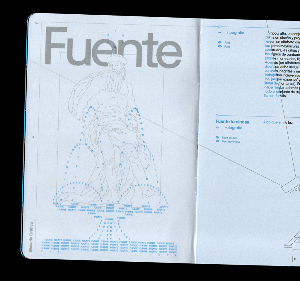
Typography Meets Artistry: The Editorial Design of Glosario Gráfico

In an age dominated by digital feeds and fleeting visuals, editorial design remains a powerful form of communication—capable of slowing down the reader, demanding attention, and offering meaning that goes beyond the surface. Glosario Gráfico, a unique editorial project conceived by the design minds at Estudi Zeta™, reimagines the glossary format through a lens of creativity and typographic exploration.
At first glance, Glosario Gráfico is a book—a compact, beautifully printed object. But it is far more than a collection of definitions. It’s a celebration of graphic design’s most fundamental tools: type, space, rhythm, and texture. Specifically focused on the letters “F” and “G,” this volume turns what could have been a dry academic exercise into an experience that’s equal parts educational and visually exhilarating.
The Editorial Experiment
Created as an editorial prototype, Glosario Gráfico sits at the intersection of reference material and art object. Estudi Zeta™, known for their boundary-pushing aesthetic and conceptual clarity, approached the book with a single question in mind: How can the design of information be as expressive as the information itself?
The result is a publication that doesn’t just inform—it performs. Each page is crafted with intention. Typography isn’t just used to deliver a message, it becomes the message itself. Letters, shapes, and white space interact dynamically, constructing a narrative that unfolds visually as well as textually. The design invites readers to think not just about what words mean, but how their meaning can be shaped, enhanced, and even transformed by the way they’re presented.
A Minimalist Scope, A Maximalist Approach
By limiting the book’s content to terms beginning with the letters “F” and “G,” Estudi Zeta™ embraced a minimalist scope—but filled it with maximalist creativity. This restriction gave the team freedom to dive deeper, rather than wider, and turn their attention to detail and nuance. Readers will find entries for terms like “Font,” “Grid,” “Futurism,” and “Gestalt”—all explored not only through text, but through bold and inventive layouts that embody the essence of each term.
For example, a spread on “Grid” might display a strict, structured layout—but then break its own rules to showcase visual tension and surprise. An entry on “Futurism” could employ asymmetry, dramatic type scaling, or kinetic compositions to mirror the movement and disruption associated with the art movement. In every case, form follows meaning.
A Glossary, Reimagined
Traditional glossaries tend to follow rigid structures: alphabetical entries, uniform columns, and monochrome formatting. Glosario Gráfico throws that template out the window. Each page is treated as an individual composition, a microcosm of design intent. Text wraps unexpectedly, images interrupt the flow, and colors shift dramatically. The designers play with hierarchy and alignment to guide the eye—but never in predictable ways.
This design philosophy reflects a deeper truth about how we process information. In the real world, especially in creative disciplines, ideas rarely come neatly packaged. They arrive in fragments, in sparks, in contradictions. Glosario Gráfico captures that complexity. It doesn’t attempt to tame the content—it celebrates its wildness.
Typography as Voice
Typography plays a starring role in the book—not simply as a vehicle for language, but as a voice in its own right. Serif and sans-serif, light and bold, condensed and extended: the visual language of the letterforms becomes a dialogue with the reader. Typefaces are chosen not just for readability, but for tone, texture, and rhythm.
More importantly, type in Glosario Gráfico is active. It stretches, compresses, flips, overlaps, and dances across the page. It behaves in ways that mimic the meaning of the words it forms. This kinetic use of typography makes the book not only visually engaging, but intellectually stimulating.
Why It Matters
In an age of fast content and algorithm-driven design, projects like Glosario Gráfico remind us of the craft and care that editorial design can bring to information. It challenges designers to think about layout not just as a container, but as a canvas. It pushes readers to reconsider the quiet power of visual storytelling.
For students of graphic design, it’s an instructional tool. For professionals, it’s a source of inspiration. And for casual readers, it’s an invitation to see the alphabet—and the world it builds—through new eyes.
The Future of Editorial Innovation
Estudi Zeta™’s approach in Glosario Gráfico hints at a broader trend in editorial design: the merging of content and concept, the breakdown of rigid systems, and the rise of publications that are both informative and emotionally resonant.
As we continue to redefine what books, magazines, and even digital publications can be, Glosario Gráfico sets a bold precedent. It encourages creators to think beyond function and embrace the narrative power of design. It proves that even in the most structured forms—like a glossary—there is infinite room for play, experimentation, and expression.
Final Thoughts
Glosario Gráfico is more than a beautiful book—it’s a manifesto disguised as a glossary. It’s a reminder that design is never neutral. Every choice, from typeface to layout to color, carries meaning. In the hands of thoughtful designers like Estudi Zeta™, these choices become tools for transformation.
In short, Glosario Gráfico doesn’t just define design terms—it redefines how we experience them. And in doing so, it reaffirms the power of editorial design as a discipline that informs, inspires, and evolves.

