In a world where design often leans toward the loud and complex, the quiet elegance of Sabina Loacker’s tea brand concept is a breath of fresh air. Based in Austria, Loacker brings a refined and intentional approach to visual storytelling through her art direction, graphic design, and brand conceptualization. With this project, she redefines how we experience tea—not just as a beverage, but as a moment of serenity and mindfulness, beginning the moment one lays eyes on the packaging.
Tea, for many, is not merely a drink. It is a ritual. A pause. A warm exhale after a long day or a soft beginning to a quiet morning. Sabina Loacker captures that emotional experience with stunning clarity. Her design philosophy embraces the essence of calm, extending the soothing nature of tea into the tactile and visual experience of the product itself.
Where Tranquility Meets Design
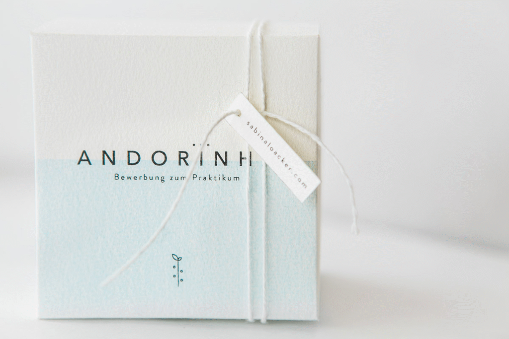
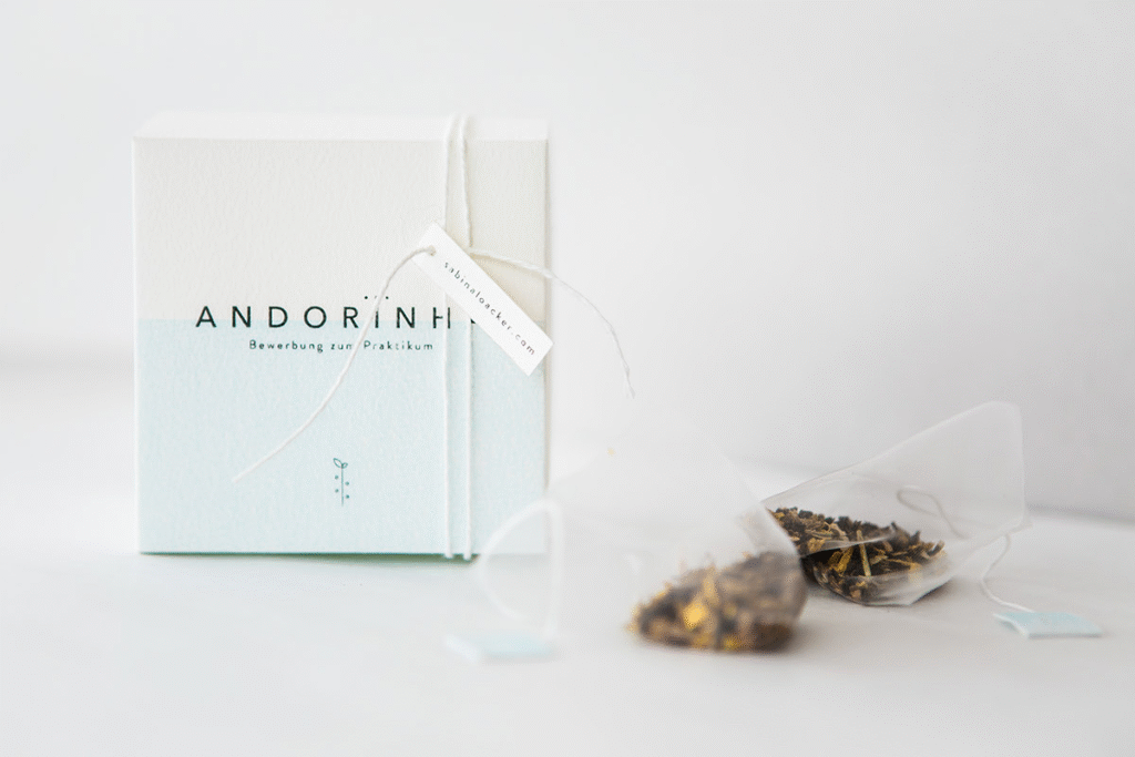
At first glance, the packaging is disarmingly simple. But that simplicity is no accident—it is deliberate and deeply thoughtful. Loacker’s use of minimalism is not a stylistic trend but a mirror of the tea experience itself. The act of steeping tea is unhurried and graceful, and so too is the design she’s created.
The color palette is soft and muted, evoking the natural hues of herbs, flowers, and the gentle steam of a freshly poured cup. There’s no visual clutter, no aggressive branding shouting for attention. Instead, the package invites you in with a whisper—a quiet suggestion to slow down and enjoy.
Typography as a Gentle Voice

A key element of this design lies in its typography. Loacker opts for a clean, understated typeface that effortlessly blends into the overall visual landscape. It’s neither too ornate nor overly modern. Instead, it feels approachable—warm and human. The text isn’t trying to dazzle with decorative flourishes or demand the spotlight; it’s simply there to guide and inform, much like a quiet conversation over tea.
The harmony between font and layout plays a vital role in maintaining a peaceful aesthetic. Every letter, every line is placed with intention, echoing the care one might take while preparing a perfect cup of tea. The typography doesn’t overwhelm. It breathes.
The Elegance of Restraint
What makes Loacker’s work stand out is its restraint. In a marketplace that often favors bold statements and complex graphics, her designs retreat into a world of soft tones and empty space. But it’s within that space that the brand’s personality comes to life.
This is branding that respects the intelligence and emotional instincts of its audience. It doesn’t spoon-feed or over-explain. It allows the user to draw their own connection—to feel something. Whether it’s the texture of the paper, the thoughtful placement of a logo, or the soft contrast between background and text, every detail has been handled with the utmost sensitivity.
A Reflection of Real-World Inspiration
Part of the magic in Loacker’s approach is her ability to draw inspiration from the everyday. This project, while visually sophisticated, is deeply grounded in the real and the familiar. It reminds us that the most beautiful ideas often emerge from what’s already around us—nature, light, stillness, and daily rituals.
Loacker’s work feels personal, like a lovingly written note or a family recipe passed down through generations. It carries an emotional weight that mass-market packaging often lacks, making each product feel like a small gift—something to be cherished rather than consumed and discarded.
More Than Design—A Brand Philosophy
This isn’t just a design concept. It’s a brand philosophy. It’s a celebration of slowness in a fast-moving world. And it asks a quietly radical question: what if our products encouraged us to pause, rather than rush?
By aligning the visual identity of the tea brand so closely with the emotional and sensory experience of tea itself, Loacker creates a full-circle moment. The branding doesn’t exist separately from the product—it is an extension of it. A continuation of the calming, thoughtful ethos that tea represents.
A Source of Creative Inspiration
For designers, marketers, and creatives alike, this project is a gentle nudge to return to the core purpose of branding: connection. Sabina Loacker demonstrates that beauty doesn’t need to shout. That elegance can be subtle. That clarity and emotional resonance can be found in the simplest of forms.
Her tea packaging is not only visually pleasing—it’s emotionally resonant. It doesn’t just represent a brand; it invites you into an experience. And in doing so, it becomes memorable—not because it dazzles, but because it feels right.
In a time where attention is constantly divided and overstimulation is the norm, Sabina Loacker’s minimalist tea branding reminds us of the value of quiet, thoughtful design. It’s not only an aesthetic achievement but a lesson in how design can soothe, speak softly, and still leave a lasting impression. Just like a good cup of tea.

