Where Simplicity Meets Structure: The Refined Branding of Gusztav.architecture
In a design world often crowded with flamboyance and visual clutter, there’s something profoundly refreshing about a brand identity that knows how to say more with less. The recent collaboration between designer Lazly Bateman and architecture and interior design expert Gusztav Veres stands as a testament to the quiet power of restraint. The result? A brand identity for Gusztav.architecture that merges timeless design philosophies with modern precision.
This visual identity concept, meticulously developed through a close working relationship between Bateman and Veres, is a masterclass in translating core professional values—like discipline, attention to detail, and creative clarity—into a cohesive visual language. The branding is not merely decorative; it is intentional, reflective, and elegantly functional.
A Dialogue Between Architecture and Design
The Gusztav.architecture brand needed to embody more than aesthetics—it had to echo the sensibilities of its founder. As an architect and interior designer, Gusztav Veres emphasizes structure, spatial harmony, and refined materials. Bateman, understanding this foundation, constructed a branding language that mirrors these same priorities.
From the outset, the collaboration was driven by an emphasis on minimalism and quality. Every design decision emerged from a mutual understanding of what matters most in the built environment and in the identity that represents it: clarity, functionality, and a calm sense of purpose.
A Logo That Speaks With Quiet Authority
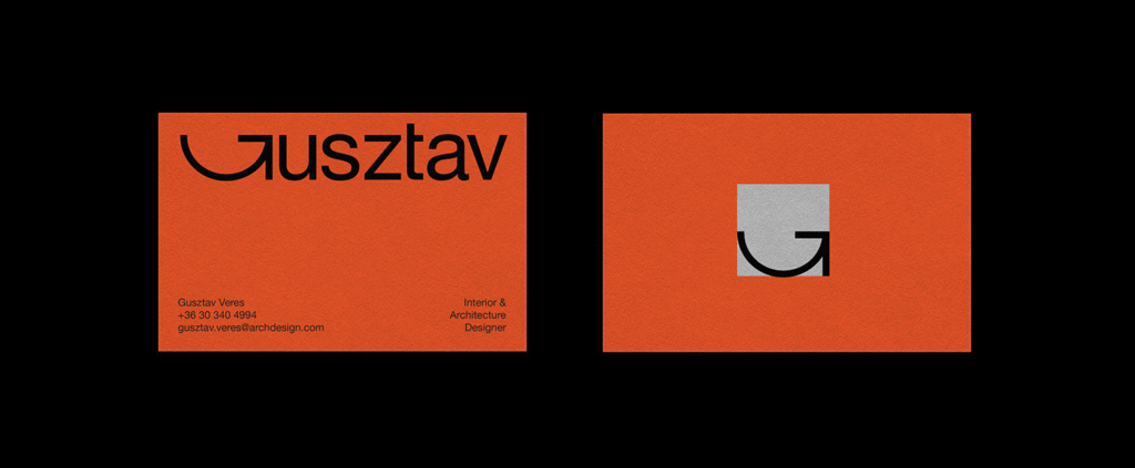
At the core of the visual identity lies a logo that exemplifies the purity of Swiss typography. With a nod to the influential Swiss design movement—known for its structured grids, precise alignment, and no-nonsense elegance—Bateman crafted a logotype that is as architectural as the spaces Veres creates.
This isn’t a logo designed to shout for attention. Rather, it draws you in with its restraint, commanding respect through symmetry and order. Its clean lines and balanced proportions echo the kind of architectural thinking that places form and function in seamless harmony.
Bauhaus Influence: More Than a Style, a Statement
While the design clearly borrows from Swiss typographic traditions, it also carries the unmistakable fingerprints of Bauhaus philosophy. The Bauhaus movement championed simplicity, utility, and the unity of art and craftsmanship—principles that align perfectly with the ethos of Gusztav.architecture.
Bateman’s visual identity is steeped in these ideals. There’s an honesty in the design—a refusal to distract or embellish for the sake of aesthetics alone. Every element serves a purpose. The typography, spacing, layout, and even the negative space all work together to create a sense of clarity and balance, hallmarks of both modernist design and thoughtful architecture.
The Language of Professionalism
One of the most compelling aspects of this branding project is how effortlessly it communicates professionalism. It does so not with bold claims or flashy graphics, but with a refined confidence. The brand identity feels mature, composed, and utterly self-assured—much like the architectural practice it represents.
From the logo mark to business cards and stationery, every touchpoint reinforces this identity. The materials chosen for physical assets reflect quality without pretension. Subtle textures, rich but muted tones, and carefully considered proportions all combine to project a feeling of quiet excellence.
The Power of Design in Quiet Spaces
Minimalist branding, when done well, requires a disciplined design hand. There’s nowhere to hide in simplicity—every detail must be perfect. Bateman embraces this challenge head-on, treating each visual component with the same care and thoughtfulness that an architect might apply to a building’s blueprint.
The result is an identity that feels less like a marketing tool and more like an architectural extension of Gusztav Veres’ design language. It’s branding that understands spatial logic and aesthetic restraint, merging them into something timeless and inherently modern.
Building a Brand With Lasting Foundations
In a world where branding often feels ephemeral—driven by trends and short-term buzz—the Gusztav.architecture identity is built for longevity. It’s not here to follow the crowd. It’s here to endure.
The identity has the flexibility to evolve while maintaining a strong foundation. Whether applied digitally, in print, or through physical signage, it adapts with ease, always retaining its core character. And that’s precisely what makes it so compelling: it’s not trying to be everything to everyone. Instead, it’s a clear and honest reflection of one designer’s approach to space, structure, and aesthetic integrity.
Final Reflections
The collaboration between Lazly Bateman and Gusztav Veres is a shining example of what’s possible when branding is treated not as decoration, but as a strategic and artistic extension of a business’s core values. The identity for Gusztav.architecture doesn’t scream for attention—it earns it, quietly and confidently.
In an age where design is often equated with visual noise, this branding reminds us of the value of clarity, discipline, and purposeful beauty. It’s not just a visual identity—it’s a design philosophy made visible. And for those who understand the language of space and simplicity, that speaks volumes.

