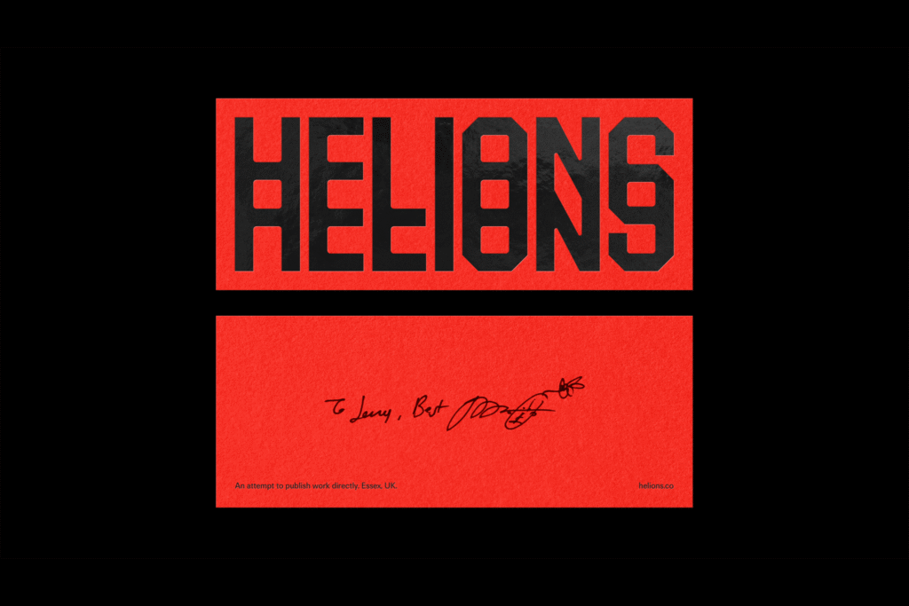
When you hear the name “Helions,” you might imagine swirling atoms or ancient gods steering fiery chariots across the sky. And while those grand associations wouldn’t be out of place, the truth is more charmingly grounded. Helions is actually a nod to Helions Bumpstead, a small village in Essex, England. It’s a name that fits well, though, for a new publishing house dedicated to photography—a venture full of light, creativity, and new beginnings, much like its celestial echoes suggest.
Founded by Jack Davison, a photographer whose talent has earned him a place in London’s National Portrait Gallery and even Elton John’s private collection, Helions is the culmination of a career built on storytelling through images. Known for his distinctive portraits and collaborations with brands like Hermès and Burberry, Davison now turns his eye toward nurturing a new creative space. And when it came to shaping the visual identity of his latest endeavor, he turned to a trusted creative partner: Matt Willey, the renowned designer and Pentagram partner.
Davison and Willey share a creative bond formed over years of collaboration, notably during Willey’s tenure at The New York Times Magazine. Their relationship is more than professional; it’s a dialogue between photography and design, where each enhances the other. Willey’s structured, tactile layouts elevate Davison’s emotive imagery, while Davison’s rich, human photographs breathe life into Willey’s polished editorial designs. It’s only fitting that Davison entrusted Willey—and Pentagram associate partner Jonny Sikov—with crafting Helions’ identity.
For Helions, Willey and Sikov created a wordmark that dances with light. Designed with an optical effect reminiscent of light refractions, the logo feels instantly connected to the essence of photography. It’s a visual nod to the way Davison himself bends light and composition, echoing the techniques of early modernist photographers like Man Ray and Walker Evans. The result is a wordmark that feels familiar yet invites a new perspective—just like Davison’s work.
The custom typography is unmistakably Willey: bold, condensed, and industrial with softened curves and beveled edges. It’s a geometric sans serif that balances precision with a hint of rugged charm. In print, the identity comes alive through the use of gloss and metallic foils, enhancing the brand’s relationship with light. Even the standalone ‘H’ symbol, resembling a strip of film, acts as a clever shorthand for Helions, promising both creativity and continuity on book spines and collateral alike.
Restraint is key here. Willey and Sikov avoid overworking the concept, letting the clean color palette of black, white, and red maintain an elegant punch without unnecessary ornamentation. The simplicity gives Helions room to breathe—and leaves space for the real star of the show: the work it will publish.
Helions’ first offerings set the tone perfectly. A is for Ant and A is for Ant: Children’s Edition are companion books born from Davison’s collaboration with Oscar-winning production designer Shona Heath. These are not typical alphabet books; instead, they offer a whimsical, poetic journey through Davison’s imaginative lens.
The larger edition leans toward a classic photobook format, while the children’s edition invites interaction—designed to be folded, scribbled on, and shaped by tiny hands. Both editions explore different sequences and textures, making each experience distinct. The children’s version, with its gold-foiled cover and newsprint pages, is especially striking—a tactile, playful invitation to creativity.
Davison’s motivation is deeply personal. As a father, he wanted to create something his children could engage with—a window into his world of creativity, nature, beauty, and, importantly, silliness. A is for Ant succeeds on all counts. It’s a joyful blend of the serious and the absurd, proving that sophistication and accessibility can coexist beautifully, even for the youngest audiences.
Willey’s custom hand-painted letters in the book do more than label; they act as visual characters themselves, reinforcing the book’s rhythm and mood. The typographic playfulness, informed by Dada’s experimental spirit, complements Davison’s surreal yet heartfelt imagery. It’s another testament to the duo’s shared language, where graphic design and photography converse seamlessly.
Helions, then, is more than a publishing house—it’s an extension of Davison’s artistic spirit. It promises a platform for collaboration, experimentation, and reinterpretation. The brand identity Willey crafted is rooted in the fundamentals of photography but open enough to evolve with whatever directions the future might bring.
With such a strong start, Helions feels less like a static brand and more like a living, breathing creative organism—one that invites others to join, to play, and to see the world in a new light. As Davison and Willey continue their collaboration, Helions is set to shine ever brighter. And if the first releases are anything to go by, we can expect many more beautiful, unconventional stories ahead.

