In a world where design trends seem to come and go in the blink of an eye, it’s rare to encounter a visual identity that feels as fresh today as it did half a decade ago. Yet that’s precisely the case with Helvetimart, the specialty food market in Lausanne, Switzerland—brought to life on the shelf by Mexico City’s Anagrama Studio. Although the store has since closed its doors, its packaging design continues to stand as a testament to thoughtful creativity and the power of cultural storytelling.
Rooted in Regional Pride
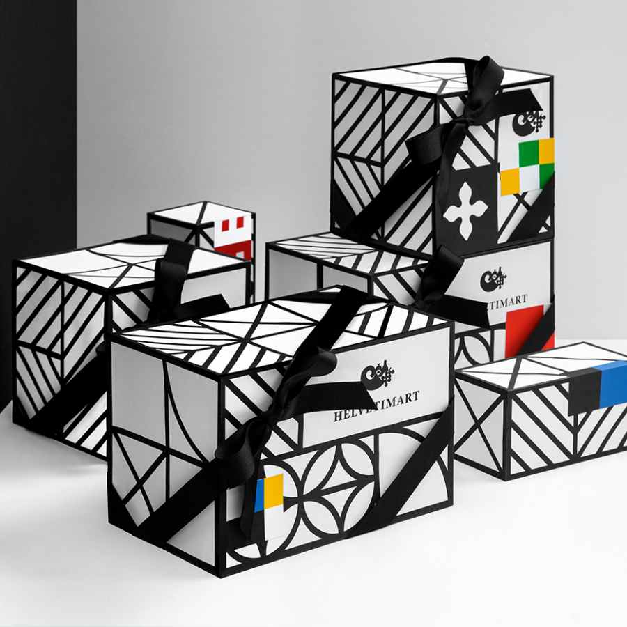
Helvetimart wasn’t just any grocery. It was a carefully curated emporium, gathering cheeses from the Alps, charcuterie from Jura, and sweet pastries from Ticino under one roof. The challenge for Anagrama was clear: how to capture the essence of Switzerland’s 26 cantons—each with its own history, flag, and local specialty—while maintaining a cohesive brand system. The solution? A visual language built on the geometry and color palettes of those very flags.
Rather than defaulting to clichéd mountain motifs or generic “Swissness,” Anagrama delved into the heraldic vocabulary of each state. The sharp diagonals of Valais’s stars, the bold crosses of Geneva, the green-and-white stripes of Fribourg—all found echoes in patterns, lines, and gradients. These elements were woven into labels, cartons, and shop signage, ensuring that every product carried a subtle, region-specific signature.
A Symphony of Color and Form
What makes Helvetimart’s packaging feel timeless is the judicious use of color. Each flavor or product line adopted a primary hue drawn directly from its canton’s flag—warm sienna for Uri, deep navy for Zurich, lush emerald for Ticino—paired with a neutral off-white background. The result is a palette that’s vivid without being overwhelming, playful yet grounded.
Geometric shapes—triangles, rectangles, and chevrons—did more than decorate; they guided the eye across the label, creating a sense of movement reminiscent of Switzerland’s rolling landscapes. Bold blocks of color framed minimalist product names in a clean, sans-serif typeface, lending modern clarity to the rustic charm of regional fare. Typography was kept unadorned but confident, allowing the colors and patterns to take center stage without ever feeling busy.
Packaging as Storytelling
Perhaps the most compelling aspect of the Helvetimart identity is how packaging became a narrative tool. A wedge of Gruyère might bear a stylized motif drawn from its home canton’s emblem, inviting shoppers to connect taste with place. A jar of honey from the Valais region showcased slanted bars that subtly echoed its flag’s star-strewn diagonal. Even non-canton-specific items—like reusable tote bags and promotional posters—felt part of the same ecosystem, thanks to repeating graphic devices and harmonious color relationships.
This approach did more than signal provenance; it educated. Shoppers learned to associate shapes and hues with regions they might never have visited. In a single glance, the packaging communicated origin, quality, and heritage—a miniature map of Swiss gastronomy rendered in ink and paper.
Timelessness by Design
It’s tempting for designers to chase the “next big thing,” layering trendy effects or overtly futuristic type. Anagrama’s work on Helvetimart reminds us that restraint often wins the day. By anchoring their choices in something as enduring as cantonal symbolism, they sidestepped the risk of appearing dated. Five years on, the labels still feel contemporary—a rare feat in packaging, where seasonal refreshes often blur brand identity.
This timeless quality also speaks to Anagrama’s thoughtful process. Rather than shoehorning the client into a predefined style, the studio co‑authored the brand story, ensuring every visual decision echoed Helvetimart’s mission. The result was a design language as authentic as the artisanal cheeses and cured meats it celebrated.
Lessons for Future Projects
Helvetimart’s branding offers several valuable takeaways for designers and brand managers alike:
- Leverage Cultural Assets
Local symbols—flags, colors, emblems—carry deep meaning. Thoughtful reinterpretation can forge an instant emotional link with consumers. - Keep Geometry Simple
Basic shapes, when composed skillfully, create dynamic interest without cluttering the message. - Balance Boldness with Restraint
Vivid color choices can energize packaging, but anchoring them in a neutral backdrop prevents visual overload. - Use Typography as a Foundation
A clear, legible typeface offers stability, allowing more experimental graphic elements to shine. - Think Long‑Term
Aim for a design system that evolves gracefully rather than needing constant overhauls to stay current.
The Legacy of Helvetimart
Though the physical market has closed, its design legacy endures in portfolios, design awards, and the memories of those who encountered it on Lausanne’s bustling streets. Anagrama’s collaboration with Helvetimart proves that packaging is more than a vessel—it’s an opportunity to tell a story, celebrate local culture, and create an experience that transcends the mere transaction of buying groceries.
In an age where digital experiences often overshadow tactile encounters, the Helvetimart project stands as a reminder that printed labels can still evoke wonder. Through a marriage of regional symbolism, thoughtful layout, and a disciplined aesthetic, Anagrama crafted a visual identity that feels both personally resonant and universally accessible. For designers seeking to make their mark, it remains an inspiring case study in how the past can inform the present, and how authenticity can keep a brand alive long after its doors have closed.

