In the ever-evolving world of branding and design, familiarity quickly gives way to fresh disruption. Spend enough time observing the patterns, and you begin to notice how what was once established slowly unravels. Category norms shift, visual languages get rewritten, and design writers find themselves constantly recalibrating to a moving target.
Nowhere is this transformation more visible than in the beverage industry—particularly in the rise of kombucha and probiotic sodas. Minimalism, once the gold standard for ‘premium’ appeal throughout the 2010s, has lost its grip. In its place, maximalism reigns: bold colors, kinetic visuals, and exuberant graphics dominate shelves. What once whispered luxury through subtlety now screams excitement through sensory overload.
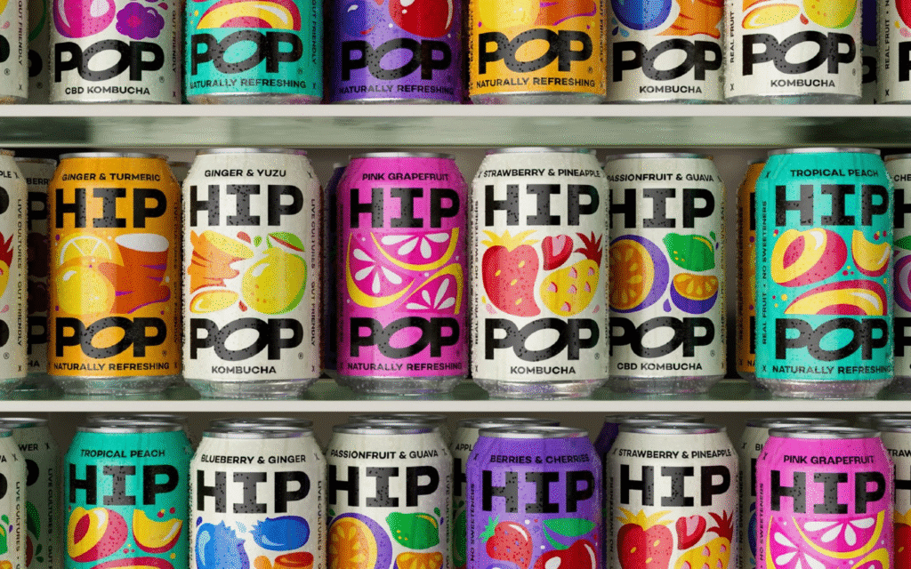
Brands like Hip Pop exemplify this new energy. A kombucha label carving a space alongside disruptors like Poppi (now owned by Pepsi), Hip Pop has recently undergone a striking rebrand executed by creative agency Robot Food. With a growing consumer appetite for adventurous flavors and visually stimulating products, Robot Food seized the opportunity to steer Hip Pop into a future where attention is the most valuable currency.
The world of kombucha today feels reminiscent of the craft beer boom or the artisanal coffee surge: a place where packaging serves as a canvas for personality. Gone are the days when modesty or muted design suggested sophistication. Today’s lo-cal and living sodas are proud, playful, and unabashedly attention-seeking—designed to catch a consumer’s eye both on the shelf and in a scrolling Instagram feed.
Previously, Hip Pop’s identity leaned heavily on ornate illustrations and conceptual imagery, creating an aesthetic that was imaginative but ultimately confused. The detailed architectural motifs, while charming in theory, felt disconnected from the simple truth: this is a refreshing drink meant to offer quick satisfaction, not a portal to some whimsical alternate reality. Coupled with an overused condensed typography trend that had lost its luster by 2020, the brand felt trapped between ambition and execution.
Robot Food’s redesign strips away this clutter in favor of directness and dynamism. The new visual identity is bright, punchy, and full of kinetic life. Bold illustrations of ingredients leap off the can, rendered with a simplicity and vibrancy that immediately communicates flavor and freshness. Each variety boasts its own color story, yet together they form a cohesive and unmistakable brand family.
At the core of the rebrand is a strong, confident logotype. Solid and no-nonsense, it anchors the playful illustrations, ensuring that amid all the energetic movement, there is a consistent focal point. This balance between spontaneity and structure reflects Robot Food’s understanding of both contemporary consumer behavior and the essentials of good branding: be memorable, be adaptable, and most importantly, be authentic.
While the design clearly leans into the “attention economy”—optimized for social media virality—it also retains a crucial tactile quality. Hip Pop’s decision to screen-print its cans, rather than applying simple labels, gives the brand a more substantial, finished feel. It’s a move that not only enhances shelf presence but also subtly signals maturity and readiness for larger opportunities, perhaps even acquisition.
The rebrand captures the spirit of today’s health-conscious but experience-driven consumer. It recognizes that for many buyers, kombucha is no longer a niche health drink but a mainstream indulgence—an affordable luxury that feels good to buy, good to drink, and good to show off. In this space, loyalty is fluid, but first impressions are everything. Hip Pop’s new look ensures it won’t be overlooked.
In essence, Robot Food has done more than refresh a kombucha brand—they’ve repositioned it for a future where success hinges not just on quality ingredients or functional benefits, but on emotional connection, visual excitement, and immediate recognizability. It’s a rebrand that understands today’s consumer mindset and meets it head-on, with energy, clarity, and unmissable style.
Through bold strokes and smart decisions, Hip Pop now stands as a vivid example of how brands can thrive in a landscape where conventions are constantly rewritten—and where those willing to evolve are the ones that endure.

