In the heart of Sydney’s cultural scene, Monkey Baa Theatre Company has been enchanting audiences for over two decades. Known for its vibrant productions aimed at young people, the company needed a fresh identity that could capture the same boundless energy and rich imagination found in its performances. With this mission in mind, they turned to creative studio Universal Favourite — and the result is a rebrand as playful, heartfelt, and multifaceted as the stories Monkey Baa brings to life.
A Brand Reimagined for Every Stage of Life
Monkey Baa’s original visual identity, though well-meaning, fell short of expressing the full spirit of the company. It lacked the whimsy, warmth, and storytelling magic that are core to every production they put on stage. From literary adaptations to original works, Monkey Baa has always been about sparking imagination in children, teens, and the adults who guide them — teachers, parents, carers. So the brand needed to speak to them all, in ways both engaging and authentic.
The central creative idea for the rebrand — “at every stage” — is both clever and deeply meaningful. It references the physical stage where performances unfold, but also acknowledges the emotional and developmental journey of Monkey Baa’s wide-ranging audience. Whether you’re five or fifteen, or a grandparent taking your grandchild to their first theatre experience, the new identity embraces the diversity of perspectives that make up the Monkey Baa community.
Inspired by the Pages of Childhood
To bring this concept to life, the design team drew heavily from the world of classic children’s literature. The aesthetic is charmingly nostalgic yet distinctly modern, influenced by the textures, layouts, and illustrative styles found in picture books and timeless story collections. The cut-paper visual elements, hand-drawn lines, and bold colors evoke a sense of joyful creativity — as if the design itself had leapt from a child’s imagination.
This connection to literature is no accident. Many of Monkey Baa’s productions are adaptations of beloved Australian children’s books, making the literary reference not just stylish but thematically fitting. Designers took cues from iconic creatives like Saul Bass and Paul Rand, applying their spirited, hands-on style to form a visual language that echoes the tactile, emotional world of storytelling.
A Logo that Wiggles with Personality
The heart of the rebrand lies in the logo — a lively, contemporary wordmark built around the typeface Sebenta, a slab-serif font often seen in vintage children’s books. It’s grounded yet playful, just like a young audience member trying hard to stay seated but bubbling with anticipation.
For body copy and headlines, the team selected Gellix, a bold geometric sans serif that balances readability with character. Together, these typefaces create a typographic language that is clear and accessible for all age groups, while still retaining enough eccentricity to feel at home in the world of theatre.
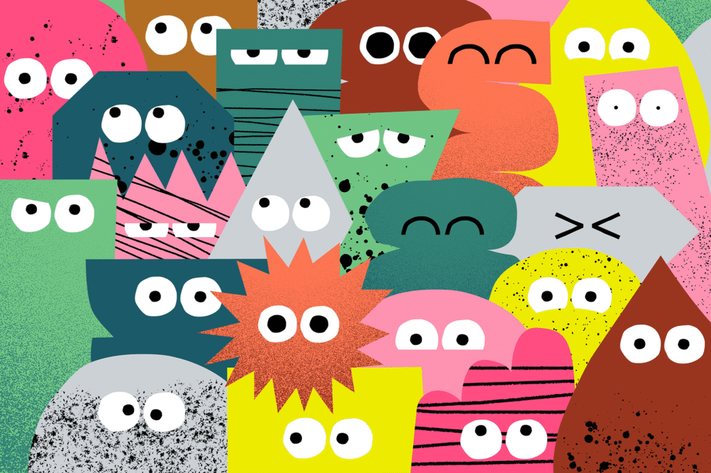
A Cast of Expressive Characters
What’s a great play without its cast? In this case, Monkey Baa’s new brand comes alive through a suite of characterful illustrations — simple, expressive figures that can be rearranged, remixed, and reshaped. These aren’t static mascots; they’re visual actors, capable of embodying the many moods and meanings of Monkey Baa’s productions.
Rendered in cut-paper style, these character shapes do double duty as containers for images and content, adding flexibility and cohesion across digital, print, and environmental materials. They can be silly or serious, quiet or bold — just like the stories they support.
Speaking to Every Voice
To complement the visual overhaul, copywriter Cat Wall helped craft a verbal identity that could stretch from “nursery to nursing home.” That is, a tone of voice capable of speaking clearly and charmingly to children, teens, caregivers, educators, and donors alike.
This voice is rich in wonder, playfulness, and kindness, with the ability to modulate its tone depending on the context. It might be bubbly and fun in a child-facing poster, then warm and professional in an educator brochure. Messaging was carefully developed for each audience segment, ensuring the brand communicates effectively without ever losing its spark.
Bringing the Stage to the World
The new Monkey Baa brand doesn’t live in a vacuum. It’s made to move, interact, and take up space. From the theatre lobby to promotional billboards, from social media assets to school flyers, the identity plays with scale and emotion to bring the Monkey Baa experience to life.
The company’s website, developed in partnership with Ten Two, also underwent a major redesign. Now brimming with whimsical interactions, intuitive navigation, and animated characters, it invites visitors into the theatrical world from the moment they click.
And with the 2023 season launch, the rebrand took center stage — adorning posters, brochures, and digital campaigns that announced a bold new era for the company.
A Leap Forward, Rooted in Story
Monkey Baa’s rebrand isn’t just a visual refresh — it’s a transformation that puts creativity, storytelling, and empathy at the center of every interaction. It honors the company’s literary roots, theatrical flair, and educational mission, while positioning them confidently for the future.
In a world where attention is fleeting and screens often dominate young lives, Monkey Baa reminds us of the power of live storytelling — of characters who come alive on stage, and brands that do the same in the world.
Would you like a visual summary of this brand identity to accompany the article?

