Soma Brewing Co.: Where Bold Typography Meets Fresh Craft
In the ever-expanding universe of craft breweries, standing out demands more than just great beer—it requires a story told through striking visuals, cohesive branding, and thoughtful design. Enter Soma Brewing Co., a brand that has taken these elements to heart and raised the bar through an innovative collaboration with Quim Marin Studio.
Known for their bold approach to design, Quim Marin Studio has crafted a branding and packaging identity for Soma Brewing Co. that’s as refreshing and distinct as the beer itself. With a visual language built around confident typography and a refined color palette, this project is a perfect fusion of modern style and artisanal spirit.
Brewing Design with Purpose
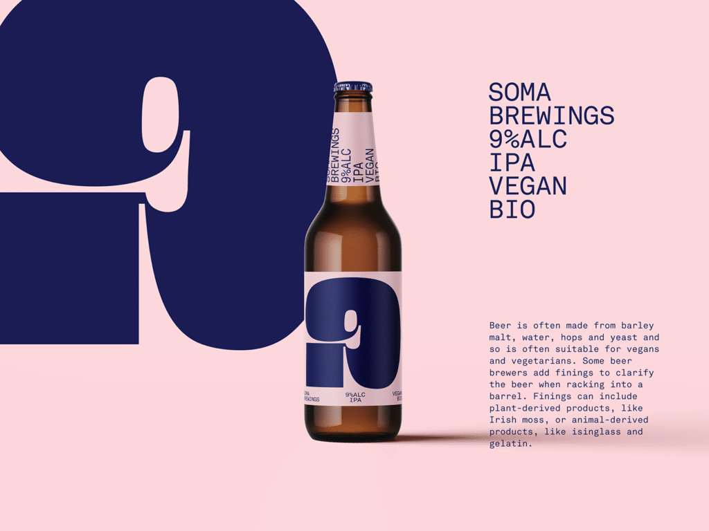
At the core of Soma Brewing Co.’s new identity is a celebration of type. Typography isn’t merely a vehicle for communication here—it is the heartbeat of the design. Quim Marin Studio’s choice of typefaces is deliberate and impactful, projecting a sense of modernity while retaining a grounded, approachable personality. Each character feels thoughtfully placed, adding rhythm and visual interest to everything from bottle labels to merchandise and marketing materials.
This clever use of type doesn’t overshadow the beer—it complements it. The typographic style lends a sense of clarity and order, acting as a visual shorthand for the quality and craftsmanship that Soma Brewing Co. pours into every bottle. Whether you’re looking at the label on a pilsner or reading the name across a tap handle, the brand speaks in a bold, recognizable voice.
A Palette That Pops
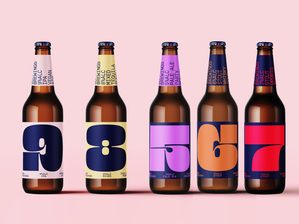
Color plays a starring role in Soma’s identity, with a palette that is vibrant yet restrained. Rather than rely on loud, gimmicky visuals, the studio opted for tones that feel contemporary and confident. These colors do more than catch the eye—they evoke freshness, energy, and creativity.
From soft pastels to bolder accent shades, each hue is chosen to reinforce the modern appeal of the brand. The color scheme not only enhances the packaging but also ensures that each variant of beer is instantly recognizable, creating a cohesive yet flexible visual system.
This careful attention to color helps position Soma Brewing Co. as both a craft innovator and a lifestyle brand—one that appeals to design-savvy drinkers and curious newcomers alike.
Packaging That Tells a Story
Great packaging does more than protect its contents—it invites interaction. Soma Brewing Co.’s packaging, under Quim Marin’s direction, is clean, confident, and irresistibly tactile. The labels are a showcase of thoughtful design, where typography, color, and layout come together in perfect harmony.
Instead of overcrowding the label with ornate elements, the studio embraced white space and minimal embellishments. This not only lets the typography shine but also gives the impression of a brand that is self-assured and modern. The design feels premium without pretension, and artistic without being overdesigned.
Every label and piece of collateral feels like it belongs to the same family, creating a visual consistency that strengthens brand recognition. Yet there’s enough flexibility within the system to allow each beer to express its unique character.
Beyond the Bottle
What makes this branding project especially successful is its adaptability. The visual identity works seamlessly across all brand touchpoints, from taproom signage and menus to merchandise and digital presence. The consistency in tone, color, and type gives Soma Brewing Co. a professional edge that sets it apart from more generic or trend-driven competitors.
But beyond its design integrity, the branding invites people into the Soma experience. It communicates that this is a brand for people who value quality—not just in what they drink, but in how that product is presented.
Design That Reflects the Brew
Just like a well-balanced beer, the Soma Brewing Co. brand achieves harmony between substance and style. It’s not trying to be flashy for the sake of attention—it’s grounded in design principles that speak to intention and craft. Quim Marin Studio has succeeded in translating the essence of Soma’s brews into a visual language that resonates.
By focusing on thoughtful typography and a fresh color palette, the studio has managed to reflect the clarity, complexity, and care that go into every Soma brew. The design feels intuitive, yet it’s built on a foundation of careful decisions and strong visual strategy.
A New Standard for Craft Branding
Soma Brewing Co.’s reimagined branding is more than a visual facelift—it’s a strategic identity built to endure. It taps into the current aesthetic climate while maintaining a timeless quality that will allow it to evolve with the brand.
For other breweries or lifestyle-focused brands looking to elevate their identity, this project stands as a clear example of how great design isn’t just decoration—it’s direction. Quim Marin Studio shows that when branding is done right, it becomes as memorable and craveable as the product itself.
In a crowded craft beer market, Soma Brewing Co. now has something even better than shelf appeal—it has a design story that lives, breathes, and drinks well.

