When we think of ice cream, what first comes to mind? For some, it’s a dessert, cold and sweet. But for many, it’s far more than that—it’s a moment of comfort, a reward for a long day, a taste of childhood. This deeper emotional connection is exactly where the story of OOP ice cream begins.
OOP is a Qatar-based ice cream brand with a friendly, approachable personality and a flavor of nostalgia. Its branding was crafted by Futura, a design studio in Mexico City, with a focus on evoking the playful, emotional, and spontaneous spirit ice cream brings to people across generations. This wasn’t just a branding project—it was a return to simpler joys, reimagined for a modern audience.
A Concept Rooted in Emotion
The branding journey started with a question: What does ice cream really mean to people? The immediate answer—“dessert”—was dismissed just as quickly. Ice cream, the team realized, is about comfort. It’s about that little moment of indulgence we allow ourselves, and the memories we associate with childhood summers, family outings, and carefree laughter.
OOP’s identity embraces this idea wholeheartedly. Rather than following traditional tropes, the design leans into the emotional pull ice cream has on all of us. It’s not about what’s in the cone—it’s about what that cone represents.
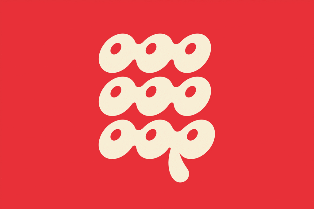
A Logo That Melts into Memory
At the heart of the brand is a logo that feels as fluid and joyful as ice cream itself. Rather than rigid lines or formal lettering, the OOP logotype flows like a drip of melting cream—letters softly merging into one another. This personalized type treatment, free of hard edges, gives the brand a rounded, inviting feel. It’s playful, almost as if the logo is in motion, reflecting the fleeting delight of enjoying an ice cream before it melts.
Repetition plays a role here too. The consistent looping forms of the logo help create a recognizable rhythm, making the identity both visually engaging and unforgettable.
Structured Chaos in Design
To balance the whimsical nature of the logo, the rest of the editorial design introduces a contrasting structure. A monospaced sans-serif typeface provides order and clarity, setting the tone for menus, packaging, and other written materials. This duality—structured text paired with an organic logotype—adds visual interest and reflects the balance between spontaneity and tradition.
Adding to the visual narrative are illustrations of a vintage cartoon-inspired character who’s perpetually in motion—yet melting all the while. These illustrations inject humor and emotion, portraying the character as both a symbol of energy and a victim of the heat. It’s a clever metaphor for the way modern life can feel overwhelming, and how something as simple as ice cream can offer a pause, a little sweetness amidst the chaos.
Diagonal text compositions reinforce this sense of spontaneity. Just as we often reach for ice cream on a whim, the branding doesn’t feel too composed or calculated—it feels lived-in, spontaneous, and real.
Colors of the Past, Tinted for Today
Color plays a major role in bringing the OOP brand to life. The primary palette draws from the pastel tones of classic ice cream parlors—soft pinks, creamy yellows, minty greens—invoking a sense of vintage charm. These hues carry us back to times when decisions were simple and pleasures were pure.
But to keep the brand grounded in the present, these pastels are contrasted with occasional bold tones. These flashes of bright color inject energy and modernity, preventing the design from feeling stuck in the past. It’s a clever visual reminder that while OOP taps into nostalgia, it’s very much a brand for today.
More Than Ice Cream
What Futura achieved with OOP’s branding is more than just visual design—it’s emotional storytelling. By understanding the emotional layers behind what ice cream means to people, they’ve created a brand that resonates not just on the surface, but deep within our memories.
In a world where so much branding is about being the loudest or most polished, OOP whispers something softer but more enduring: Don’t let them melt. It’s a call to hold onto the little joys, the sweet comforts, the fleeting but magical moments of life.
OOP isn’t just about scoops and cones. It’s about feelings, memories, and a bit of fun that never truly fades—even as the ice cream does. And that’s a flavor worth remembering.

