For years, Pets at Home has been more than just a pet store — it’s been a hub for everything a pet owner could need, from grooming and veterinary care to pet insurance and community support. With over 450 locations across the UK, it’s a brand that many recognize — yet surprisingly, its growing collection of sub-brands and services had started to blur the overall identity. As these components evolved and flourished independently, something was being lost in translation: a unified, emotionally resonant brand presence that connects everything back to the core purpose — pets.
That’s where London-based design agency Nomad stepped in. Tasked with redefining and reconnecting the brand ecosystem, Nomad worked closely with Cath Ryan, Head of Brand at Pets at Home, to build something clearer, stronger, and more cohesive — a fresh identity that wasn’t just about streamlining logos or updating signage, but about reigniting the joyful, emotional bond that people share with their animals.
From Fragmented to Focused
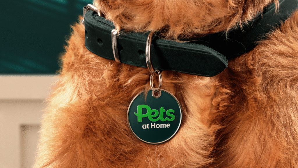
In its previous incarnation, Pets at Home had grown into a collection of disconnected visual identities. Sister companies, services, and product lines each had their own look and feel, which — though distinct — diluted the brand’s collective power. Nomad’s vision was simple yet impactful: unify everything under one clear, confident idea — “Pets.”
By stripping the brand name back to its core — just Pets — the identity became instantly more agile, relatable, and universal. It also allowed the brand to double down on its purpose: to always act in the best interest of pets and those who care for them. This new “Pets” logo isn’t just a name — it’s an anchor point, a central node from which all related services and sub-brands now gain their strength and clarity. Together, these elements create a visual and emotional network that feels familiar, friendly, and future-facing.
Real People, Real Pets
Central to the new identity is a celebration of the genuine, joyful, and often eccentric relationships between people and their pets. Thousands of pet owners volunteered to be part of the rebrand’s imagery, and under the lens of photographer Roo Lewis, a new style of visual storytelling emerged. Rather than polished, stock-like imagery, the new Pets brand features delightfully imperfect and deeply human moments: a dog that mirrors its owner’s hairstyle, a cat sitting smugly on a kitchen counter, a lizard peeking out of a jacket.
This isn’t just marketing. It’s recognition. The new art direction intentionally moves away from generic pet photography and toward images that reflect the real, personality-filled bonds people have with their pets. These aren’t just animals. They’re family — and every poster, billboard, or web page now speaks that truth.
Typography with Heart
No brand overhaul is complete without a voice — both visual and verbal — that ties everything together. For Pets, Nomad collaborated with type foundry Colophon to create a bespoke typeface: Pets Headline. Internally nicknamed “Helpetica,” the typeface had to walk a fine line — expressive and playful, yet professional and trustworthy enough to support everything from promotions to clinical advice.
The result is a custom font that feels as vibrant as the people and animals it represents. It’s bold without being brash, warm without being whimsical — perfect for a brand that might tell you about flea treatments in one breath and introduce you to a quirky new pet toy in the next.
A Voice That Barks (and Meows) with Joy
Of course, what you say is just as important as how you look. The new Pets voice is bold, upbeat, and unmistakably fun — brimming with joy, quirk, and warmth. It’s the voice of someone who knows that pets aren’t just something you own — they’re someone you love.
Irreverent without being silly, the tone reflects the emotional highs (and occasional chaos) of life with animals. It reassures, celebrates, and sometimes even jokes — because that’s what pet ownership is really like. Supported by playful illustrations from Hannah Warren, the brand language now feels as energetic and unpredictable as a kitten on a caffeine rush.
Celebrating the Animal Within
Too often, pet brands reduce animals to faceless stock models — perfectly posed, digitally cut out, devoid of spirit. But Pets at Home has chosen a different path. Photographer Liz Seabrook was brought in to capture portraits of animals with real expression and personality. A droopy-eyed bulldog. A wide-eyed rabbit. A parrot with what looks suspiciously like attitude. These are pets as their humans see them: full of life, quirks, and character.
These portraits will now appear across advertising, packaging, and online platforms, acting as proud mascots of the Pets universe. They remind audiences that this brand doesn’t serve animals in the abstract — it exists for these animals. The ones with muddy paws, messy fur, and limitless love.
One Brand, Many Tails
What Nomad has achieved with this redesign is more than just a visual refresh. It’s a re-centering of a brand with a huge reach and even bigger heart. By reimagining Pets at Home as simply Pets, they’ve crafted a cohesive identity that feels modern yet personal, confident yet comforting.
This new world of Pets is vibrant, expressive, and unafraid to show a bit of fur and flair. It’s a place where design, tone, and imagery all work together to champion the joy of pet ownership — a world built for those who see their pets not as possessions, but as beloved companions.
And that, truly, is a brand evolution worth barking about.

