Nestled high in the mountains of Arteaga, Coahuila, Bodega Los Cedros isn’t just another winery—it’s the realization of a family’s century‑old dream. Tucked into a region once known as “El Cedrito,” this Mexican vineyard draws its name from the fragrant cedar groves that dot its slopes. Charged with bringing that heritage to life, Mexico City’s Anagrama Studio set out to create a brand identity that would feel as timeless and organic as the land itself.
Capturing a Sense of Place
For Anagrama, the journey began not in a design studio but on the rugged hillsides of Arteaga. There, at over 2,000 meters above sea level, cool mountain breezes mingle with afternoon sunlight to ripen grapes that yield wines of remarkable depth and clarity. This distinctive climate—marked by high altitude, temperature swings, and crisp air—informs every aspect of Los Cedros’s character. It was only fitting, then, that the branding should pay homage to these elemental forces.
Rather than leaning on clichés of rolling vineyards or ornate filigree, the design team mined the region’s natural vocabulary. Pine trees, ever‑present on the nearby ridges, became the vineyard’s silent ambassadors. A trio of stylized cedars emerged as the brand’s signature icon, their triangular silhouettes evoking both the peaks that cradle the land and the needles that carpet the forest floor. Simple yet evocative, the motif captures the spirit of the site in a single, memorable graphic.
Elegance Through Simplicity
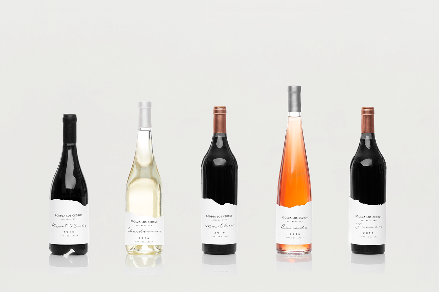
Where some wine labels drown in decorative flourishes, Bodega Los Cedros finds beauty in restraint. The label’s die‑line echoes the soft curves of drifting clouds, a nod to the mist that rolls off the mountains each dawn. Against this undulating frame, the pine‑tree emblem stands bold and unadorned, anchoring the design in unmistakable form.
Typography plays a vital role in this balance of modern and organic. A clean, sans‑serif font carries the winery’s name and vintage year, offering legibility and a contemporary edge. Complementing it, a hand‑drawn script whispers through the label—used sparingly for varietal names or tasting notes—its fluid strokes mirroring the natural irregularities found in the wild landscape. This marriage of straightforward, geometric type with a softer, more expressive script reflects Los Cedros’s own duality: a blend of disciplined winemaking and unbridled passion.

A Neutral Canvas for Rich Colors
One of the design’s quiet triumphs is its muted color palette. Soft off‑whites and gentle taupes dominate the label, allowing the wine itself—the deep ruby of a young Tempranillo or the golden straw of a well‑aged Chenin Blanc—to take center stage. This illuminated contrast between bottle and label not only highlights the liquid within but also reinforces the brand’s ethos of authenticity: nothing is hidden, and nothing unnecessary is added.
Subtle accents of forest green or deep charcoal punctuate certain editions, tying back to the cedar trees without overwhelming the overall calm. Even when special releases call for a bolder hue, the palette remains grounded in nature, avoiding garish tones in favor of those you might find at sunset or in shaded glades.
Packaging as Storytelling
Beyond a mere product identifier, each bottle becomes a vessel for narrative. The cloud‑inspired die‑line wraps around its circumference like mountain mist, while the pine‑tree icon appears on cork tops and case packaging, forging a consistent brand experience. Whether displayed on a shop shelf or presented at a tasting, the design sparks curiosity: What lies behind those three simple trees?
Inside, the wine continues the dialogue. The label’s tactile paper stock, its embossed logo, and even the slight texture of the printed script encourage a closer look and a lingering touch. It’s a reminder that, in an age of digital immediacy, there remains magic in the analog moment—lifting a cork, reading an elegant label, savoring the first sip.
A Celebration of Craft
Anagrama Studio’s work for Bodega Los Cedros stands as a celebration of craft—for both designer and winemaker alike. By distilling the essence of El Cedrito’s landscape into clean, purposeful graphics, they elevated packaging to an act of storytelling. Each element feels intentional, whether it’s the three‑tree symbol, the whisper of clouds along the die‑line, or the interplay of typefaces that balance precision with personality.
In doing so, the design honors the vineyard’s founding dream: to produce wines that speak of place and passion in equal measure. Through thoughtful use of color, form, and texture, Anagrama forged a visual identity that feels as enduring as the mountains and as alive as the forest canopy.
Raising a Glass to Thoughtful Design
Today, Bodega Los Cedros stands as more than a winery; it’s a testament to what happens when design and environment come into harmony. In every bottle, the logo’s pine trees point skyward, the clouds hug the glass, and the grapes—nurtured by sun, wind, and altitude—tell their own story. Thanks to Anagrama Studio’s elegant execution, that story is told with clarity, warmth, and a gentle nod to nature’s quiet grandeur. Saludos to a design that doesn’t just adorn a bottle, but invites drinkers to taste the soul of the mountains.

