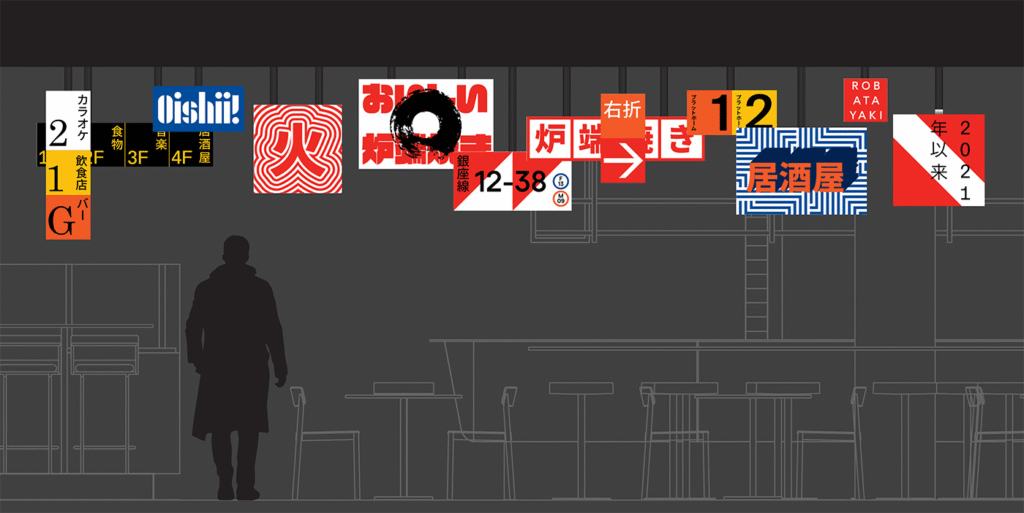
In the heart of Melbourne’s central business district, nestled within the historic Herald & Weekly Times Newspaper building, lies a dining experience that bridges continents and centuries. Robata, an izakaya-style restaurant, breathes new life into the ancient Japanese art of robatayaki—fireside cooking—reimagined through the lens of modern design, local flavor, and a distinctly Melbourne attitude.
This is more than just a restaurant—it’s a carefully crafted cultural encounter. Designed by the Melbourne-based creative agency Mucho, Robata’s visual identity is bold, evocative, and immersive, celebrating both tradition and transformation.
Where Tradition Meets Transformation
Robatayaki, which literally translates to “fireside cooking,” is a method of charcoal grilling that has been central to Japanese culinary heritage for generations. In traditional settings, it is practiced around a sunken hearth, where chefs serve skewered dishes directly to guests seated at the counter. At Robata, this time-honored practice is transported into a new context—one where Japanese culinary customs meet Melbourne’s laid-back dining culture.
Here, the dining experience is casual but elevated, sophisticated yet unpretentious. Robata’s mission is clear: to honor the depth of Japanese technique while adding a contemporary twist shaped by Australian ingredients, sensibilities, and storytelling.
Visual Identity Born of Fire and Neon
In crafting the restaurant’s brand identity, Mucho anchored the entire concept around a single, potent symbol: the Japanese kanji character for “fire.” It’s a fitting icon, not only because of the literal flames used in robatayaki, but also due to its symbolic weight. Fire, after all, is at the heart of transformation—of raw ingredients into exquisite flavors, and of tradition into reinvention.
This fiery motif is complemented by bold, modern typography that avoids clichés and instead establishes a visual language that is both assertive and playful. The branding pulses with energy—clean lines meet vivid color, and minimalism dances with character. There’s a duality here, much like in the menu itself: grounded in heritage but lit with modernity.
The Spirit of Tokyo, Brought to Life
To fully bring the Robata experience to life, the visual identity had to extend beyond logos and menus. It needed to permeate the entire atmosphere of the space—and it does, powerfully.
Mucho drew inspiration from the electric buzz of Tokyo’s streets after dark, particularly the glow of neon signs that flicker over ramen shops and bustling alleys. That influence culminated in one of the restaurant’s signature features: a dramatic lightbox installation designed to immerse guests in a setting that feels transported from a Japanese super-city.
The result is cinematic and futuristic, yet grounded in authenticity. Stepping into Robata feels like entering a different world—not a replica of Japan, but an imaginative fusion where the soul of Tokyo meets the relaxed rhythm of Melbourne.
Design with Depth and Play
One of the most striking aspects of Robata’s identity is how it balances drama with warmth. The design doesn’t simply overwhelm with spectacle—it invites curiosity. The visuals communicate a narrative of fire and flavor, but also of place and people.
The color palette and lighting pay homage to Japan’s urban nightscape, while still allowing the textures of the space—charcoal wood, glowing embers, polished steel—to create tactile depth. Playfulness lives in the small details: the use of exaggerated icons, hints of retro futurism, and cheeky contrasts between traditional characters and modern fonts.
Every visual element serves a purpose, contributing to a larger story of culinary craft and cultural connection. It’s a brand identity that doesn’t just decorate—it deepens the dining experience.
A Melbourne Approach to Japanese Dining
What truly sets Robata apart is its ability to celebrate Japanese culinary traditions while weaving them into the fabric of Melbourne’s diverse and dynamic food scene. There is no attempt to simply replicate Japan; rather, Robata interprets it—respectfully, creatively, and with its own flavor.
This approach echoes throughout the visual identity. There is reverence, certainly—but also reinvention. Robata doesn’t shy away from bold decisions, whether it’s in typography or interior design. And that’s exactly what makes it feel right at home in Melbourne, a city known for embracing innovation without losing touch with authenticity.
Fire as the Thread
In the end, fire becomes more than just a cooking method—it is the thread that runs through every part of Robata. It’s the core idea that fuels the kitchen, shapes the visual identity, and ignites the imagination of every guest who walks through its doors.
From a single kanji character to a glowing light installation, from Melbourne’s creative pulse to Japan’s culinary soul, Robata stands as a shining example of how branding can do more than sell a story—it can set it ablaze.
Would you like a shortened version of this piece for social media or promotional use?

