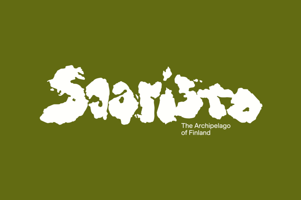
In the lexicon of Finland, “Saaristo” simply means “archipelago.” Yet beyond Finnish borders, it now evokes something much greater—a brand new identity for Western Finland’s vast and breathtaking chain of islands. Home to more than 40,000 islands, the world’s largest archipelago is stepping confidently onto the global stage with a brand designed to capture not just its geographical grandeur but its emotional pull as well.
The ambitious task of articulating the spirit of Saaristo fell to international design studio Bond, whose previous work for clients like Cable Factory and Anton & Anton has already demonstrated a keen sensitivity to cultural storytelling. The challenge was monumental: how do you create a cohesive identity for a region so immense and so diverse? Saaristo isn’t just a place; it’s a sprawling, living organism shaped by ancient forces—and Bond sought to mirror that essence in every aspect of the brand.
Shaped by Nature, Shaping the Soul
At the heart of Bond’s strategy is the simple yet profound idea: “shaped by.” These islands have been carved by nature over millennia, forming a unique ecology of plants, animals, and landscapes. But Saaristo doesn’t just shape ecosystems—it reshapes the people who visit, offering countless experiences that leave a permanent mark on the soul.
This dual shaping—of land and of visitors—becomes the emotional engine of the brand. It paints Saaristo not as a static destination, but as a dynamic interplay between place and person, past and present, isolation and connection.
A Geological Alphabet
Bond’s creative genius shines brightest in their central graphic concept. With careful study and a bit of artistic license, they recognized that the shapes of the islands themselves could form a kind of geological alphabet. Islands are not just symbolic of Saaristo; they become Saaristo—literally spelling out the name in the logotype with minimal adjustment.
This clever move gives the identity an internal logic and unity that feels both organic and inevitable. Diversity is honored, yet brought together through design. What could easily have been a messy sprawl becomes a disciplined, tectonic language of forms, suggesting endless adventures and infinite variety.
In a branding era obsessed with bigger, bolder, and stranger logos—where icons need to scream across screens and social feeds—Bond’s choice makes perfect sense. The Saaristo logotype is monumental, magazine-masthead bold, and wonderfully weird in a way that feels true to both the ancient origins of the archipelago and the modern demands of visual culture.
The Power of Motion and Emotion
But Bond didn’t stop at the static. Motion is woven deeply into the Saaristo brand experience. Through fluid zooms from satellite views to coastline close-ups, the islands become not just backdrops but active characters. The landscape lives and breathes, pulling viewers through a cinematic dance of scale—sweeping from vast geological formations to intimate, human moments like the wind riffling through a visitor’s hair.
This use of motion isn’t just decorative; it’s a vivid metaphor for Saaristo’s transformative power. Just as the islands shift and change under the influence of weather, tides, and time, so too are visitors changed by their journeys across these ancient stones.
The visual system further explores elevation and topography, abstracting mountain profiles into bold color blocks and dynamic shapes. These forms serve as versatile containers for imagery—sometimes raw and elemental, sometimes tender and personal—capturing everything from the icy bite of a Nordic breeze to the golden blur of a summer sunset.
An Icon for an Endless Journey
There is, of course, a trade-off. The intricate, large-scale logotype doesn’t scale down particularly well. Shrunk to the size of a favicon, some of its nuance is inevitably lost. Yet the grandeur of Saaristo was never meant to be contained in a tiny digital corner. It’s a brand built for big spaces: posters, films, signage, experiences. It demands breathing room, just as the islands themselves do.
In the end, Bond’s work for Saaristo succeeds because it doesn’t just market a place; it captures a process—a shaping, a journey, a transformation. It respects the deep time of geology while speaking in the language of the contemporary world.
Saaristo is not a destination you merely visit. It’s a landscape you enter, a world that imprints itself upon you. And thanks to Bond’s vision, that story now has a powerful and unforgettable voice.

