In the heart of Berlin’s techno scene, a new label has emerged with a pulse that reverberates through the city’s cultural DNA. Spellbound, founded last year by DJ and producer Shaleen—also known for her SURD series championing femme and queer-centric events—embodies a profound respect for techno’s past while pushing it firmly toward the future. Fittingly, when it came time to craft Spellbound’s visual identity, Shaleen turned to Studio Gruhl, a Berlin-based creative house known for weaving complex cultural textures into compelling design narratives.
Studio Gruhl’s challenge was to encapsulate Berlin’s rich, rebellious techno history without falling into tired clichés. They succeeded by building an identity that is at once deeply rooted and thrillingly new, balancing raw, hand-wrought elements with futuristic digital aesthetics. The result is a dynamic system that evolves just like the music it represents—forever shifting, never static.
A Visual Language Born of Berlin’s Spirit
The foundation of Spellbound’s identity rests on three conceptual pillars: the “Attitude of Berlin,” the “Traces of Berlin,” and the “Colours of the City.” Each pillar reflects a different facet of the city’s unique relationship with techno culture.
The “Attitude of Berlin” captures the uncompromising energy of the city’s nightlife, where rules dissolve in favor of pure, unfiltered expression. “Traces of Berlin” honors the layered, textured past of a place where history is never far from view, whether in the crumbling facades of old warehouses or the worn cobblestones underfoot. Finally, “Colours of the City” draws from the interplay between Berlin’s muted grey streetscapes and the neon vibrancy of its club life—posters, flyers, and flashing lights that color the night.
These three elements provide more than inspiration; they act as structural anchors, ensuring that even as the brand explores a vast array of visual expressions, it remains cohesive and unmistakably tied to its origins.
Building a Brand as Fluid as Techno Itself
At the core of Studio Gruhl’s approach is a modular, grid-based system—a sort of visual “canvas” that mirrors the way DJs layer beats, samples, and textures to build a set. This framework accommodates a massive library of over 50 graphic elements: glitchy 2D and 3D illustrations, analogue textures, bold geometric forms, and brutalist renderings. Together, these elements can be endlessly remixed and recombined, allowing the Spellbound identity to adapt and grow with the label’s evolution.
Malte Gruhl, founder of Studio Gruhl, emphasizes the flexibility of this system. “Spellbound can turn up the volume by adding more and more elements,” he explains, “or it can strip things back to create something more direct and restrained.” This modularity makes the brand both expansive and precise—a living, breathing reflection of the techno ethos.
Past and Future, Analog and Digital
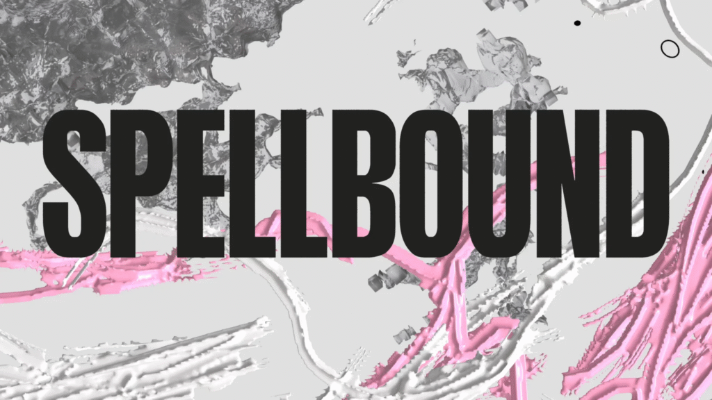
Spellbound’s visual world pays homage to the gritty, DIY spirit of Berlin’s 1990s underground. Inspired by the aesthetics of hand-cut, photocopied club flyers and the rough edges of warehouse parties, Studio Gruhl incorporated hand-made textures created from scans of torn posters and other found materials. These organic, imperfect elements offer a tactile counterpoint to the sleek digital precision of the brand’s other components.
The color palette stays true to techno’s traditional roots—dominated by stark black and white—but introduces slightly distorted neon tones reminiscent of weathered club posters. It’s a visual dialogue between decay and vibrancy, the analog and the digital, the past and the future.
A Robust Yet Democratic Design
One of the central challenges was to create a brand that was immediately recognizable without overshadowing the artists Spellbound supports. The custom logotype strikes that balance perfectly. Bold and urgent, it demands attention but remains versatile enough to function across a variety of applications—from co-branded materials to small-scale digital spaces.
Interestingly, Studio Gruhl opted for accessibility over exclusivity when it came to typography. They based the wordmark on Anton, an open-source Google font, complemented by Nimbus Sans L. These choices ensure that the label’s team can easily work with the brand assets moving forward, keeping the design system usable and sustainable.
A New Chapter for Berlin Techno
In crafting Spellbound’s identity, Studio Gruhl has achieved something rare: a brand that feels both timeless and entirely of the moment. It doesn’t seek to rewrite Berlin’s storied techno history but instead adds a vibrant, new chapter to it—one that is unafraid to acknowledge its roots while boldly looking ahead.
Spellbound’s brand isn’t a rigid set of logos and colors; it’s a living, evolving organism. Like the music it represents, it’s meant to shift, expand, and surprise. And much like a great DJ set that leaves you lost in the beat yet unmistakably grounded in a sense of place, Spellbound captures the soul of Berlin’s underground—and projects it far into the future.

