Support Independent Type II: A Manifesto in Typography
In a world where homogenization often defines design, Support Independent Type II stands as a bold and refreshing call to arms. This is more than just a book—it is a tactile, visual, and ideological celebration of the thriving culture of independent type design. Spearheaded by Lars Harmsen, Marian Misiak, and Pola Małaczewska, and published by Slanted Publishers, the second installment of this groundbreaking series pushes editorial design to its creative limits while championing the rebellious spirit of non-mainstream typography.
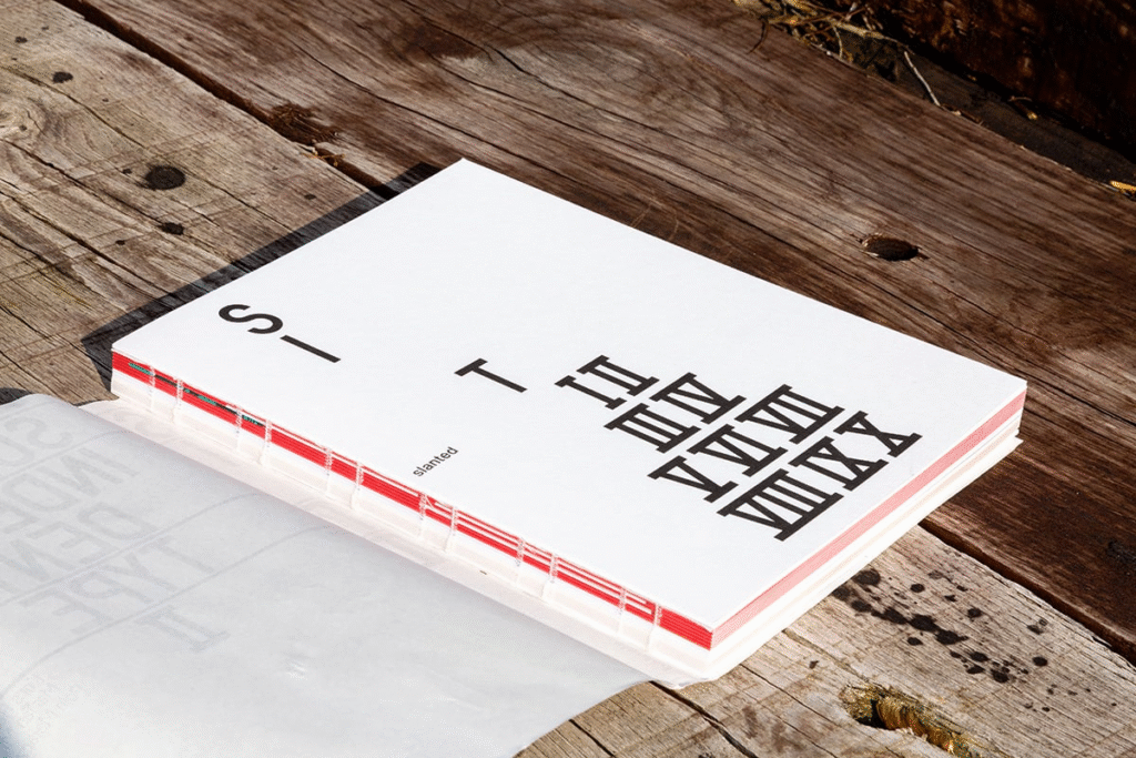
A Statement Bound in Paper and Ink
At first glance, Support Independent Type II might look like a beautifully assembled coffee table book. But beneath the surface, it’s something far more provocative. With 288 pages showcasing over 300 independent type foundries, it’s a meticulously curated testament to the designers who are rejecting mass-market monotony in favor of innovation, experimentation, and authenticity.
Each font featured in the book is not merely a typeface—it’s an expression of personality, a cultural response, a political commentary, or an aesthetic journey. Through this lens, typography becomes more than a tool for communication. It becomes an art form that shapes meaning, emotion, and identity.
The Rise of the Independent Voice
In a market often dominated by massive font distributors and sterile design conventions, independent type foundries are carving out a space for creativity to thrive. Support Independent Type II captures this moment with both reverence and energy. The book acts as a time capsule of our current design culture—one that’s increasingly rejecting uniformity and embracing diversity of thought and form.
These foundries, scattered across the globe, represent a digital diaspora of designers challenging the status quo. They are rethinking how type is made, sold, and shared. Whether it’s a quirky serif with retro vibes or a bold experimental sans dripping with futuristic charm, each piece in the book is a standalone idea, proudly disconnected from corporate influence.
Design That Speaks
The power of Support Independent Type II lies not just in its content, but also in how it presents that content. The editorial design isn’t simply a backdrop for showcasing fonts—it’s a co-conspirator in the storytelling. Each page feels dynamic and alive, brimming with intent and personality.
The design team leaned heavily into experimental editorial layouts, physical type explorations, and unpredictable textures to transform the book into a complete sensory experience. Uncoated and transparent papers from Reflex Paper lend a variety of tactile impressions as you flip through, while the open thread-stitching by Buchbinderei Spinner adds a handcrafted edge. Offset printing with spot colors by Stober Medien ensures that each font shines in its intended glory, rich and vibrant in its execution.
Even the book’s construction reinforces its message. The dust jacket wraps around a softcover with an exposed spine, revealing the raw mechanics of bookbinding. It’s a quiet nod to the transparency and honesty of the independent type scene—what you see is what you get, unpolished and proud.
More Than a Catalog
While Support Independent Type II is undeniably a showcase, it also serves as a cultural manifesto. It asks readers to reconsider their relationship with type. What does it mean to support independent design? How does a typeface shape the tone of a publication, a brand, or a movement? What values are embedded in the forms we use to communicate every day?
These questions echo throughout the book’s pages. The inclusion of essays, visual experiments, and contextual insights turns the book into a living dialogue about design ethics, authorship, and creative freedom.
It also serves as an educational tool—one that demystifies type design for those unfamiliar with the discipline while inspiring seasoned creatives to explore new directions. In a way, it’s a platform that uplifts underrepresented voices, showcases diverse styles, and democratizes access to exceptional design.
Bridging Analog and Digital
In an era where so much design work lives online, Support Independent Type II feels refreshingly physical. It reconnects us with the analog experience of books—not just as vessels for content, but as thoughtfully crafted objects in their own right. The feel of the paper, the movement of the spine, the vividness of the prints—all contribute to a multisensory encounter that digital design simply cannot replicate.
At the same time, the work within it is unmistakably modern. The juxtaposition of digital typefaces displayed through analog materials creates a compelling tension—one that mirrors the current state of design, straddling two worlds in constant conversation.
Conclusion: A Typeface Is Never Just a Typeface
Support Independent Type II is more than a publication—it’s a movement encapsulated in a book. It honors the boldness of independent creators who refuse to compromise their vision. It celebrates the power of typography to communicate more than words. And above all, it invites all of us—designers, readers, and consumers alike—to take a closer look at the choices we make when we read, write, and design.
In supporting independent type, we’re not just buying fonts. We’re investing in creative freedom, cultural richness, and the evolving future of design. This book makes a compelling case for why that matters—on every page, in every detail, and through every letterform.

