In the world of branding, even the most carefully crafted projects often nod to familiar trends — think pastel color schemes, sanitized sans-serifs, and names that eschew proper capitalization. Occasionally, however, a brand emerges that feels like it’s operating in its own orbit — effortlessly cool without relying on obvious cultural references. Suupaa, the Melbourne-based Japanese convenience store, is one such rare gem.
Designed by local studio A Friend of Mine (AFOM), the branding for Suupaa does what so few manage: it surprises. It doesn’t lean on nostalgia or the current tides of aesthetic trends. Instead, it carves its own path with a visual language that feels at once intentional, playful, and profoundly sophisticated.
A Fresh Take on the Konbini Concept
Suupaa, a blend of Japanese konbini culture and fast-casual dining, opened earlier this year with a vision as sharp as its brand identity. Created by the team behind Melbourne’s much-loved Future Future restaurant, Suupaa transports the quirky energy of a Japanese convenience store into a new, elevated context. Though I have yet to set foot in Japan or Australia, even a casual observer can recognize how Suupaa captures the magical duality of konbini culture — where the everyday becomes a source of genuine delight.
Central to Suupaa’s brand is its mascot: a plump, white pufferfish known simply as the Suupaa fish. In a nod to Japan’s affinity for cute characters across all sectors — from fashion to pharmaceuticals — this pufferfish appears in playful forms throughout the store. Whether sculpted into the storefront signage or animated across the website (built by More Studio), the Suupaa fish injects charm without overwhelming the brand’s clean, monochromatic palette.
Minimalism with Depth
At first glance, Suupaa’s branding may seem minimalist, relying heavily on black, white, metallic silver, and occasional bursts of bold red and deep blue. But closer inspection reveals layers of texture and clever design decisions. Puffy, pill-shaped signage hints at a tactile world; digital menu screens double as whimsical aquariums where the Suupaa fish swims past neon-hued dishes. These details mirror Tokyo’s bustling visual culture while maintaining a measured restraint.
Typography, too, plays a vital role in the brand’s unique voice. AFOM selected Px Grotesk from Swiss foundry Optimo for the main logotype — a chunky, no-frills typeface that’s strong but still retains a certain softness. It’s complemented by Grilli Type’s GT Alpina Typewriter, a slightly nostalgic typeface evoking receipts and product labels, reinforcing Suupaa’s mix of retail pragmatism and dining sophistication. Synt, a lively typeface from Berlin’s Dinamo studio, adds rhythmic contrast to other brand materials, injecting subtle movement and energy.
Packaging that Defies Expectations
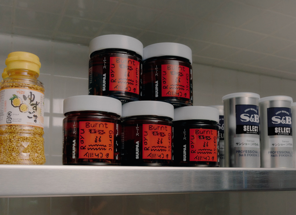
Rather than succumbing to the sensory overload typical of convenience store packaging, Suupaa embraces a more refined aesthetic. Packaging features lo-fi gradients inspired by 1980s Japanese graphic design, lending a sense of understated retro flair. Metallic silver reigns supreme across takeaway cups and cartons, offering a sleek, futuristic contrast to the more nostalgic elements.
Suupaa also cleverly introduces guest artist collaborations, beginning with an XO Sauce label that plays on the emoji-like appearance of the letters “XO.” This rotating artist feature not only keeps the brand visually dynamic but also aligns with the store’s broader ethos of blending the familiar with the unexpected.
Campaigns with Editorial Swagger
Beyond the physical and digital store experience, Suupaa’s wider campaign materials push the brand into yet another sphere — fashion editorial chic. Partnering with art director Marsha Golemac and photographer Lauren Bamford, AFOM crafted a visual campaign inspired by 1980s corporate aesthetics. Stark monochromatic tones and photocopy-style textures blur the line between a convenience store and a high-end fashion label, reinforcing the brand’s core idea: elevating the everyday without losing its spirit.
A Perfect Balance of Whimsy and Precision
At its heart, Suupaa’s branding is a masterful dance between opposites — efficiency and eccentricity, function and fantasy. It captures the essence of konbini culture for a new audience, infusing each element with meticulous care and creativity. To outsiders, Japan’s convenience stores might seem like wonders of delightful packaging, seasonal oddities, and hyper-specific treats. Suupaa distills that sense of joy into a space where practicality meets polished whimsy.
In a branding landscape often saturated by safe bets and tired trends, Suupaa stands as a beacon of what’s possible when design dares to be deeply personal, intensely detailed, and unmistakably itself. AFOM’s work on Suupaa proves that with the right mix of creativity and control, even a humble convenience store can become something truly extraordinary.

