Project_Modified: A Thoughtful Exploration in Editorial Elegance
In a world where fast content often takes precedence over thoughtful design, it’s refreshing to see projects that slow us down—encouraging reflection, admiration, and curiosity. One such project is the beautifully executed editorial work by designers Yeseul Kim and Edo Kim, who brought a refined visual voice to the Project_Modified Journal. This publication doesn’t merely document a body of work; it transforms research, methodology, and creative process into a tactile and aesthetic experience.
More than just a summary, the journal stands as an artifact—a carefully considered object that bridges the gap between content and form. It not only communicates ideas but embodies them. Through a sophisticated use of typography, layout, and white space, the designers breathe life into what could have been a routine academic or project report. The result is a visual narrative that honors both function and beauty.
Editorial Design with Intent
At the core of this project lies the challenge of translating complex research and methodical processes into a readable, engaging format. The Project_Modified Journal succeeds because it doesn’t overwhelm—it guides. Its editorial design is characterized by a calm precision that allows the content to unfold naturally, encouraging the reader to explore at their own pace.
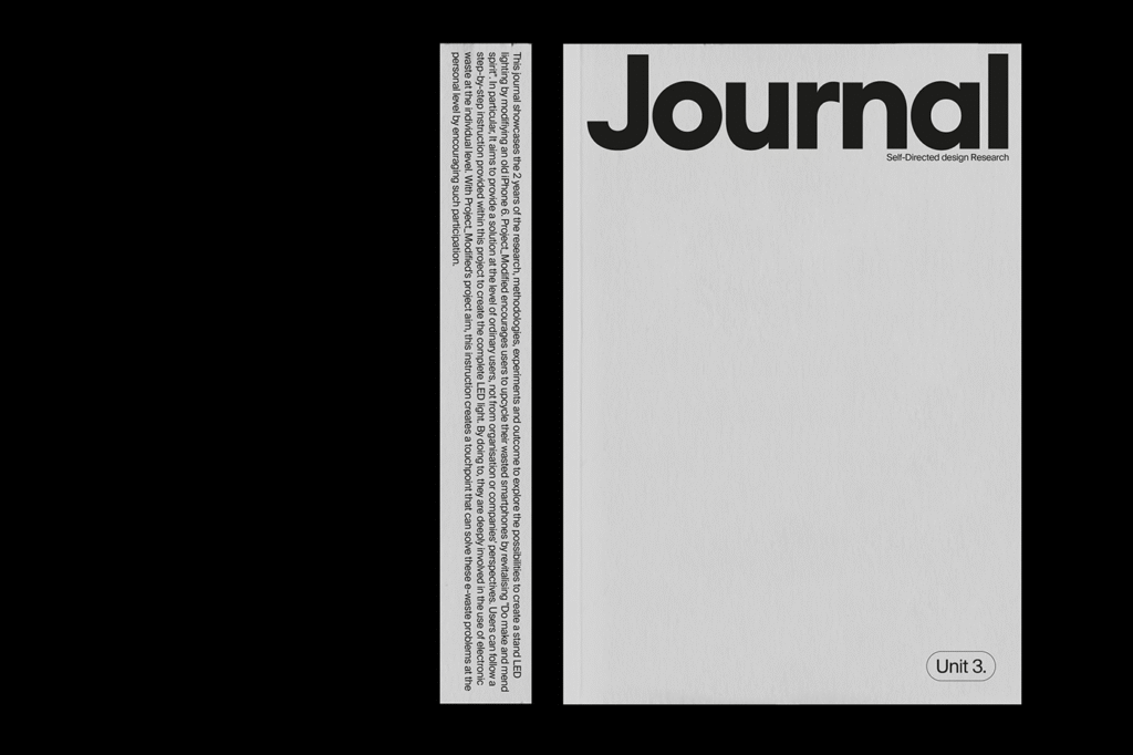
Typography takes center stage here—not just in its clarity, but in its composition. Type isn’t thrown onto the page; it’s curated. From the elegant serif fonts chosen for body copy to the inventive hyphenation in section headers, every typographic decision serves a dual purpose: to communicate, and to captivate. These choices elevate the material, giving each section its own tone, rhythm, and visual personality.
A Love Letter to White Space
One of the most striking features of the journal is its generous use of white space. In contemporary editorial design, where pages often feel overstuffed with content and imagery, the restraint shown by Kim and Kim is bold. White space here is not empty—it’s alive. It acts as a pause, a breath, a moment of reflection between thoughts. It allows the content to settle and be absorbed.
This spatial awareness enhances readability, yes, but it also demonstrates confidence. The designers trust their content enough to let it breathe. Rather than competing for attention, each element—text, image, layout—has its own place and purpose. The result is a publication that feels deliberate and calm, like a gallery wall where every piece has room to resonate.
Visualizing Research, Not Just Reporting It
What makes the Project_Modified Journal stand apart is its treatment of research and methodology as creative material. Rather than reducing process to data points and diagrams, Kim and Kim explore how the journey itself can be visualized meaningfully. Imagery is used not as decoration but as extension—each photograph or graphic is a thoughtful response to the surrounding content.
In many editorial projects, images are crammed between blocks of text or relegated to standalone pages. Here, they are integrated with care. Visuals flow seamlessly alongside typographic grids, supporting and enhancing the narrative. There’s a dialogue happening between image and text—one that strengthens the journal’s storytelling.
Hyphenation as a Design Language
A subtle yet powerful design choice in the journal is the stylized use of hyphenation, especially in the section headers. Often overlooked or avoided in modern design for its potential to disrupt flow, hyphenation is here embraced as a signature detail. It provides a graphic cadence, almost like a whisper or echo at the beginning of each chapter. These hyphens guide the reader’s eyes and prepare them for transitions in tone and content.
It’s an inventive example of how even the smallest typographic details can contribute to the overall voice of a publication. When handled with intention, even punctuation becomes part of the design vocabulary.
Where Design and Thoughtfulness Converge
Kim and Kim’s editorial work with Project_Modified isn’t loud. It doesn’t shout for attention or rely on gimmicks. Instead, it draws you in slowly, page by page, until you’re immersed in its quiet sophistication. It’s proof that design doesn’t have to be overwhelming to be powerful. In fact, its power lies in restraint, in clarity, and in intention.
This project speaks to the importance of aligning form with content. The subject—research and creative methodology—calls for a tone of curiosity and reflection. The design answers with precision and elegance. Together, they form a coherent and memorable whole.
Final Thoughts
The Project_Modified Journal is a reminder that editorial design, at its best, is a form of storytelling. It’s not just about organizing content—it’s about shaping experience. With their refined touch, Yeseul Kim and Edo Kim offer more than a visual feast; they create a space where thought, process, and creativity are honored and elevated.
In an age of overexposure and content fatigue, projects like this are not just welcome—they are necessary. They remind us that good design is not only about what we see, but about how we feel as we move through it. The Project_Modified Journal invites us to slow down, look closer, and appreciate the beautiful intersection where thoughtful design meets thoughtful ideas.

