Uoga Uoga’s Fresh New Look: A Celebration of Natural Beauty with a Juicy Twist
When a brand grows, its identity often needs to grow with it. Such was the case with Uoga Uoga, the beloved Lithuanian cosmetics brand known for its handmade, natural products. Originally wrapped in a charming, homespun aesthetic, Uoga Uoga found itself ready for a bold step forward. As it expanded into larger cities and reached for a more diverse, modern audience, the brand turned to design experts at &ANDSTUDIO for a fresh visual identity that would honor its origins while speaking to a more urban, contemporary crowd.
The result? A vibrant, joy-infused rebrand that perfectly balances nature and modernity, capturing the heart of Uoga Uoga while opening the door to new possibilities.
Evolving from Crafty Roots to Urban Fresh
Uoga Uoga’s early look reflected its roots in natural craftsmanship—earthy, organic, and endearing. But as the brand grew beyond its original niche, there was a clear need for a more polished visual language—something that could stand out in stylish city boutiques while still whispering of berries, forests, and hand-mixed ingredients.
The challenge wasn’t to create a new identity from scratch, but to evolve what already existed. &ANDSTUDIO approached the task with care, aiming to blend the old with the new. Their design philosophy centered on a concept they dubbed “contemporary natural”—a visual narrative that speaks of simplicity, beauty, and joyful vitality. This new identity had to feel fresh and approachable, yet rooted and real.
A Juicy Concept, Born from Nature
The soul of the redesign emerged from a single word: juiciness.
This wasn’t just a cute metaphor. Juiciness—bursting with color, flavor, freshness—is a quality directly tied to Uoga Uoga’s ingredients, many of which come straight from nature. In fact, the name “Uoga” itself means “berry” in Lithuanian, making this theme even more fitting.
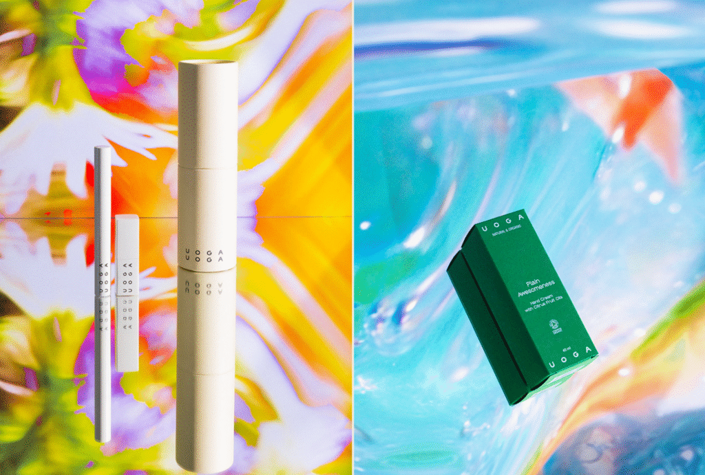
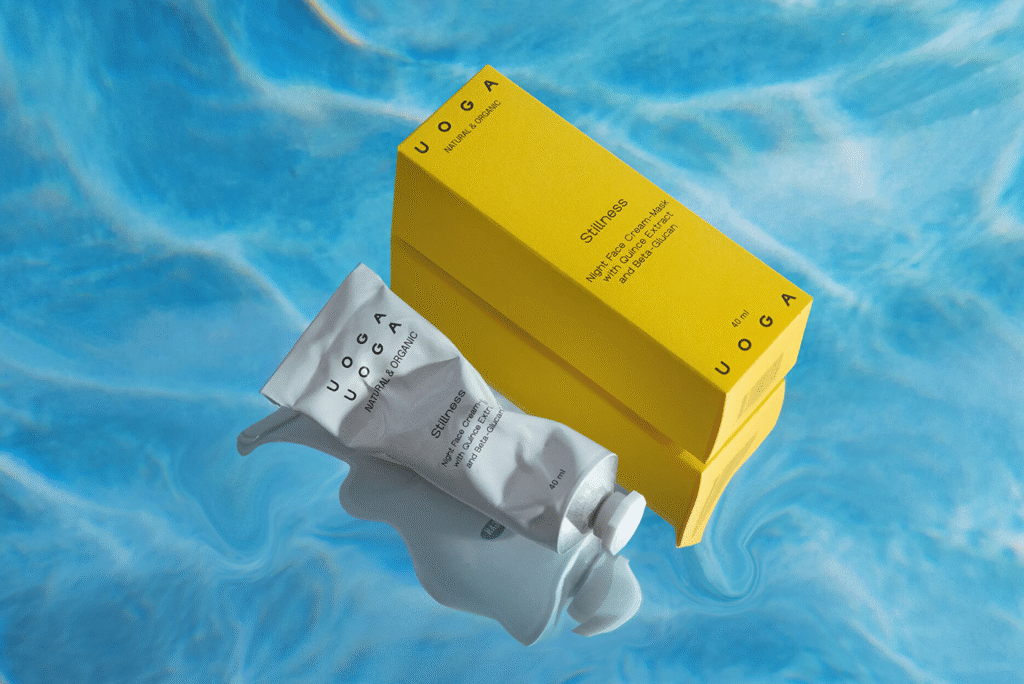
Juiciness became the guiding light for the entire visual identity. Instead of playing it safe with muted tones or minimalist black-and-white packaging—common in the world of organic cosmetics—Uoga Uoga boldly embraced vivid, saturated colors. These hues aren’t random. Each one reflects the natural ingredients within the products—sunny yellow for sea buckthorn, deep red for cranberry, lush green for herbal infusions. It’s a joyful, color-coded system that’s not only beautiful but functional, making it easy for customers to navigate the product line at a glance.
The base palette of ivory and black provides a modern, clean framework, allowing the vibrant accents to sing without overwhelming. It’s a delicate balance—sophisticated yet playful, luxurious yet honest.
Typography and Logo: Quiet Confidence with a Twist
The Uoga Uoga logo was also reimagined to reflect the new direction. It’s simple and modern, flexible enough to adapt to both physical packaging and digital applications. The wordmark wraps around edges, sits confidently across labels, and holds its own on screens.
Typography played a crucial role in distinguishing the brand. Rather than relying on the geometric sans-serifs so common in beauty branding, &ANDSTUDIO selected Groteska and Epilogue, a pair that brings character and nuance. These typefaces offer subtle irregularities and expressive curves that hint at the human touch behind Uoga Uoga’s handmade processes. The result is both elevated and authentic.
Design that Speaks to the Senses
What truly sets this rebranding apart is how well every design element works together to create a sensory experience. From the tactile feel of the containers to the carefully chosen colors and expressive typography, the brand doesn’t just look good—it feels good.
The packaging is designed to stand out on the shelf without shouting. It quietly draws you in, inviting you to touch, to explore, to engage. There’s a sense of joy embedded in the design—a reminder that beauty routines can be more than functional. They can be moments of pleasure and self-connection.
Photographer Martyna Paukste brought this vibe to life through art direction that emphasizes texture, color, and natural elegance. Her work captures the essence of the brand: joyful, grounded, and effortlessly fresh.
Natural, but Never Boring
The new Uoga Uoga brand identity proves that natural doesn’t have to mean neutral. It shows that “organic” and “fun” aren’t opposites. With the help of &ANDSTUDIO, the brand has evolved into something bolder and more expressive, while keeping its soul intact.
The rebrand isn’t just a new coat of paint—it’s a strategic shift that repositions Uoga Uoga for the next chapter. By maintaining its commitment to natural ingredients while presenting a visually exciting and emotionally resonant identity, the brand now appeals to both longtime fans and a new generation of conscious, style-savvy consumers.
A Blueprint for Future-Focused Natural Brands
For other natural brands looking to grow without losing their identity, Uoga Uoga offers an inspiring example. It’s a reminder that evolution doesn’t require abandonment—it can be about translation. With the right design approach, core values can be reinterpreted in ways that resonate more deeply, more widely.
In the hands of a thoughtful creative studio like &ANDSTUDIO, even the simplest ingredient—like a berry—can inspire a brand story that’s colorful, dynamic, and utterly unforgettable.
And in the end, that’s what great branding is all about: not just being seen, but being felt.

